
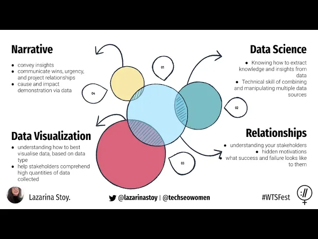

How to Tell Stories with Data for Stakeholder Impact
Want your data to inspire action? Numbers alone don’t drive decisions - stories do. Data storytelling blends a clear narrative, thoughtful analysis, and visuals to turn raw stats into insights that stakeholders understand and act on.
Here’s how to make your data stories impactful:
Focus on the problem: Identify the key challenge stakeholders care about.
Tailor to the audience: Match the story to their goals - executives want outcomes, technical teams need details.
Structure clearly: Use a problem-solution-outcome format for clarity.
Simplify visuals: Choose charts that highlight insights without clutter.
Engage with interaction: Use live polls, Q&A, or dashboards to spark participation.
Pro Tip: For high-stakes presentations, professional design and storytelling expertise can make all the difference.
Ready to craft stories that stick? Let’s dive in.
Telling Stories with Data - What is Data Storytelling and How to implement as a Consultant
Creating a Clear Data Story
Crafting an effective data story starts with pinpointing a specific business challenge and using targeted data to guide solutions. Building on the earlier discussion about stakeholder alignment, this focused approach ensures that insights lead to meaningful, actionable outcomes.
Find the Main Business Problem
The foundation of any impactful data story lies in identifying the core business issue that resonates most with your stakeholders. This isn't about spotting interesting data trends - it’s about addressing the problems that matter most to your audience and helping them make critical decisions.
Consider these key questions: What challenges are stakeholders grappling with? What results are they aiming for? What decisions need to be made? For instance, if customer retention is a concern, the central question might be, "Why are customers leaving, and what can we do to improve retention?" Framing the problem in this way ensures your story tackles real-world challenges rather than just presenting numbers.
When your insights align closely with stakeholder priorities, they’re more likely to engage with your story and act on the findings. Research even shows that data stories tied directly to stakeholder concerns lead to higher engagement and more effective decision-making. Tailor your problem statement to reflect their needs and priorities.
Choose and Structure Your Data
Once you've identified the primary business challenge, selecting the right data becomes much easier. Focus on data that is accurate, relevant, and directly tied to your narrative. Every piece of information should help stakeholders connect the dots between the problem and the solution.
For example, if your story revolves around boosting sales performance, prioritize data like sales trends, customer demographics, conversion rates, or competitive positioning. Avoid overloading your audience with unnecessary details. Best practices in data storytelling emphasize using only the data needed to make your case, keeping the story clear and credible.
Organize your data to follow a logical flow that supports your narrative. Start by providing context - offer an overview of the current situation. Then, use data to illustrate the scope and impact of the problem. Finally, connect the dots by showing how the data leads to actionable solutions. For instance, in a story about reducing operational costs, you might begin with an analysis of current spending, highlight inefficiencies, and then quantify potential savings.
Build a Story with Clear Structure
A well-structured story often follows a problem–solution–outcome format. Start by clearly defining the problem or challenge, using data to emphasize its importance. For example, if you're addressing declining website traffic, you could begin by showcasing recent drops in visitor numbers to set the stage for analyzing the impact on lead generation.
Next, dive deeper into the issue by presenting detailed data - such as user behavior patterns or areas where significant drop-offs occur. This helps stakeholders understand the root causes. Then, propose solutions, backing them with evidence from similar scenarios, benchmark data, or pilot program results to demonstrate their effectiveness. For instance, you might show how adjustments to navigation and content strategy have previously boosted website performance.
Wrap up your story by outlining the expected outcomes or benefits, using measurable goals to predict the impact of your recommendations. For example, you could highlight targets like increased visitor numbers or improved conversion rates.
This approach has proven successful in real-world scenarios. Take the example of a grantmaking foundation that used a structured data story to showcase the impact of its programs on community health. They began by addressing rising health challenges, presented data on program participation and outcomes, and concluded with recommendations to expand successful initiatives. This clear and logical narrative not only helped stakeholders understand the value of the programs but also supported key funding decisions.
Creating Clear Data Visuals
After structuring your data story, the next step is to transform those insights into visuals that are easy to interpret and help guide decisions. Clear visuals are the perfect complement to a well-organized data narrative.
Pick the Right Chart Type
Choosing the right chart type is critical for effectively communicating your message. The key is to match your chart to your data and the story you're telling.
Bar charts are ideal for comparing numbers across categories. For example, if you're analyzing sales performance by region or comparing product line revenues, bar charts make these differences instantly clear. They’re especially useful when comparing multiple categories side by side.
Line charts are great for showing trends over time. Whether you're tracking quarterly revenue growth or monthly website traffic, line charts make it easy to spot patterns and understand whether metrics are rising, falling, or remaining steady.
Pie charts work well for visualizing proportions, but they should be used sparingly and only when you have a few categories (three to five segments). For instance, they’re useful for showing market share by product. Avoid 3D pie charts - they distort proportions and make it harder to interpret the data accurately.
Scatter plots are perfect for uncovering relationships between two variables, such as the link between advertising spend and sales. They’re also handy for identifying outliers or highlighting correlations.
Chart Type | Best For | Example Use Case |
|---|---|---|
Bar Chart | Comparisons across categories | Sales by region or department |
Line Chart | Trends over time | Monthly revenue growth |
Pie Chart | Proportions (few categories) | Market share by product |
Scatter Plot | Relationships between variables | Advertising spend vs. sales |
Make Visuals Simple and Clear
When presenting to stakeholders, clarity is everything. Your visuals should spotlight the most important insights without overwhelming the audience.
Start by removing unnecessary elements. Gridlines, background images, and flashy decorations can distract from your message. A clean, minimal design helps your audience focus on the data and absorb key takeaways more quickly.
Use color intentionally to emphasize critical points. Instead of using a rainbow of colors, stick to one or two accent colors to draw attention where it matters most.
Avoid cramming too much information into a single chart. Break down complex data into separate visuals, each focusing on a specific aspect. This approach makes it easier for your audience to follow the story without feeling overloaded.
A great example of these principles in action comes from the New York City Department of Health during their 2022 COVID-19 response. Their presentations to city officials featured simple bar and line charts with color coding to highlight trends. They stripped away gridlines and unnecessary labels, ensuring that even non-technical stakeholders could quickly grasp the data and make informed decisions.
Clear labels and legends are non-negotiable. Every chart should have a descriptive title that tells viewers exactly what they’re looking at. Use straightforward language in your labels - avoid technical terms or abbreviations that might confuse your audience.
Using PowerPoint for Better Visuals
PowerPoint offers powerful tools to create professional data visuals without needing additional software. Knowing how to use these features can elevate the quality of your presentations significantly.
The built-in chart tools in PowerPoint allow you to create bar charts, line graphs, pie charts, and scatter plots directly in your slides. You can then customize colors, fonts, and layouts to align with your presentation's style and goals.
Stick to templates and themes with consistent color palettes and fonts to maintain a polished look. Choose a clean, professional template that keeps the focus on your data rather than competing for attention.
Animations can add value when used thoughtfully. For instance, instead of displaying an entire bar chart at once, you can animate each bar to appear sequentially. This approach lets you guide your audience through the narrative step by step, building anticipation as you reveal key data points. For example, when presenting quarterly growth, animate each quarter's bar to appear as you discuss it.
However, avoid over-the-top transitions or excessive animations. Subtle effects are best - they help guide attention without distracting from the content.
For critical presentations, consider partnering with professionals. Agencies like Present Partners specialize in crafting PowerPoint slides that combine strong storytelling with sleek visual design. Their expertise ensures that your data visuals not only look polished but also align with your objectives and help drive decisions.
Research underscores the importance of well-designed visuals. A study found that 71% of executives prioritize data storytelling skills when reporting to stakeholders. Additionally, compelling visuals can increase audience engagement by as much as 300%. Whether you're seeking funding, building client relationships, or setting strategic direction, investing in clear and effective visuals is a smart move.
These principles tie seamlessly into broader strategies for connecting with different stakeholder audiences.
Adapting Stories for Different Stakeholders
Different stakeholders care about different things - CFOs want to see ROI, while technical teams dive into the nitty-gritty of data. Using clear visuals and flexible strategies ensures your message connects with every audience.
Learning What Stakeholders Want
Before crafting your story, take the time to understand your audience. Each stakeholder group has its own priorities, so tailoring your approach is key.
Start by talking to key stakeholders and reviewing past feedback. This helps you uncover what matters most to them. For example, technical teams might want detailed data, while executives often prefer big-picture insights. Ask about their challenges, their definition of success, and the kind of information they need to make decisions. This prep work ensures your story aligns with their expectations.
Stakeholder Type | Concerns | Data Focus | Communication Style |
|---|---|---|---|
Executives | Business impact, ROI, strategic alignment | High-level trends, key metrics | Concise, action-oriented |
Finance Teams | Cost analysis, budget impact, risk assessment | Financial metrics, projections | Detailed, evidence-based |
Technical Teams | Methodology, accuracy, implementation | Data quality, technical specifications | In-depth, analytical |
Sales Teams | Customer impact, revenue opportunities | Performance metrics, market insights | Results-focused, competitive |
Adding Interactive Elements
Interactive features can turn a one-way presentation into a lively conversation. They engage stakeholders, encourage participation, and provide real-time insights into what resonates.
For instance, live polls or surveys can spark interest. During your presentation, you might ask, "What do you think drove the most growth last quarter?" before revealing the actual data. This not only builds anticipation but also helps you understand their initial thoughts.
Interactive dashboards are another powerful tool. They let stakeholders explore data on their own terms. For example, when discussing budget scenarios, you can allow them to tweak parameters and instantly see how those changes impact projections. This hands-on experience often leads to richer discussions and quicker buy-in.
Q&A sessions are most effective when spread throughout the presentation rather than saved for the end. Pausing after major points to address questions ensures clarity and keeps everyone engaged. For larger groups, audience response systems can be a game changer. These tools allow stakeholders to submit questions anonymously or vote on options, encouraging honest feedback and participation from quieter team members.
The type of interactivity should match your audience. A small executive team might prefer open discussions, while larger groups could benefit from structured polling or anonymous feedback tools.
Improving Based on Feedback
Just like your visuals, your storytelling should evolve based on feedback. Rarely does a first presentation hit every note perfectly. The best storytellers continuously refine their approach by listening to their audience.
Pay attention to non-verbal cues during your presentation. Are people leaning in and engaging, or do they look confused or uninterested? Note which slides spark the most discussion and which ones fall flat - these observations are often as valuable as direct feedback.
After the presentation, follow up with stakeholders to gather specific input. Ask what they found most helpful, what could be clearer, and what additional information they’d like. You can use a quick email survey or a short phone call to collect these insights.
Recurring questions or requests for clarification are red flags. If multiple people ask about the same data point or concept, it’s a sign you need to provide more context or simplify that part of your story. Consider adding explanatory slides, defining technical terms, or restructuring sections for better flow.
Before presenting to a larger audience, test revised versions with a smaller group. This gives you a chance to iron out any remaining issues and ensure your timing works. It’s also a confidence booster for the final run.
Keep a feedback log to track patterns over time. You might discover that certain groups consistently need more background information or that specific types of visuals resonate better with particular audiences. This insight allows you to fine-tune future presentations from the outset.
Feedback isn’t just about fixing what’s wrong - it’s also about recognizing what works. When certain elements get a positive response, incorporate them into other presentations. Building on your strengths is just as important as addressing weaknesses.
Working with Experts for Important Presentations
When you're gearing up for a high-stakes presentation - whether it's pitching to investors, reporting to the board, or trying to land a major client - your data story needs to be flawless. Beyond clear visuals and tailored narratives, expert input can take your presentation from merely good to one that influences decisions. This is where specialized presentation agencies can make all the difference.
Why Expert Help Matters
Professional agencies bring a level of expertise that in-house teams often can't match. They combine strategic insight with polished design to ensure your message connects with your audience. Their ability to simplify complex information into clear, actionable stories is a game-changer. While your team may be too immersed in the details to see the bigger picture, outside experts can step back, identify the most compelling narrative, and structure it in a way that keeps stakeholders engaged.
These experts also excel at transforming dense data into visuals that are both impactful and easy to understand. Using advanced techniques, they carefully choose charts, colors, and layouts to ensure your slides enhance your message rather than overwhelm your audience. A cluttered spreadsheet can become a clean, visually engaging graphic that supports your story.
Another key advantage is the long-term value of working with a trusted agency. Over time, they develop a deep understanding of your goals, audience, and communication style. This allows them to refine your presentations consistently, creating a recognizable and effective approach to stakeholder communication.
Additionally, expert agencies bring audience-specific insights to the table. They know how to tailor content for different groups - whether it's technical teams who crave detailed data or executives who need big-picture takeaways. This precision significantly increases the likelihood of achieving your goals, whether it's securing funding or influencing key decisions.
The Impact of Present Partners

One standout example of such expertise is Present Partners, a New York-based agency specializing in designing presentations that win funding, secure clients, and drive decisions. Their approach covers every stage of presentation development, ensuring that your message is clear, compelling, and visually polished.
Present Partners focuses on more than just slide design. Their story development and copywriting services help craft narratives that make your data resonate. They also excel in presentation planning and content structuring, ensuring every element of your deck aligns with your core message and audience needs.
What sets them apart is their ability to combine strategic thinking with visual clarity. They don’t just make slides look good - they help you refine your entire communication strategy. This includes understanding your audience's priorities, organizing your data to support key points, and creating presentations that hold up under pressure.
Their commitment to building long-term partnerships with clients is another major strength. Instead of delivering a one-off project, they invest in understanding your business and adapting as your needs evolve. For organizations with recurring stakeholder presentations, this consistency ensures high-quality results every time.
For businesses tackling complex data - whether it’s financial forecasts, market trends, or operational metrics - Present Partners also brings expertise in PowerPoint-focused design. They maximize PowerPoint’s capabilities while navigating its limitations, creating presentations that are both functional and visually engaging.
Ultimately, the investment in professional support often pays for itself. When you consider the potential returns from a successful funding round, a major client acquisition, or a critical decision, the cost of expert presentation design becomes a smart, strategic choice rather than an expense.
Conclusion: Creating Impact Through Data Stories
Blending narrative, visuals, and data creates a powerful combination that resonates with both logic and emotion. This approach ensures your message sticks with your audience and prompts action, unlike data presented in isolation.
Studies reveal that these techniques can help secure funding, win clients, and shape key decisions. The difference between a forgettable presentation and one that drives results often lies in how well you craft and deliver your data story.
To keep your message clear, avoid unnecessary jargon and focus on presenting essential data with clean, engaging visuals. Remember, visuals are processed 60,000 times faster than text, so they’re a critical tool for ensuring your audience quickly grasps your message without extra effort.
Once your narrative is clear, it’s crucial to align it with what matters most to your stakeholders. Whether you’re addressing investors focused on ROI, executives interested in strategic initiatives, or clients seeking effective solutions, your story must directly speak to their priorities.
For high-stakes presentations, professional design and narrative expertise can transform potential opportunities into measurable outcomes. As discussed earlier, the returns from a well-crafted presentation - like securing funding or landing a major client - make investing in expert design and storytelling a smart move.
FAQs
How can I tailor my data storytelling to address the unique needs of different stakeholders?
To make your data story resonate with different stakeholders, start by digging into their specific goals, challenges, and what drives their decisions. This could mean asking thoughtful questions, reviewing past communications, or analyzing their roles within the organization.
With this understanding, shape your narrative to emphasize the data points that matter most to their priorities. Incorporate clear visuals, straightforward language, and relatable examples to keep your story engaging and practical. Clarity and focus are essential for connecting with a variety of audiences effectively.
How can I simplify complex data visuals to make them easier for stakeholders to understand?
Simplifying data visuals is all about making insights easy to understand at a glance. Focus on one clear message per visual - trying to cram too much information into a single chart or graph can overwhelm your audience. Keep titles straightforward, labels clear, and formatting consistent to naturally guide attention where it’s needed.
Pick the right type of chart for your data. For instance, use bar charts to compare values and line charts to show trends over time. Avoid cluttering visuals with unnecessary elements like too many colors or distracting 3D effects. To draw attention to key points, use bold colors or annotations to highlight what’s most important. When you prioritize simplicity and clarity, your visuals can effectively communicate insights and strengthen your overall narrative.
Why should you include interactive elements in data presentations, and how do they enhance stakeholder engagement?
Incorporating interactive elements into data presentations can make a world of difference in how stakeholders engage with the material. Adding features like clickable charts, filters, or drill-down options allows people to dive into the data in ways that matter most to them. This approach not only makes the content feel more dynamic but also helps users uncover insights that are directly relevant to their needs.
These interactive tools also promote active participation, keeping the audience engaged and attentive. When you transform passive viewers into active participants, the presentation becomes far more memorable and impactful. This heightened engagement often leads to a clearer understanding of the data and more informed decision-making.