


Visual Storytelling Techniques for Client Slides
Visual storytelling turns dry, text-heavy slides into engaging presentations that inform, persuade, and drive decisions. By combining clear narratives and impactful visuals, you can simplify complex ideas, keep your audience focused, and leave a lasting impression. Here’s how:
Use visuals strategically: Replace dense text with images, infographics, and diagrams to make data easier to understand.
Structure your story: Frameworks like the Hero's Journey or Story Mountain guide your audience through challenges and solutions.
Prioritize clarity: Focus on one idea per slide, use consistent layouts, and direct attention with size, color, and placement.
Personalize your content: Tailor visuals and data to your client's specific goals and challenges for maximum relevance.
When done right, visual storytelling builds trust, simplifies decision-making, and transforms presentations into powerful tools for action.
How to Tell Effective Visual Stories in Your PowerPoint
Narrative Structures for Client Slides
A well-structured narrative can turn a series of slides into an engaging story. It helps guide your audience through complex ideas while keeping their attention firmly on your main message. These frameworks, when paired with strong visuals, create presentations that are both clear and impactful. Here, we’ll explore three effective narrative structures - Hero's Journey, Story Mountain, and Story Loop - that can elevate your client presentations.
Hero's Journey Framework
The Hero's Journey places the client at the center of the story as the hero, with you, the presenter, playing the role of the guide. This structure follows a familiar three-act storytelling pattern:
Setup: Begin by outlining the client’s current situation. Highlight their market position, challenges, or goals.
Confrontation: Introduce the obstacles they face, such as market pressures, competitive threats, or operational hurdles. Use clear data points and visuals to illustrate these challenges.
Resolution: Present your solution and demonstrate how it leads to outcomes like higher revenue, improved efficiency, or market leadership.
This framework is ideal for consulting presentations, strategic planning discussions, or transformation initiatives where the goal is to help the client envision a path to a better future.
Story Mountain for Presentations
Story Mountain creates a sense of rising tension, culminating in a climactic moment that underscores your key message. It’s particularly effective when you need to emphasize critical decisions or create a sense of urgency.
Introduce the Issue: Start by clearly stating the main business challenge.
Build Tension: Layer in supporting data, insights, or trends that highlight the stakes and intensify the need for action.
Climactic Moment: Pinpoint the critical decision or unveil your primary solution, explaining why immediate action is essential.
Resolution Steps: Offer a clear, step-by-step path showing how your solution addresses the challenge.
Positive Outcomes: Conclude with the benefits and next steps, leaving your audience with a clear vision of success.
This structure works particularly well for sales presentations and investment pitches, where balancing tension with a clear resolution is crucial.
Story Loop Techniques
Story Loop techniques are designed to grab attention right from the start and maintain engagement throughout. By opening with an unresolved challenge or intriguing statement, you can spark curiosity and keep your audience invested.
Start with a Hook: Capture attention by addressing a key concern, sharing a surprising statistic, or posing a thought-provoking question.
Sustain the Narrative Thread: Throughout the presentation, keep referring back to the initial challenge without resolving it too soon.
Deliver the Resolution: Near the end, provide a satisfying answer to the challenge, ensuring the audience feels the journey was worth their time.
This approach is especially effective in thought leadership presentations or educational sessions where you need to sustain interest over complex topics.
Putting It All Together
When using any of these structures, it’s essential to plan your story arc before jumping into slide design. Use section headers to signal transitions and ensure every slide contributes to the overarching narrative. Pair these frameworks with strong visuals, and you’ll create presentations that not only inform but also inspire action.
Up next, we’ll dive into how visual hierarchy and slide layouts can strengthen these narrative frameworks and make your client presentations even more impactful.
Visual Hierarchy and Layout Best Practices
A well-executed visual hierarchy can transform cluttered slides into clear, impactful presentations by directing your audience’s attention. When done effectively, it enables decision-makers to grasp complex information quickly and with confidence. The secret lies in combining size, color, and placement to create a logical flow of information.
Organizing Content Through Visual Hierarchy
Visual hierarchy is built on three main elements: size, color, and placement, each playing a role in prioritizing information.
Size: Larger elements naturally draw more attention, so make critical components like headlines stand out, while keeping supporting details in smaller fonts.
Color: Use colors strategically to guide focus. Warm tones like red or orange can highlight urgent action items, while cooler shades like blue or green convey calm and trust, making them ideal for background data or secondary points.
Placement: Position key information where the eye naturally lands - typically at the top or center of a slide. This creates a logical path for viewers to follow.
Research backs up the importance of visual hierarchy. According to a Prezent.ai report, slides with clear organization improve retention and decision-making by as much as 67%. This happens because a well-structured slide reduces cognitive load, allowing clients to focus on the message rather than deciphering its importance.
Consistency is another critical factor. Use the same visual style for similar types of information throughout your presentation. For instance, if key findings are in bold red 24-point font on one slide, keep that format consistent across the entire deck. This predictability helps audiences process information faster and more effectively.
Stick to one primary idea per slide. For complex topics, break them into smaller, more manageable sections instead of cramming everything onto a single slide. This approach ensures clarity and keeps your audience engaged.
Effective Slide Layouts for Client Scenarios
Tailoring slide layouts to the type of information you're presenting can make a big difference. Here are three layout styles that work particularly well for client presentations:
Workflow slides: Ideal for illustrating processes or step-by-step tasks. These layouts are especially useful for operational presentations where clients need to understand how different phases or actions connect. Use arrows, numbered steps, and consistent spacing to clearly show the flow of information.
Timeline slides: Perfect for showcasing project plans, company histories, or product development stages. Highlight key milestones prominently and use consistent markers to differentiate events.
Comparison slides: Designed to compare options, products, or metrics side-by-side. These layouts simplify decision-making by clearly showing contrasts and similarities. Consistent formatting and the strategic use of color or size can emphasize the most critical differences.
The table below summarizes these layout types and their applications:
Layout Type | Best Use Case | Key Benefit |
|---|---|---|
Workflow Diagram | Explaining processes or procedures | Clarifies step-by-step actions |
Timeline | Project plans, company history | Shows chronological progression |
Comparison Chart | Evaluating options or metrics | Highlights differences/similarities |
Real-world results highlight the power of thoughtful layouts. In 2023, a Fortune 500 consulting firm redesigned its client pitch decks, replacing dense bullet points with workflow diagrams and comparison charts. The result? A 40% increase in client engagement scores and a 25% higher win rate for new business proposals.
When structuring your slides, follow a logical flow: start with context or background, present the challenge or opportunity, and then lead into your solution and its outcomes. This familiar storytelling pattern - beginning, middle, and end - makes it easier for audiences to follow your reasoning and connect with your recommendations.
With 65% of people identifying as visual learners, these layout strategies are essential for turning complex ideas into clear, actionable insights tailored to your audience.
Next, we’ll explore how imagery and data visualization can further elevate client engagement.
Using Imagery and Data Visualization for Impact
Visuals are more than just decorative elements in presentations - they’re powerful tools that can inform, persuade, and inspire action. When used thoughtfully, imagery and data visualization work hand-in-hand to strengthen your message, connecting with your audience on both an emotional and logical level. The secret lies in selecting visuals that complement your narrative and resonate with your audience.
Selecting and Integrating Imagery
When it comes to choosing images, relevance is more important than aesthetics. The visuals you select should directly support your main points and align with the audience’s expectations and industry norms. High-quality, professional images build trust and credibility, while generic stock photos can have the opposite effect.
Photos of real people in relatable situations can humanize your message, making abstract ideas easier to grasp. For instance, if your presentation is for a healthcare client, incorporating medical imagery or industry-specific icons can establish trust and familiarity right away. Similarly, custom illustrations or icons can demonstrate your understanding of the industry while adding a polished touch.
To integrate visuals effectively, focus on simplicity. Dedicate each slide to a single idea, and use white space strategically to guide attention to your key message. Replace repetitive bullet points with icons to make your slides more visually engaging and easier to scan.
Consistency is another critical factor. Uniformity in image size, style, and color palette creates a cohesive look, helping your audience process information more quickly. A consistent visual theme eliminates distractions and keeps the focus on your message.
Once your imagery is in place, the next step is to simplify complex information through data visualization.
Best Practices for Data Visualization
Data visualization transforms raw numbers into insights that are easy to comprehend. Start with simple, familiar chart types like bar charts, line graphs, or pie charts - these are universally understood and don’t require additional explanation. Avoid overly complex designs, such as 3D effects or intricate layouts, which can confuse rather than clarify.
To emphasize key points, use contrasting colors or callouts to highlight important data. Pair this with plain, descriptive labels and titles that explain the significance of the information, not just the numbers themselves.
Gradually revealing data through progressive disclosure can help maintain engagement. By introducing complex information in stages, you allow your audience to follow your argument step by step without feeling overwhelmed.
Infographics are another effective tool, blending data with storytelling to make statistics more relatable and memorable. Tailor the level of detail to your audience - technical professionals may appreciate in-depth data, while executives often prefer a focus on high-level trends and actionable insights.
While clarity is essential, visuals can also evoke emotional responses, adding another layer of impact to your presentation.
Creating Emotion Through Visuals
Colors have a psychological effect on how your audience interprets your message. Warm tones like red and orange can create urgency or excitement, making them ideal for emphasizing key metrics or critical actions. Cooler shades like blue and green, on the other hand, convey calm and reliability, making them a great choice for background elements or messages about stability.
Using brand colors consistently throughout your presentation reinforces professionalism and strengthens your client’s connection to your message. Strategic color highlights can also draw attention to specific calls to action or decision points without overwhelming the design.
Storytelling through visuals can make your presentation far more engaging. For example, using before-and-after scenarios or customer success stories with relevant imagery can illustrate the real-world impact of your recommendations. When clients can see themselves or their customers reflected in your visuals, your message becomes far more relatable and persuasive.
Pairing visuals with real-life testimonials or anecdotes further enhances authenticity. Imagine showing a customer photo alongside a testimonial and a simple chart demonstrating measurable results - that combination of emotional appeal and logical proof can be incredibly compelling.
Lastly, animation and transitions can add focus to your presentation, but they should always serve a purpose. Avoid using animations purely for decoration, as they can distract from your message.
Research underscores the effectiveness of visual storytelling: audiences remember up to 65% of visual content after three days, compared to just 10% of written or spoken information. Every visual element should amplify your narrative, helping you captivate your audience and drive decisions.
Clarity, Consistency, and Personalization
The best client presentations strike a balance between clarity, consistency, and personalization.
Keeping Visual and Narrative Clarity
Clarity begins with a straightforward rule: focus on one main idea per slide. If you're explaining a complex process, break it into smaller steps using workflow or timeline slides. This keeps your audience from feeling overwhelmed.
White space is your friend. Avoid cramming too much onto one slide - strategic use of white space helps draw attention to the most important points. Keep text brief and use bullet points sparingly. Remember, your slides are there to support what you’re saying, not to replace it.
For intricate data or processes, skip the lengthy paragraphs. Instead, use visuals like infographics, diagrams, or flowcharts to make the information easier to digest. Comparison slides can also work wonders for simplifying complex topics.
To maintain a clear narrative, organize your slides with a logical flow: a beginning, middle, and end. Each slide should build on the last, guiding your audience toward a clear conclusion or actionable takeaway. This approach ensures your message stays focused and easy to follow.
Building Consistency Across Slides
Consistency in visuals not only looks professional but also helps your audience absorb information more easily. To achieve this, stick to a unified color scheme, font set, and layout grid throughout your presentation. When slides vary too much in style, it can distract from your message.
Aligning your presentation with the client’s brand identity is equally important. Use their brand colors, logos, and typography to create a sense of familiarity. The tone of your presentation - whether formal, innovative, or casual - should also match the client’s brand personality in both visuals and language.
Using templates is a practical way to maintain this consistency, especially when multiple team members are working on the presentation. A well-designed template ensures everyone sticks to the same visual framework, minimizing the need for last-minute fixes.
Tailoring Presentations to Client Goals
Personalization goes far beyond slapping a client’s logo on a slide. It’s about shaping your content, visuals, and messaging to address the client’s specific needs, goals, and challenges.
Start by researching the client’s industry and any recent developments. Highlight their unique pain points or achievements and frame your solutions in terms of measurable outcomes. For instance, a financial services client might prioritize strategies for risk reduction, while a tech startup might focus on scaling rapidly.
Whenever possible, use data that’s specific to the client. Instead of relying on generic benchmarks, include their actual performance metrics or tailor projections to their current situation. This shows that you’ve done your homework and understand their position in the market.
Adjust the level of detail to suit your audience. Technical teams may appreciate a deep dive into methodologies, while executives are likely to prefer concise, high-level insights that emphasize strategic impact.
Here’s an example: Salesforce revamped its presentation decks in 2022, introducing unified templates and client-specific content. The result? Client engagement jumped by 30%, and deal close rates improved by 15%.
The most effective presentations feel custom-made for the client. When your slides address their specific challenges and use their language, your message becomes far more engaging.
Personalization should always enhance, not detract from, clarity and consistency. By maintaining a polished visual structure while tailoring the content to fit each client’s needs, you can deliver presentations that are both professional and highly relevant.
Conclusion and Present Partners' Approach
Recap of Visual Storytelling Techniques
Visual storytelling has the power to turn ordinary presentations into engaging narratives that inspire action. The techniques outlined in this guide work together to create presentations that not only deliver information but also persuade and captivate.
Narrative frameworks like the Hero's Journey, Story Mountain, and Story Loop provide structure, guiding the audience through a logical and emotionally engaging flow. Visual hierarchy ensures that key points stand out, making it easier for viewers to focus on what matters most without feeling overwhelmed. Impactful imagery and data visualization simplify complex ideas, using tools like workflow diagrams, timelines, and comparison slides to make data more accessible and memorable.
By focusing on clarity, consistency, and personalization, these methods make your message more impactful. Visual storytelling achieves three essential goals: presenting detailed information clearly, preventing overload, and delivering insights that drive smart decisions. These techniques form the backbone of effective presentation design.
How Present Partners Can Help
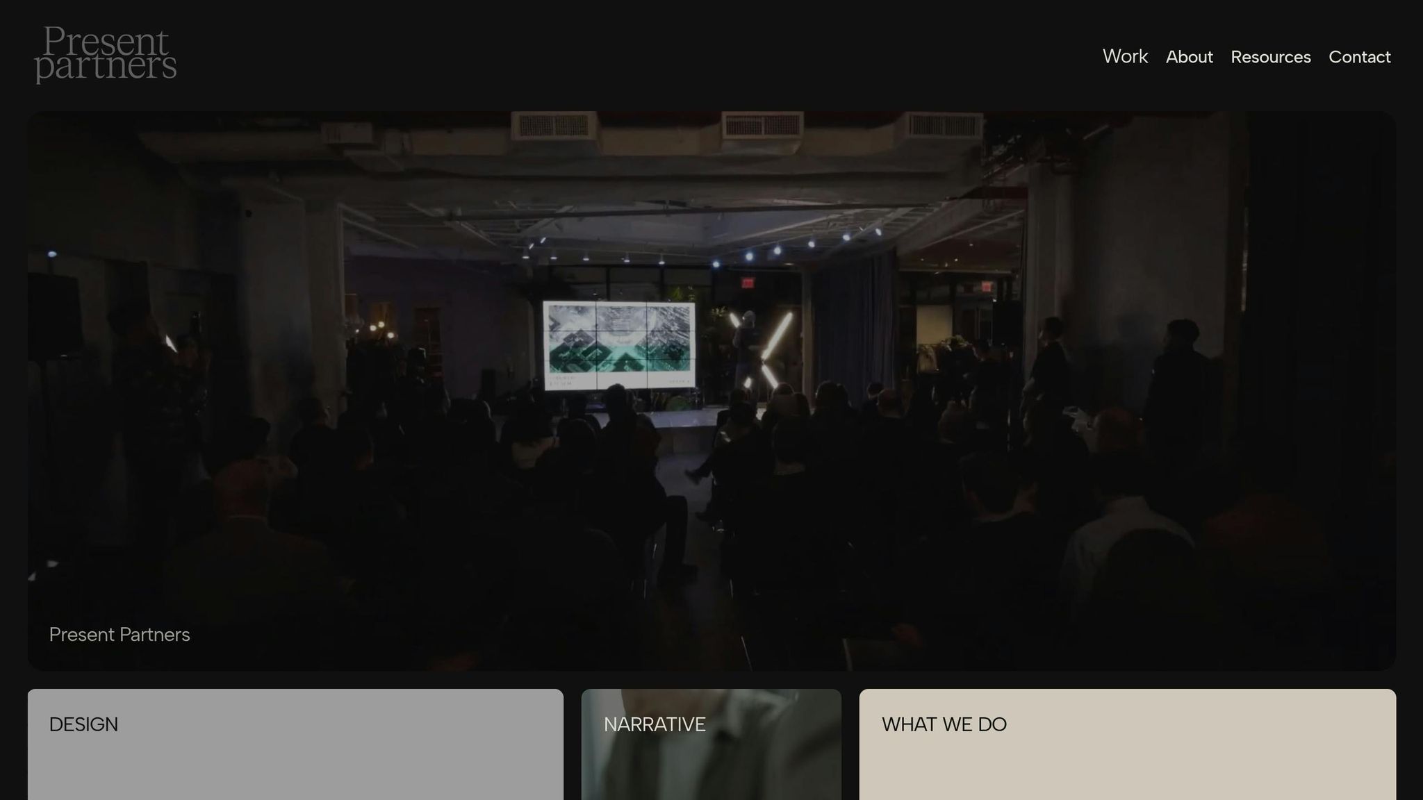
Present Partners applies these storytelling principles to create presentations that secure funding, win clients, and support critical decisions. Based in New York, this agency specializes in high-stakes presentation design, offering services tailored to moments when compelling visual storytelling is most essential.
Their work aligns with the strategies discussed in this guide across three main areas: Design services focus on creating visually polished slides with strong layouts, clear hierarchy, and consistent imagery. Narrative services include story development and copywriting, leveraging proven frameworks like the Hero's Journey to craft presentations that resonate emotionally and logically. Strategy services address planning and content structure, ensuring presentations are tailored to specific goals and audiences.
What sets Present Partners apart is their dedication to building lasting relationships with clients. By working closely with organizations over time, they gain a deep understanding of each client’s unique challenges, industry context, and communication style. This approach results in presentations that feel custom-made rather than one-size-fits-all.
Their expertise shines in high-stakes situations, such as securing major funding or landing high-value contracts. Present Partners combines strategic storytelling with expert design to ensure every slide contributes to a cohesive, persuasive narrative while maintaining a professional, polished look.
For organizations aiming to go beyond basic slide decks, collaborating with specialists who understand both the creative and strategic aspects of visual storytelling can transform a presentation from merely informative to truly impactful.
FAQs
How can I create presentation visuals that address my client's unique goals and challenges?
To design visuals that truly resonate with your client's goals and address their challenges, it's crucial to first grasp their objectives and the core message they want to communicate. Incorporate visual storytelling techniques such as clean layouts, striking imagery, and a well-structured visual hierarchy to seamlessly lead your audience through the main points.
For specialized expertise, consider collaborating with agencies like Present Partners, a New York-based firm known for its high-stakes presentation design. They excel at creating slides that influence decisions, win over clients, and deliver measurable results by blending strategic insights with clear, impactful visuals.
What are the differences between the Hero's Journey, Story Mountain, and Story Loop frameworks, and how can I choose the best one for my presentation?
The Hero's Journey, Story Mountain, and Story Loop are three storytelling frameworks that can help you craft a well-structured presentation. Each serves a different purpose, depending on the story you want to tell:
Hero's Journey: Perfect for stories about transformation or overcoming challenges. This framework works best when your presentation follows a path from struggle to success.
Story Mountain: Ideal for a straightforward narrative with a clear beginning, middle, and end. It's a great choice for presentations that follow a linear progression.
Story Loop: Designed to spark curiosity by starting with an open-ended question or scenario and resolving it at the conclusion. This is especially useful for keeping your audience engaged and building suspense.
When deciding which framework to use, think about your audience and the message you want to convey. For instance, if you're presenting a solution to a problem, the Hero's Journey can add emotional depth. If you're walking through a step-by-step process, Story Mountain provides clarity. On the other hand, if you want to keep your audience intrigued, the Story Loop can be a powerful tool. The key is to match the framework to your presentation's goals and narrative.
How can I create data visualizations that are both engaging and easy to understand?
When designing data visualizations that grab attention and convey your message clearly, prioritize clarity and purposeful design. Break down complex data into simple, easy-to-follow visuals by using clean layouts, harmonious color schemes, and intuitive charts or graphs that emphasize the most important insights.
Your visuals should enhance your story by directing attention to the key points. Steer clear of clutter or excessive details that might dilute your message. Using space wisely, establishing a clear hierarchy, and applying contrast effectively can help guide your audience's focus and make your presentation resonate more strongly.