


Client Presentation FAQ: 15 Common Questions
Client presentations can make or break business relationships. This guide answers 15 common questions about creating effective presentations, covering everything from slide design to delivery tips. Here’s what you’ll learn:
Choosing templates: Why custom templates are better than default ones and how to pick the right one.
Slide design: Use the 6x6 rule, focus on contrast, and avoid clutter for clear communication.
Visuals: Select high-quality, relevant images and simplify charts for better impact.
Content organization: Use frameworks like Problem-Solution-Benefit or Before-After-Bridge to structure your message.
Delivery tips: Practice, engage your audience, and handle feedback with confidence.
Avoiding mistakes: Steer clear of overloading slides, inconsistent design, and poor delivery habits.
Whether you're pitching ideas, sharing results, or proposing strategies, this guide ensures your presentations are clear, professional, and audience-focused.
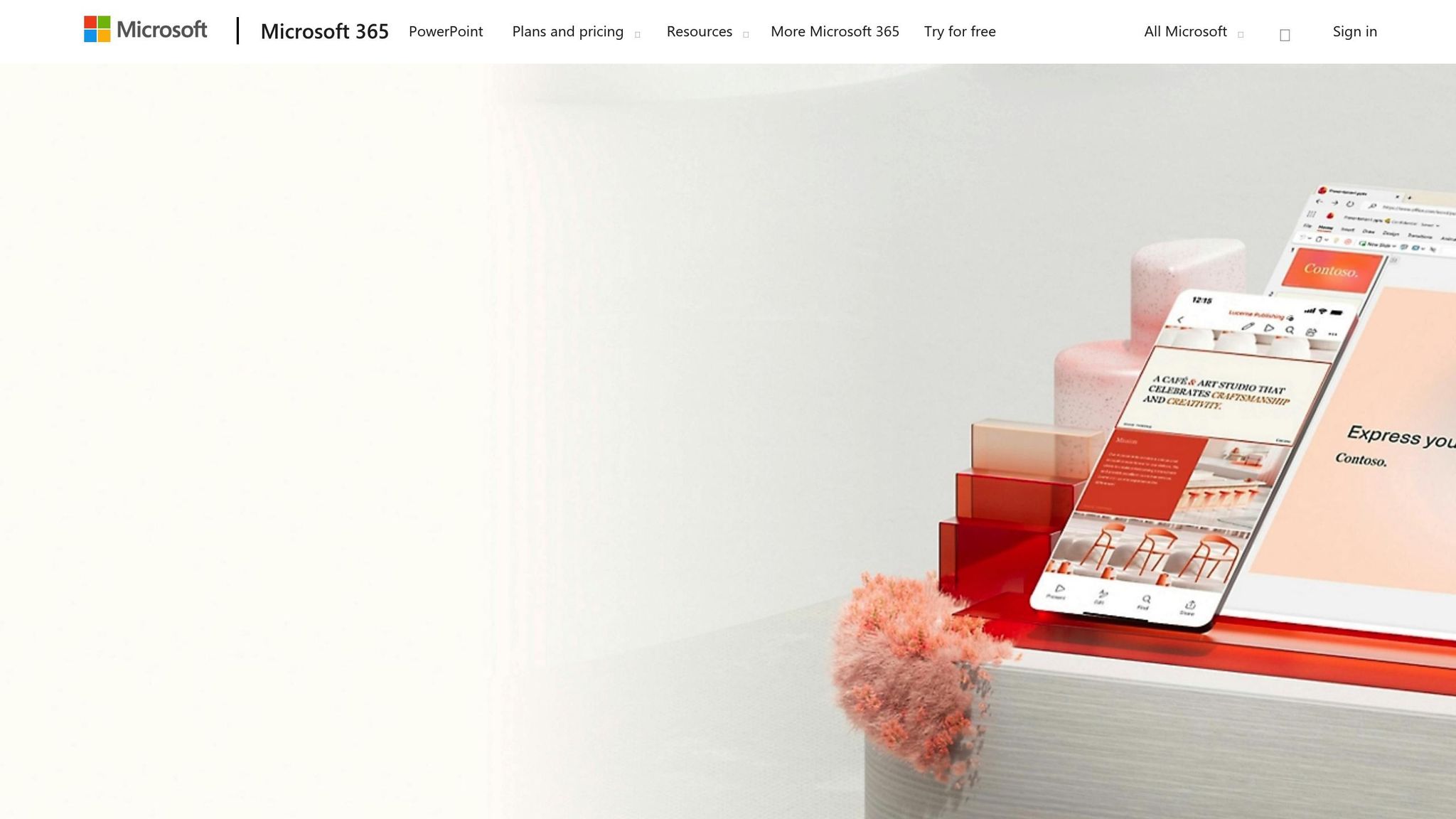
How to Make Professional Presentations to Attract Clients
Selecting the Right PowerPoint Template
Your choice of template can make or break your presentation. Using the wrong one can hurt your credibility, while the right template enhances your professionalism and attention to detail. Many presenters rush to pick the first template they find, but when client relationships are at stake, this decision deserves careful consideration.
Why Custom Templates Outshine Default Ones
Default templates often fail to make an impact. They create an immediate issue: your presentation risks blending into a sea of sameness. When clients see the same overused blue backgrounds or generic layouts they've encountered countless times, your message may lose its edge.
These templates also impose rigid layouts that can stifle creativity and disrupt the natural flow of your ideas. Instead of focusing on your message, you might find yourself wrestling with the template’s limitations, leading to slides that feel awkward or disconnected.
Another drawback is the visual clutter common in default designs. Over-the-top animations, random shapes, or unnecessary design elements can distract your audience. Your insights should take center stage - not a floating triangle in the corner of every slide.
Custom templates, on the other hand, are tailored to fit your client’s brand and your presentation goals. They offer a clean, polished look while maintaining flexibility. This balance ensures your content stands out without feeling constrained.
Tips for Choosing a Professional Template
1. Embrace white space. A good template dedicates at least 30% of each slide to empty space. This keeps your slides clean and helps your audience focus on the key points without feeling overwhelmed.
2. Prioritize typography and color schemes. Choose templates with no more than two font families: one for headers and another for body text. Sans-serif fonts like Calibri, Arial, or Helvetica are easy to read at various sizes. Use brand colors sparingly as accents, and stick to neutral backgrounds - white, light gray, or soft off-white tones work well. Also, ensure there’s enough contrast between text and background for readability, whether viewed on a screen or printed in black and white.
3. Focus on visual hierarchy. A professional template guides the viewer's eye naturally. Headers should stand out clearly from body text, and bullet points should align consistently. Spacing between elements should feel intentional, helping the audience absorb information in a logical order.
4. Test the template. Try it out with a title slide, a bullet-point slide, and an image-heavy slide. If the design works across these formats without needing major tweaks, it’s a solid choice. The best templates are understated - they enhance your content without drawing attention to themselves.
5. Match the template to your audience. Consider your client’s industry and preferences. A bold, dynamic design might resonate with a creative agency but feel out of place for a financial services firm. For more traditional industries, stick to clean, minimal layouts. Aligning your design with your audience’s expectations ensures your presentation feels appropriate and professional.
Once you’ve selected the perfect template, you’re ready to create clear, polished slides that fully utilize its potential.
Creating Clear and Professional Slides
Once you've selected the perfect template, the next step is crafting slides that resonate with your client's needs. A well-designed presentation can make all the difference in delivering your message effectively and leaving a lasting impression.
Basic Principles of Good Slide Design
Keep it simple. Each slide should focus on a single idea. Overloading slides with too much information can overwhelm your audience. Instead, break down complex topics into smaller, manageable parts across multiple slides to maintain clarity.
Follow the 6x6 rule: limit slides to six bullet points, with no more than six words per point. If your content exceeds this, divide it into additional slides to keep the message concise and easy to follow.
Use contrast wisely. Your text should stand out clearly against the background. Dark text on light backgrounds is generally the easiest to read, especially if your audience might print the slides. Avoid low-contrast combinations, such as light gray on white or dark blue on black, as these can strain the eyes.
Alignment matters. Ensure all elements on your slide are intentionally aligned. Left-align body text for readability and center-align titles to draw attention. Consistency in alignment brings a sense of order to your slides.
Repetition creates familiarity. Stick to consistent fonts, colors, and spacing throughout your presentation. This uniformity helps your audience focus on your content rather than being distracted by design changes. A visually predictable format enhances understanding.
How to Use Images and Graphics Properly
Once you’ve nailed the basics of slide design, visuals can take your presentation to the next level by reinforcing your message.
Choose high-quality images. Blurry or pixelated visuals can make your presentation look unpolished. Use images with a resolution of at least 1,920 x 1,080 pixels for full-slide backgrounds and 800 x 600 pixels for smaller graphics. Start with high-resolution files and scale them down as needed.
Relevance is key. Every image should directly support your message. While a beautiful landscape might catch the eye, it’s a distraction if it doesn’t tie into your content. Stick to visuals that clarify or emphasize your key points.
Simplify your charts and graphs. When presenting data, remove unnecessary elements like extra gridlines or background colors that clutter the visual. Use consistent colors across related charts and include clear labels and units. If the chart feels crowded, reduce the data points or split the information into separate slides.
Icons can be more effective than stock photos. For abstract concepts like "growth" or "teamwork", icons are often a better choice. They’re simple, scale easily, and don’t carry distracting emotional cues like stock photos might.
When placing visuals, consider their impact. Full-bleed images (extending to the slide edges) can create a striking effect, while framed images work well alongside text. Always maintain the original aspect ratio to avoid stretching or distorting images - distorted visuals can detract from your professionalism.
Keeping Your Design Consistent Across All Slides
Consistency is what ties your presentation together, ensuring it looks polished and cohesive.
Leverage master slides. Set up fonts, colors, and layout elements in the master slide template before you start designing individual slides. This way, every slide inherits the same style, and any updates to the master slide automatically apply across the presentation.
Stick to a defined color palette. Limit yourself to three or four colors: one for backgrounds, one for primary text, one for headers, and one for accents. Write down the exact color codes (e.g., #333333 for dark gray) to maintain consistency, even if you’re collaborating with others.
Be consistent with fonts. Use the same typeface and font sizes for similar elements across all slides. For example, if your headers are 36-point Calibri Bold, keep them that way throughout. This uniformity creates a rhythm that makes your presentation easier to follow.
Pay attention to spacing. Consistent margins and spacing might seem minor, but they contribute significantly to a professional look. Uniform spacing ensures your slides feel balanced and intentional.
Use animations and transitions sparingly. If you decide to include transitions, pick one style and stick with it. The same goes for animations - keep timing and effects consistent. When in doubt, it’s better to skip animations altogether. A clean, static presentation often has a stronger impact than one filled with distracting movements.
Organizing Content for Clear Communication
Once your slides are polished and visually appealing, the next step is organizing your content to guide your client seamlessly through your message. A well-structured presentation not only complements great design but also ensures your audience understands and retains your key points. Think of it this way: while design captures attention, clear organization keeps the message impactful.
Tested Frameworks for Client Presentations
Using proven frameworks can help you build a logical narrative that feels natural and compelling. These structures make it easier for your audience to follow along and see your recommendations as the obvious solution.
Problem-Solution-Benefit: Start by outlining the client’s challenge, then present your solution, and wrap up by explaining the specific benefits they’ll gain. This creates urgency around the problem and positions your solution as the ideal answer.
Situation-Complication-Resolution: Begin with the current situation, highlight the complication causing issues, and then introduce your resolution. This approach doesn’t just explain what you’re proposing - it shows why it’s necessary now.
Options-Criteria-Recommendation: For presentations with multiple choices, this framework works wonders. Lay out the options, explain the criteria you used to evaluate them, and then make your recommendation. It demonstrates your reasoning and adds credibility to your choice.
Before-After-Bridge: Perfect for proposing changes, this method starts with where the client is now (before), paints a picture of their ideal future (after), and positions your solution as the bridge to get them there.
No matter the framework, always end with a clear call to action. Once your structure is set, focus on including just the right amount of text to support each key point.
How Much Text to Put on Each Slide
Striking the right balance with text is crucial. Too much text can overwhelm your audience, forcing them to choose between reading and listening. Too little text can leave them lost when reviewing the slides later.
Start with the 7x7 rule: Aim for no more than seven lines of text, with seven words per line. This keeps slides readable and ensures key points are clear.
Use a headline-and-support format: Start with a concise headline that summarizes your main point. Underneath, include three to five bullet points that provide supporting details. Each bullet should stand alone - avoid fragments that only make sense when paired with your spoken explanation.
Write for two audiences: Your slides should work for both the people in the room and those reviewing them later. Provide enough context to make your message clear without turning your slides into dense documents.
Leave room to breathe: White space isn’t wasted - it’s essential. It helps your content stand out and makes it easier for your audience to process. If a slide feels crowded, break it into multiple slides instead of cramming everything together.
For complex topics, consider splitting the content into a series of slides. This step-by-step approach allows your audience to absorb information gradually, rather than being overwhelmed all at once.
Customizing Content for Your Specific Client
Generic presentations rarely leave a lasting impression. To truly connect with your client, tailor your content to their unique situation. The best presentations feel like they were made just for them - because they were.
Do your homework: Research recent client updates, reports, or challenges. By addressing their current concerns, you can frame your content in a way that feels relevant and timely.
Speak their language: Use their terminology and refer to their products, services, or processes by name. If they call customers "members" or "users", reflect that language in your presentation. This attention to detail shows you’ve taken the time to understand their business.
Personalize your examples: Highlight case studies or successes from similar industries or situations. If you don’t have direct examples, focus on principles and outcomes that align with their goals.
Align with their decision-making style: Some clients prioritize financial details, while others care more about timelines or risk. Understand what matters most to them and tailor your content to address those priorities.
Prepare for their concerns: Anticipate objections or questions based on your research and past conversations. Include slides that address these points to show you’ve thought ahead and are ready with solutions.
When your presentation feels tailored to their specific needs and challenges, clients are far more likely to engage with your ideas and take the next steps. Thoughtful customization shows not just preparation, but genuine investment in their success.
Presenting with Confidence and Keeping Clients Engaged
Delivering a presentation with confidence can transform good content into something truly impactful. Did you know that 75% of adults experience stage fright? The good news is that with deliberate preparation, you can channel those nerves into positive energy that enhances your delivery.
How to Practice for a Client Presentation
Practicing effectively means more than just running through your slides; it's about preparing in a way that builds confidence and ensures a polished performance.
Start strong by memorizing your opening lines. Pair this with a controlled tone, confident posture, and purposeful gestures. A solid opening eases initial nerves and sets the tone for the rest of your presentation.
Rehearse aloud. Whether in front of a mirror, a trusted colleague, or even via a recording, practicing out loud helps you refine your body language, eye contact, and voice projection. For virtual presentations, recording yourself can be especially helpful.
Know your material inside and out. A deep understanding of your subject allows you to speak naturally, handle unexpected questions, and reduce reliance on notes. Simplify complex ideas and practice explaining them clearly.
Anticipate questions. Based on your research or past interactions, prepare concise answers to likely questions.
Time your presentation. Rehearse it multiple times to ensure it fits comfortably within your allotted time, leaving space for audience questions or discussions.
Consistent and deliberate practice not only builds confidence but ensures you're ready to keep your audience engaged.
Keeping Your Audience Interested Throughout
Even the best-prepared presentation can fall flat if your audience loses interest. Keeping their attention requires intentional strategies that foster connection and interaction.
Use storytelling to bring your points to life. Instead of overwhelming your audience with data, weave in relatable stories that illustrate your key ideas.
Engage with eye contact. In larger rooms, shift your gaze across different sections of the audience to create a sense of connection.
Encourage interaction. Ask questions or pause briefly during transitions to invite discussion and keep your audience involved.
Vary your voice. Adjust your pace, volume, and tone to emphasize key points and maintain interest. Strategic pauses can also add impact.
Move with purpose. Step closer to the audience for emphasis or shift positions to keep the energy dynamic.
These techniques help create a presentation that feels engaging and interactive, rather than one-sided.
Managing Last-Minute Changes and Client Feedback
No matter how well you prepare, unexpected challenges can arise. Whether it's technical hiccups, last-minute feedback, or shifting priorities, staying flexible is crucial.
Allow time for last-minute adjustments. Finish your preparation early so you can handle any last-minute revisions without stress.
Have a backup plan for tech issues. Save your presentation in multiple formats (like PowerPoint and PDF), and test all equipment in advance.
Stay calm when receiving feedback. If a client offers input during your presentation, acknowledge it positively and address it without losing your stride.
Be ready for shifts in focus. Clients may want to explore specific topics in more detail. Keep extra slides or data handy and decide whether to address the change immediately or later.
Manage nerves with the 3-4-5 breathing technique. Inhale for 3 seconds, hold for 4, and exhale for 5. This simple exercise can help you stay composed.
Common Presentation Mistakes to Avoid
Even the most well-prepared presentations can fall flat if certain missteps creep in. While clear design and structured content are essential, avoiding common errors in both design and delivery is just as important. These mistakes, whether in visual choices or how you present, can distract from your main message and weaken client engagement. By recognizing these pitfalls, you can craft presentations that leave a lasting impression.
Design Mistakes That Can Undermine Your Message
The way your presentation looks plays a huge role in how your audience perceives it. Some design errors can make your content harder to follow or even damage your credibility. Here are a few to watch out for:
Overusing animations: A simple fade-in can add polish, but spinning text or bouncing graphics? Those are just distractions. They pull attention away from what really matters - your message.
Inconsistent design: Mixing fonts, colors, or formatting styles across slides can make your presentation look sloppy. This often happens when multiple team members contribute without sticking to a unified template or style guide.
Cluttered slides: Packing too much onto one slide - whether it’s multiple charts, long paragraphs, or endless bullet points - forces your audience to choose between reading or listening. Usually, they end up doing neither.
Poor color choices: Bright red text on a blue background might seem bold, but it’s also hard to read. Similarly, colors that don’t project well or display inconsistently across devices can leave some viewers struggling to follow along.
Low-quality images: Blurry or pixelated visuals don’t just look unprofessional - they can also make your audience question your expertise.
Ensuring Your Slides Are Readable and Accessible
Accessibility isn’t just about meeting guidelines - it’s about making sure everyone can engage with your content. Here’s how to keep your slides clear and inclusive:
Font size matters: Anything smaller than 24 points can be hard to read, especially for those sitting farther back in a room. For key points, aim for larger, easy-to-read text.
Contrast is key: Light gray text on a white background might look sleek on your laptop, but it can completely vanish when projected. Stick to strong contrasts, like dark text on a light background, to ensure readability.
Choose the right fonts: Sans-serif fonts like Arial, Calibri, or Helvetica are easier to read at different sizes and distances. They’re a safe bet for professional presentations.
Establish visual hierarchy: Not all content is equally important, so don’t treat it that way. Use size, color, or bold text to differentiate main points from supporting details. This helps guide your audience through the flow of your presentation.
Include alternative text: Adding alt text to images and charts ensures visually impaired viewers using screen readers can still grasp your content. Explaining visuals aloud also helps everyone understand complex diagrams or data.
A polished design is only half the battle - how you deliver your presentation matters just as much.
Common Delivery Mistakes to Address
Even a beautifully designed presentation can fall flat if the delivery doesn’t connect with the audience. Here’s what to avoid:
Reading straight from the slides: If you’re just reciting what’s on screen, your audience might wonder why you’re there at all. It gives the impression that you don’t fully grasp your material.
Talking too fast: Nervousness or trying to cram in too much information often leads to rapid speech. This can confuse your audience, especially when presenting detailed data or technical concepts.
Neglecting eye contact and body language: Looking at your slides instead of your audience (or at your screen instead of the camera during virtual presentations) creates a disconnect. Open body language and direct eye contact help build trust and keep your audience engaged.
Skipping pauses: Rushing through without stopping for questions or reactions can overwhelm your audience. Pausing not only gives them time to absorb information but also invites valuable feedback that could strengthen your proposal.
Not testing equipment: Few things derail a presentation faster than technical hiccups. Test everything in advance, and always have backup files ready in case something goes wrong.
Conclusion
Creating impactful client presentations hinges on thoughtful design, customized content, and confident delivery.
This guide has explored how using templates, establishing a clear visual hierarchy, and following structured frameworks can result in presentations that communicate effectively. We've also highlighted how steering clear of common missteps - like overcrowded slides or hurried delivery - can significantly elevate your presentation’s effectiveness.
Presentations are more than just slides; they’re a way to turn complex concepts into relatable stories tailored to your audience. Combining strategic planning with sharp design ensures every element aligns with your central message. These principles are at the heart of a strategic approach to presentation design.
"At Present Partners, we believe presentations aren't decoration - they're strategy."
This belief shapes every step of their process. It means starting with the message and narrative before diving into the visuals. It emphasizes that while simplicity takes effort, it’s the key to delivering clarity.
For those navigating high-pressure presentations, practical assistance can bridge the gap between theory and execution. Present Partners specializes in crafting presentations for critical moments, transforming intricate ideas into clear, persuasive narratives through their Editor First philosophy. Their approach prioritizes refining the message before enhancing the visuals, ensuring every design choice is driven by purpose.
"We design high stakes presentations. The ones that win funding, secure clients, and drive decisions. We turn complex ideas into clear, compelling stories."
Whether you're working on an investor pitch, a key client proposal, or an executive briefing, remember: your slides are more than just visuals - they’re strategic communication tools. The effort you put into perfecting them, from choosing the right template to delivering with confidence, directly influences your ability to achieve your goals.
FAQs
How do I tailor a PowerPoint template to match my client’s brand and presentation objectives?
To make a PowerPoint template truly reflect your client’s brand and objectives, start by pinpointing their core brand elements - colors, fonts, and logos. Incorporate these consistently into the slide master to maintain a unified look throughout the presentation. Custom layouts and placeholders should also align with the brand’s aesthetic while supporting the presentation’s key purpose.
Steer clear of design elements or effects that conflict with the brand’s identity. Take time to regularly review the slides to ensure they remain cohesive and communicate the message clearly. A clean, polished design not only keeps the focus on the content but also reinforces the client’s branding effectively.
How can I keep my audience engaged and interested during a client presentation?
Keeping your audience engaged during a presentation starts with a strong opening. Begin with a hook that grabs attention - this could be a surprising fact, a thought-provoking question, or a short story that ties into your message. Stories, in particular, are powerful tools for making your message feel relatable and memorable.
Your slides should be clear and visually appealing, enhancing your message rather than distracting from it. Focus on delivering key points that truly matter to your audience, ensuring they walk away with something valuable.
To keep the energy up, include interactive elements. Ask questions, run a quick poll, or invite audience participation. These moments of interaction not only break up the flow but also help maintain interest. Additionally, vary your tone and pace throughout the presentation to avoid monotony. And don’t underestimate the power of eye contact - it helps build a genuine connection with your listeners.
By combining these techniques, you can turn an ordinary presentation into a dynamic and engaging experience that leaves a lasting impression.
How can I keep slides clear and easy to read while still including enough detail for later reference?
To make your slides clear and easy to follow, keep the text short and to the point while maintaining a good visual balance. A helpful guideline is the 5/5/5 rule: no more than five words per line, five lines per slide, and avoid filling too many slides with dense text. Instead, use visuals like charts, icons, or images to illustrate your ideas and keep your audience engaged.
If you need to provide more in-depth information, add detailed notes in the speaker notes section or prepare a handout for your audience. This way, your slides stay clean and visually appealing, while still offering additional details for later review.