
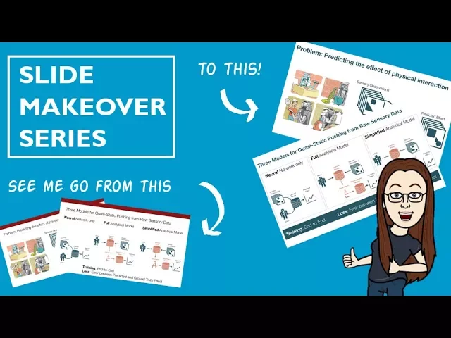

Fixing Cluttered Slides: 5 Simple Solutions
When your slides are overloaded, your message gets lost. To fix this, focus on these five simple tactics:
Cut Down Content: Keep slides concise. Stick to one idea per slide and limit text to avoid overwhelming your audience.
Use White Space: Empty space makes slides easier to read and keeps attention on key points.
Organize Visuals Clearly: Align text, images, and charts with clean layouts to guide the viewer’s focus.
Replace Text with Images: Use visuals to convey ideas faster and more effectively.
Standardize Design: Use templates for consistent, professional-looking slides.
How to declutter and organize your presentation slides
Reduce Slide Content
One of the best ways to fix cluttered slides is to cut down the content. Overloading a slide with too much information can overwhelm your audience. Research suggests that the human brain can comfortably process up to six elements on a slide. Go beyond that, and cognitive load can skyrocket by 500% - making it harder for your audience to absorb the message.
Slides packed with too much text create "walls of text" that split attention. This forces your audience to either read or listen, but not both, which ultimately weakens your overall message and reduces understanding.
The fix? Less is more. Every word, bullet, and visual element on your slide should have a clear purpose and directly support your main point.
Show One Idea Per Slide
The golden rule of slide design is: one slide, one idea. This method ensures your audience can focus on a single concept at a time, improving clarity and making your presentation easier to follow.
Trying to cram multiple ideas onto one slide dilutes their impact. Your audience may struggle to keep up, and important details can get lost. Instead, break complex topics into multiple slides. Each slide should focus on just one concept, giving it the attention it deserves.
Think of your slides as chapters in a story. You wouldn’t cram multiple plot points into a single chapter of a book, so don’t pack multiple ideas into one slide. For instance, if you’re presenting quarterly results, don’t combine revenue growth, customer acquisition, and market expansion on a single slide. Dedicate separate slides to each topic so your audience can fully grasp each achievement before moving on.
Apply Content Limits
To keep your slides clean and focused, follow specific content rules. Two popular guidelines can help you stay disciplined when reducing slide content.
The 5-5-5 rule: No more than five words per line, five lines per slide, and five slides per topic. This forces you to distill your message to its core.
The 7x7 rule: Allows slightly more flexibility, with up to seven words per line and seven lines per slide.
Rule | Words Per Line | Lines Per Slide | Additional Limit |
|---|---|---|---|
5-5-5 Rule | 5 maximum | 5 maximum | 5 slides per topic |
7x7 Rule | 7 maximum | 7 maximum | None specified |
These rules are based on how much information the brain can handle at once. Exceeding these limits risks overwhelming your audience and reducing their ability to retain your message.
For example, a cluttered slide might initially feature long paragraphs and numerous bullet points. Applying the 7x7 rule transforms it into a cleaner, more readable version: a short, clear title and up to seven concise bullet points, each with no more than seven words. This makes the slide easier to scan and understand.
Write Short Titles and Key Points
Slide titles and bullet points are prime real estate - keep them concise and to the point. Short titles and key points make it easier for your audience to grasp the information quickly while reducing distractions.
For example, a title like "Sales Growth" is direct and clear, while "An Overview of Sales Growth Trends in Q1 2025" buries the main idea in unnecessary words. Your audience shouldn’t have to work to figure out what the slide is about.
The same goes for bullet points. Use keywords or short phrases rather than full sentences. Let your spoken words provide the context and details, while the slide acts as a visual guide to the key takeaways.
Focus on information that supports the slide’s main idea and cut anything that doesn’t add value. But be careful not to strip away too much - slides that lack context can become ineffective. The goal is to remove anything that doesn’t serve your message while keeping the content clear and relevant.
Use White Space Well
White space - the empty areas around slide elements - plays a key role in making your slides easier to read and more visually appealing. When used well, it reduces mental strain and helps your audience focus on what matters most. Without it, slides can feel cluttered and overwhelming.
Thoughtful use of white space not only guides the viewer's eye but also gives your presentation a polished, professional look. By minimizing visual competition between elements, it allows your audience to absorb key points quickly, without unnecessary distractions.
Give Content Room
Proper spacing between elements is essential for creating clean, visually appealing slides. Overcrowded layouts can make it hard to distinguish one piece of information from another. Instead, give each element enough breathing room to stand out.
Start by ensuring there’s sufficient margin around your slide content. A margin of at least 0.5 inches around the edges can prevent your text and images from appearing cramped. This simple adjustment creates a more balanced and organized appearance.
For text, increase line spacing to 1.2–1.5 times the font size. For example, if your font size is 24 points, set the line spacing to approximately 29–36 points. This extra space improves readability and makes your slides easier on the eyes.
When working with bullet points, avoid stacking them too closely. Add extra spacing between each point to make them feel distinct and prevent your slide from resembling a wall of text. Adjust paragraph spacing to clearly separate each bullet point for better flow.
Consistency is key when combining images and text. If you place an image 1 inch from the top of one slide, maintain similar spacing on other slides. This uniformity ties your presentation together and gives it a more professional feel.
Direct Focus with Layout
White space can be a powerful tool for directing attention to your most important content. By carefully placing empty space around key elements, you can naturally guide your audience’s eyes to where you want them to look. This technique is particularly effective for highlighting important statistics, quotes, or calls to action.
For instance, if you’re presenting a critical statistic like "85% customer satisfaction", place it in the center of the slide with plenty of empty space around it. This isolation makes the statistic impossible to miss and emphasizes its importance.
White space also helps establish a visual hierarchy, making it clear what information is most important. Place your key points in areas with the most surrounding space, while secondary details can occupy less prominent areas. This creates a logical reading flow that leads your audience through your content effortlessly.
Asymmetrical layouts can be especially effective for directing focus. Position your main content on one side of the slide to naturally draw attention. Additionally, use white space to separate different sections of information. Instead of relying on lines or boxes to divide content, let the extra space do the work. For example, if you’re highlighting three key benefits, space them evenly across the slide with generous white space between each point.
The background color you choose also affects how well white space works. A true white background maximizes its impact, but light gray or other subtle tones can work just as well. Avoid busy patterns or images in the background, as they compete with the white space and undermine its calming effect.
Using white space effectively helps create slides that are clean, focused, and easy to navigate. It’s a simple but powerful way to elevate your presentation design.
Arrange Visual Elements for Clarity
The way you position images, text, and graphics on your slides plays a huge role in how clear and engaging your presentation is. A smart layout not only grabs attention but also makes the key points easy to understand at a glance. By organizing your visuals thoughtfully, you guide the audience’s focus and ensure your message comes across effectively. These strategies build on earlier tips about simplifying content and making good use of white space.
Use Contrast, Alignment, and Proximity
Three key design principles - contrast, alignment, and proximity - can help you create a clear visual hierarchy and eliminate confusion.
Contrast: Use contrasting elements like dark text on light backgrounds or bright highlights to make important information stand out. For example, a bold accent color can draw attention to a critical statistic.
Alignment: Keep your content organized with invisible guidelines. Instead of centering everything, try left-aligning text and visuals for a cleaner, more professional look. For instance, if your slide title starts 2 inches from the left edge, align related bullet points and images to that same position.
Proximity: Group related elements together and separate unrelated ones. Place chart titles directly above their respective charts and cluster related bullet points to make their connection clear.
Use Grid Systems
Grid systems provide a reliable framework to keep your slides balanced and visually appealing. Imagine dividing your slide into invisible rows and columns - commonly, a 12-column layout works well. This method helps maintain consistency and structure across your presentation.
PowerPoint’s built-in alignment guides make it easy to create and follow a grid. Turn on gridlines in the view options and align text blocks, images, and other elements to these lines for a polished look.
A simple two-column grid often works well for business presentations. For example, you could dedicate 60% of the slide width to main content on the left and 40% to supporting visuals on the right. If your slide has multiple elements, a three-column layout can help you avoid clutter. For instance, you might place bullet points on the left, an image or chart in the center, and additional details on the right.
Consistency is key. If your company logo appears in the bottom-right corner on one slide, make sure it stays there throughout the presentation for a cohesive and professional appearance.
Replace Text with Images
Images are a powerful way to grab attention and convey ideas quickly. Presentation expert Beth Nyland puts it perfectly: "Think of each slide as an Instagram post... the image is what grabs your attention. And most of the time, it's all you see, because it's all you need to see."
Choose visuals that directly reinforce your message rather than serving as generic decoration. Start by identifying the main point of your slide, then think of specific images that illustrate it. For example, instead of listing bullet points about teamwork, show a photo of your team collaborating in action.
Make sure your images are large, clear, and impactful. Ideally, they should take up at least half of your slide space. Small or blurry images can detract from your message and make it harder for your audience to stay engaged.
Pair a strong image with a striking statistic to drive your point home. High-quality visuals are essential - poor-quality images can reduce your credibility and distract from your message.
"Replacing text-heavy slides with meaningful images can mean much more than a reduction in word count. For your organization, it could represent a radical shift in culture." - Beth Nyland
Simplify and Standardize Slide Design
Creating slides from scratch can eat up valuable time and often leads to inconsistent results. A better approach? Stick to consistent design standards. This builds on the visual organization principles we’ve already covered, ensuring your slides not only look polished but also maintain a unified, professional appearance.
Standardizing slide design is like creating a visual "roadmap" for your audience - much like how road signs guide drivers. The consistency makes it easier for them to follow along without distraction. A key tool in achieving this is using templates, which form the backbone of a standardized design process.
Use PowerPoint Templates
Templates are game-changers for creating professional slides. They provide a structured framework that saves time and ensures a polished design, allowing you to focus on crafting your message instead of agonizing over design details.
These templates are crafted by experienced designers who apply principles like consistency, readability, and visual hierarchy. This means you get professional-quality results without needing to be a design expert yourself.
The business benefits are clear: companies that consistently present their brand see an average revenue increase of 23%. And with 30 million presentations created daily, the potential for improvement is massive.
Templates come packed with pre-designed layouts, graphics, and fonts, making it easy to create slides that communicate your message effectively. They incorporate essential design elements like balanced color schemes, text hierarchy, and white space. This not only simplifies the process but also makes it less intimidating, especially for those new to presentation design.
Customization is another significant perk. You can adjust colors, fonts, and graphics to align with your brand or presentation tone. Add your company’s logo, tweak the color palette to match your branding, or modify fonts - all while maintaining the professional structure of the template.
Templates also act as a safeguard against common design pitfalls. They help you stay focused on your goals and avoid clutter or confusing layouts, boosting the overall professionalism and credibility of your presentation.
Make Slides Accessible
While templates ensure consistency, accessibility guarantees your slides communicate effectively to all viewers. Accessible design makes your presentation clearer and easier to understand, directly supporting your goal of reducing clutter and confusion. A consistent layout naturally complements accessibility by organizing content in a logical, reader-friendly way.
Start with readable fonts. Stick to simple, clean typefaces like Arial, Calibri, or Helvetica. Avoid overly decorative fonts that might look appealing but are difficult to read, especially from a distance. Font size is equally important - use at least 24-point text for body content and larger sizes for headings.
Color contrast is another critical factor. Opt for dark text on light backgrounds, ensuring enough contrast for readability. Avoid problematic combinations like red text on green backgrounds or light gray on white, which can strain the eyes or confuse viewers.
Organize your content with clear headings and logical flow. Use PowerPoint’s built-in heading styles instead of manually enlarging and bolding text. This not only improves readability but also allows screen readers to navigate your slides more effectively.
Keep animations and transitions simple. While these can add flair, overly complex effects can distract or even alienate some viewers. Subtle, purposeful animations should enhance your message, not compete with it.
For remote presentations or self-running slideshows, consider your slide timing. Allow enough time for viewers to read and absorb each slide. What seems obvious to you as the creator may require extra time for your audience to fully process.
Finally, include alt text for images if your presentation will be shared digitally. Alt text provides descriptions of images for screen readers, ensuring visually impaired users can engage with your content. Plus, it encourages you to evaluate whether each image genuinely adds value to your message.
Focus on Key Points and Remove Distractions
Your audience isn't giving you their undivided attention - distractions are everywhere. That’s why your slides need to communicate the main message instantly, even to someone who only glances at them for a few seconds. The goal? Make your message so clear that it sticks, even with minimal focus.
This approach ties back to earlier principles about reducing content and using white space effectively. While templates help with structure, focusing on key points ensures your slides deliver clear, impactful communication rather than overwhelming visuals.
Design for Quick Understanding
To ensure your slides are easy to grasp, think of them like highway billboards. Your audience has only a few seconds to absorb the message, so each slide must be instantly scannable. Keep in mind that reading and listening use the same cognitive channels, meaning your audience can’t effectively read dense slides and listen to you at the same time.
Replace long sentences with short, punchy phrases. For example, instead of saying, "Our quarterly sales results exceeded expectations by achieving a 15% increase over the previous quarter", simplify it to "Q3 Sales: +15% Growth." This condensed version delivers the same information while letting your audience stay focused on your explanation.
Where possible, swap text for visuals like images, charts, or diagrams. For instance, a simple bar chart can convey that 15% growth far quicker than a paragraph of text.
A practical rule to follow is the "6x6 rule": limit slides to six lines of text with a maximum of six words per line. This forces you to distill your message to its core. If your content doesn’t fit, consider breaking it into multiple slides.
Also, think about how your slides will be used. If you’re presenting remotely or sharing your deck later, design slides that can stand on their own. Someone reviewing your presentation at 2 a.m. should still understand each slide’s purpose without needing your narration.
Once your slides are optimized for quick understanding, the next step is to reduce unnecessary elements.
Limit Slide Elements
Exceeding six elements on a slide can increase cognitive load by 500%. This is because every element - whether it’s a text box, image, chart, or icon - requires mental energy to process. Too many elements make it harder for your audience to focus.
Count every element on your slide. If you’re over six, simplify. For example, instead of separate text boxes for "Challenge", "Solution", and "Result", combine them into one well-organized block. Use white space wisely to separate ideas without adding clutter.
Here’s a quick comparison of different design approaches:
Design Approach | Cognitive Load | Audience Retention | Ease of Understanding |
|---|---|---|---|
One idea per slide | Low | High | High |
Multiple ideas per slide | High | Low | Low |
Minimal text, visuals | Low | High | High |
Text-heavy slides | High | Low | Low |
Remove anything that doesn’t directly support your main point. That decorative border? Ditch it. A loosely related stock photo? Delete it. Even your company logo should stay small and consistent - just enough to maintain branding without competing with your content.
Concise text fragments improve retention without overwhelming the audience. Your slides should complement your spoken words, not repeat them. For complex topics, use the slide to highlight key steps or include a simple diagram rather than summarizing everything in text.
Common distractions include excessive text, multiple images fighting for attention, unnecessary animations, busy backgrounds, and inconsistent fonts or colors. Stick to a simple color palette, use one font family throughout, and avoid animations unless they serve a clear purpose, like revealing information step-by-step.
Test your slides by showing them for just three seconds - if the main idea isn’t immediately clear, simplify further. Sometimes, the best slides feel almost empty compared to typical business presentations. By cutting distractions and focusing on key points, you’ll help your audience focus on what truly matters: your message and your delivery.
Conclusion
With these five straightforward strategies, you can turn overcrowded slides into clear and impactful visuals. A cluttered slide doesn't have to dilute your message.
FAQs
How can I balance text and visuals on my slides to keep my audience engaged?
When creating presentations, strive for a balance where visuals complement concise text. Keep the text minimal - stick to key points or short phrases - and pair it with high-quality visuals that clearly convey your message. Think of visuals as the main attraction, with text playing a supporting role.
Overloading slides with too much information can overwhelm your audience. Instead, use visuals like charts, icons, or photos to emphasize your points. This keeps your slides clean and ensures your audience stays focused and engaged throughout your presentation.
How can I use white space effectively to improve my slide design?
Using white space in slide design can transform your presentation into something clean, polished, and easy to follow. The trick is to cut down on clutter - keep text and visuals to a minimum so that the key points shine through.
Pay attention to spacing - whether it’s between lines of text, images, or other elements. Proper spacing naturally directs your audience’s focus to what matters most.
Don’t forget to use margins and consistent spacing to avoid a cramped, overwhelming look. And while it’s called "white space", it doesn’t have to be white - it’s simply about leaving enough breathing room around your content to make your message clear. With slide design, simplicity often makes the strongest impact.
How can I make sure my presentation slides look polished and consistent?
To craft slides that look professional and maintain consistency, begin with a slide master template. This ensures that fonts, colors, and layouts remain uniform across your entire presentation. A consistent approach - using the same font family, color scheme, and image styles - helps create a polished and cohesive look.
For clean and precise alignment, rely on grids and guidelines to neatly position text and visuals. Templates not only save time but also help you achieve a design that feels both professional and visually engaging. Keeping your slides straightforward and well-organized will make your message easier to understand and leave a stronger impression.