
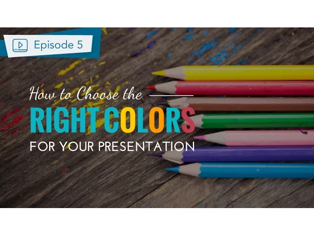

How to Choose Colors for Business Presentations
Colors can make or break your business presentation. They influence emotions, guide focus, and shape how your audience perceives your message. Choosing the right color palette can boost trust, highlight key points, and even drive decisions. But poor choices can distract and dilute your message.
Key Takeaways:
Blue builds trust and professionalism. Great for financial or corporate presentations.
Red creates urgency and grabs attention but should be used sparingly.
Green symbolizes growth and stability, ideal for sustainability or financial success.
Gray offers neutrality and sophistication, perfect for legal or technical content.
Orange adds energy and creativity, suitable for sales or innovation topics.
Purple conveys luxury or exclusivity, effective for premium products.
Black signifies authority and elegance, great for high-end or executive settings.
Quick Tips:
Match colors to your presentation goals (e.g., trust, action, or calmness).
Use brand colors sparingly to maintain identity and avoid visual clutter.
Ensure accessibility with high-contrast text and color-blind-friendly palettes.
Apply the 60-30-10 rule: 60% dominant color, 30% secondary, 10% accent.
By aligning color choices with your goals, audience, and brand, you can create presentations that are clear, engaging, and impactful.
How To Make a Presentation Part 2 - Choose the Best Color For Your Slides
Understanding Color Psychology for Business Presentations
When it comes to business presentations, the colors you choose can shape how your audience perceives your message. This is where color psychology comes into play. Each color triggers specific emotional reactions, and knowing how to use these responses can help you craft presentations that align with your goals.
Our brains process colors almost instantly, influencing how your audience views your message, your credibility, and even your call to action. By selecting colors based on psychological principles, you tap into natural human reactions, creating a stronger connection with your audience. This approach ensures your presentation strategy is both thoughtful and impactful.
In professional settings, certain colors carry learned associations tied to business concepts. These connections often stem from years of corporate branding and marketing, where specific colors have been linked to particular ideas or emotions.
What Common Colors Mean to Audiences
Blue is often considered the most trusted color in business. It represents reliability, professionalism, and stability. Companies like JPMorgan Chase and IBM have built their identities around blue because it signals trust and dependability. This makes blue an excellent choice for financial reports, strategic plans, or any presentation where credibility is key.
Red grabs attention and creates urgency. It’s the color of action, passion, and energy. Red can be especially effective in sales pitches, emergency updates, or moments where quick decisions are needed. That said, red can also evoke stress or danger, so it’s best used sparingly to highlight critical points rather than dominate an entire presentation.
Green is tied to growth, prosperity, and forward movement. It’s also associated with money and environmental responsibility. Green works well in presentations focused on company growth, sustainability efforts, or financial success. Its calming and optimistic undertones make it ideal for delivering positive news or outlining future opportunities.
Gray exudes professionalism, neutrality, and sophistication. It’s a great background color that doesn’t compete with your content, allowing other colors to shine. Gray is especially effective in legal, consulting, or corporate strategy presentations where a polished and professional tone is essential.
Orange brings energy and creativity to the table. It’s warmer and more approachable than red while still conveying a sense of dynamism. Orange is a strong choice for innovation-focused presentations or creative projects, offering a balance of enthusiasm without aggression. Many tech companies use orange to signal forward-thinking ideas.
Purple evokes luxury, creativity, and exclusivity. While less common in business settings, it can make a lasting impression when used thoughtfully. Purple works well for presentations about premium products, creative services, or unique solutions that command a higher price point.
Black communicates elegance, authority, and sophistication. It creates bold contrasts and enhances the impact of other colors. Black is perfect for high-end product launches, executive-level communications, or any scenario where you want to project power and refinement.
Using Color to Create Emotions and Influence Decisions
The right color choices can guide your audience's emotions and steer their decision-making in ways that support your presentation goals.
Building confidence and trust: Use stable, reliable colors like blue paired with white or light gray. This combination is ideal for presenting financial data, strategic plans, or any content where you need to establish authority and expertise.
Creating excitement about opportunities: Warm colors like orange or green can evoke energy and optimism. These hues are perfect for showcasing growth projections, new product launches, or expansion plans.
Establishing urgency for action: Red and orange naturally create a sense of immediacy. Use them sparingly to highlight deadlines, key action items, or critical decisions. Too much red, however, can lead to stress, so balance is key.
Conveying premium value: Rich, deep colors like navy blue, charcoal gray, or even gold suggest quality and exclusivity. These tones are effective for high-value services, premium products, or executive strategies.
Encouraging calm deliberation: Cooler colors like soft blues, greens, or neutral grays help reduce anxiety and foster thoughtful consideration. These are great for technical presentations, detailed analyses, or situations where your audience needs time to process complex information.
Consistency and intentionality are crucial when applying color psychology. Your color choices should align with your message and your audience’s expectations. For instance, a presentation on cost-cutting might benefit from conservative tones, while a pitch for innovation could embrace more vibrant, energetic colors.
Lastly, remember the importance of cultural context. In American business settings, the color meanings outlined above are widely understood. However, always consider your specific audience and industry norms when finalizing your color palette. Up next, discover how to seamlessly integrate these color strategies with your brand identity.
Aligning Colors with Your Brand and Message
Your brand colors are more than just a design choice - they’re a visual link to your company’s identity. When thoughtfully applied, these colors not only boost brand recognition but also align with the goals of your presentation. The challenge is finding the right balance between staying true to your brand and tailoring your visuals to fit your audience and message.
Consistency in branding builds trust, loyalty, and recognition. It makes your business stand out and simplifies your marketing efforts. Color plays a big role in shaping perception, so aligning your brand’s colors with your presentation can strengthen your message and leave a lasting impression.
How Brand Colors Work in Presentations
Think of your brand’s style guidelines as a starting point for your presentation’s color palette, not a strict rulebook. Many successful companies use their primary brand colors sparingly - often as accents - while relying on neutral tones for backgrounds and supporting elements.
Colors also evoke emotions. For instance, red can create urgency and inspire action, while blue tends to convey trust and dependability. Use your primary colors strategically for headings, key data points, or calls to action. Secondary colors, on the other hand, work well as subtle accents, such as dividers or icons, adding visual interest without overpowering the main content.
Avoid overloading your slides with too many colors from your brand palette. Stick to two or three key shades to maintain a clean and professional look while leveraging the psychological impact of color.
Choosing Colors That Match Your Presentation Goals
Your presentation’s purpose should guide your color choices. For example, a financial review might call for a more subdued, professional palette, while a product launch could benefit from bold, vibrant colors to energize the audience - even if both presentations are for the same brand.
For data-heavy slides, neutral tones help keep the focus on the information, while brighter colors can emphasize key takeaways in a sales pitch. If your brand palette includes both bright and dark tones, use the darker shades for detailed charts and the brighter hues for highlighting insights.
Internal meetings, like strategy sessions, may require a more muted approach, even if your brand is known for bold visuals. Subtle colors can encourage thoughtful discussions without overwhelming the audience.
The key is to adapt your color usage to the context of each presentation. Relying too heavily on one visual style across all presentations can lead to audience fatigue and reduce engagement.
Adding Brand Colors to PowerPoint Templates

Embedding your brand colors into PowerPoint templates is a simple way to maintain consistency and save time on future projects. To customize your colors in PowerPoint, go to the Design tab and follow this path: Design > Variants > Colors > Customize Colors. Here, you can input your brand’s hex or RGB codes and save the theme under your company’s name for easy access.
Master slides are essential for applying your brand colors in a cohesive way. For content slides, use your brand colors sparingly - think bullet points, dividers, or accent shapes - while keeping backgrounds neutral to ensure readability.
Pay special attention to charts and graphs, as they’re often central to business presentations. Set default chart colors from your brand palette while ensuring enough contrast between data points. If your brand colors are too similar, add complementary tones to improve clarity without straying from your brand’s identity.
Finally, create separate templates tailored to different presentation types, such as sales decks or financial reports. Always test your templates on various devices and projectors since colors can appear differently depending on the display. Having backup versions with adjusted saturation levels can save you from last-minute surprises.
Making Presentations Accessible Through Contrast and Readability
Accessible design in presentations ensures your message connects with everyone, regardless of their visual abilities. By making your slides accessible, you're not just meeting the needs of those with visual impairments - you’re also improving clarity for your entire audience. When information is easier to process, your message becomes more impactful.
Creating accessible presentations isn’t just about ticking boxes for compliance. It’s about fostering an inclusive environment where no one feels left out. Poor contrast, hard-to-read fonts, and clashing color schemes can alienate parts of your audience and dilute your message. Below are practical tips to enhance contrast and readability in your presentations.
Best Practices for Contrast and Readability
Contrast ratios are the backbone of readable slides. According to WCAG guidelines, normal text should have a contrast ratio of at least 4.5:1, while large text needs a minimum of 3:1.
For strong contrast, use dark text on light backgrounds. While black text on white offers the highest contrast (21:1), it can be harsh on the eyes. A softer alternative is dark gray (#333333) on an off-white background (#F8F8F8), which is easier to read over extended periods.
Font size and style are equally important. Stick to a minimum of 24-point fonts for body text and 36-point fonts for headings. Sans-serif fonts like Arial, Calibri, or Helvetica are easier to read on screens, making them a reliable choice.
Avoid cluttered backgrounds. If you’re placing text over an image, add a semi-transparent overlay or drop shadow to ensure the text remains legible, no matter the image’s color variations.
Color choices can make or break readability. Combinations like red on green, blue on purple, or yellow on white are hard to read and should be avoided. A quick way to test your color palette is by converting your slides to grayscale. If the text becomes hard to discern, it’s time to rethink your colors.
Designing for Color Blindness and Visual Impairments
To address color blindness and other visual challenges, consider these additional adjustments. About 8% of men and 0.5% of women experience some form of color blindness, with red-green being the most common. In a room of 20 people, chances are at least one person struggles to distinguish certain colors.
Don’t rely solely on color to communicate critical information. For example, if you’re using red to highlight key points, also use bold text, icons, or shapes to reinforce the message. In charts, pair green and red with clear symbols like upward and downward arrows or plus and minus signs.
Patterns and textures can serve as effective alternatives to color. In bar charts or graphs, use varied fill styles - such as solid, striped, or dotted patterns - alongside colors. This ensures your data is understandable even for those who can’t differentiate between certain shades.
High contrast mode compatibility is another crucial consideration. Many people with visual impairments rely on system-wide high contrast settings. To ensure your slides work in these modes, use clear formatting elements like borders and dividers instead of relying solely on color.
Test your slides using tools like color blindness simulators or by viewing them in grayscale. These tools can help identify potential issues that might not be obvious to someone with normal color vision.
Screen reader compatibility is also key to accessibility. Use built-in heading styles for text and add alt text to images so screen readers can interpret your content effectively.
Finally, test your presentation in the actual setting where it will be shown. Factors like lighting, projector quality, and screen size can all affect color clarity and readability, so make adjustments as needed to ensure your slides look great for everyone.
Tools and Tips for Selecting Color Schemes
Using the right tools and strategies can elevate your color selection process from a guessing game to a well-thought-out approach. With modern color palette generators and PowerPoint's built-in features, creating visually appealing and cohesive presentations has never been simpler. These tools not only streamline your workflow but also help you craft presentations that leave a lasting impression.
Recommended Tools for Creating Color Palettes
Adobe Color is a powerful option for designing presentation color schemes. This free tool allows you to generate palettes based on principles like complementary, triadic, or analogous colors. You can even upload your company logo to extract its existing colors and build a complete palette around them. Plus, it provides precise HEX and RGB codes, making it easy to integrate your palette into PowerPoint.
Coolors is another excellent choice, especially for those who enjoy experimenting visually. With a simple tap of the spacebar, you can generate new combinations, lock in your favorite shades, and fine-tune them further. Its built-in contrast checker ensures your palette meets accessibility standards, and export options let you grab HEX and RGB codes for seamless PowerPoint use.
Adding Colors to PowerPoint Presentations
Customizing your PowerPoint color theme ensures your slides maintain a consistent look and simplifies future updates. Here’s how to set it up:
Open PowerPoint and go to the Design tab.
In the Variants group, click the dropdown arrow, select Colors, and choose Customize Colors.
In the dialog box that appears, you can define each color in your scheme. Simply click the color boxes, open the color picker, and input the HEX or RGB codes from your palette. This step ensures your presentation aligns perfectly with your branding.
Once you've set your colors, save the theme with a memorable name, like "Q4 Sales Presentation" or "Brand Colors 2025." The theme will then appear under the Custom section for quick access in the future.
To apply your custom theme to existing slides, return to the Design tab, click Variants, and select your saved theme. PowerPoint will automatically update all elements to match your chosen colors. You can also tweak individual elements through the Format tab.
Want to share your custom theme with your team? Save it as a file: go to Design, click Themes, and select Save Current Theme. This creates a file your colleagues can import, ensuring consistent branding across all presentations.
Tips for Balancing Colors and Visual Flow
Achieving the right balance in your color scheme is key to guiding your audience’s focus. The 60-30-10 rule is a tried-and-true method for creating visually balanced presentations. Here’s how it works:
60%: Use a dominant color for the background.
30%: Apply a secondary color for charts, headings, or other supportive elements.
10%: Reserve an accent color for highlights, calls to action, or key points.
This approach establishes a clear visual hierarchy without overwhelming your audience.
Keep your palette simple - stick to 2–3 primary colors and 1–2 accent colors. A streamlined palette not only reinforces your message but also prevents visual clutter, making it easier for your audience to focus on the content.
Placement matters too. Use your brightest or most contrasting accent color to emphasize critical information, while secondary colors can support the details. Let the dominant background color provide a calm, neutral base for everything else.
Don’t forget about whitespace. Surrounding key elements with ample space enhances their impact and keeps your slides from feeling overcrowded. Finally, test your color choices under various lighting conditions and on different screens to ensure a clear and polished look.
"Apply Consistency: Keep the same color scheme and fonts throughout for a unified look." - Danyal Hayat, Marketing & Storytelling Strategist, Founder & CEO of Nebula X
Conclusion: Key Points for Choosing Colors in Business Presentations
Summary of Color Selection Methods
Choosing the right colors for business presentations involves blending psychology, branding, accessibility, and practical tools. For example, color psychology can guide you to use blue to inspire trust, red to signal urgency, or green to represent growth - all while staying in sync with your brand and audience needs.
Brand alignment is all about ensuring your presentation reflects your company’s identity. While your core brand colors should serve as the foundation, incorporating complementary shades can enhance specific messages or goals without losing the essence of your brand.
Accessibility is critical for making your presentations inclusive. High-contrast color pairings between text and backgrounds improve readability for everyone, including those with visual impairments or color blindness. Testing your slides under different lighting and on various devices helps you avoid any last-minute surprises.
Practical design tools make the process smoother. Tools like PowerPoint’s custom themes can help maintain consistency across all slides, while professional design software allows for precise color choices. Following the 60-30-10 rule - a balance of dominant, secondary, and accent colors - ensures your slides are visually engaging without overwhelming your audience.
Incorporating these strategies - psychology, branding, accessibility, and design tools - lays the groundwork for creating polished, effective presentations. For an even sharper edge, professional design expertise can refine these elements further.
The Value of Professional Design Support
While these strategies provide a solid starting point, professional design support can take your presentations to the next level, especially for high-stakes scenarios.
Expert designers bring a deep understanding of color theory, industry standards, and technical nuances. They know how colors will appear across different screens and projection systems, how to optimize for both digital and print formats, and how to create visual hierarchies that direct your audience’s focus exactly where you want it.
At Present Partners, we specialize in crafting business presentations that balance strategic color choices with impactful design. Our team doesn’t just focus on color; we integrate it with typography, layout, and storytelling to ensure your presentation aligns with your specific business goals.
Whether you’re working under tight deadlines, preparing for a critical presentation, or looking to establish consistent visual standards, professional design support can be invaluable. Designers can also help you create templates and color guidelines that your team can use across future projects, ensuring your brand remains cohesive and professional over time.
FAQs
How can I make sure the colors in my presentation are accessible to everyone, including people with color blindness?
To make your presentation accessible to everyone, including those with color blindness, stick to high-contrast color combinations like blue and yellow or black and white. These choices enhance readability and ensure your content is clear and easy to follow.
Consider using tools such as color contrast checkers to confirm your slides align with accessibility standards like WCAG. Also, avoid using color as the only way to communicate important information. Instead, incorporate patterns, labels, or text for added clarity. These steps will help you create presentations that are inclusive and understandable for all viewers.
How can I use brand colors in a presentation without making it too distracting?
To make the most of your brand colors in a presentation, aim for a focused palette of 2-4 colors. Use one or two primary brand colors for prominent elements like headings, titles, or key highlights. Pair these with softer or neutral shades for backgrounds or secondary content to keep the design polished and professional while reinforcing your brand's identity.
Be intentional with color placement to draw attention to critical details - think charts, graphics, or accent lines. Avoid overloading slides with too many colors, which can distract from your message. Consistency is essential, so stick to the same color combinations and shades throughout the presentation. This creates a unified look that’s both visually appealing and easy for your audience to navigate.
How does color psychology impact audience decisions in business presentations?
Color psychology significantly influences how audiences perceive and react during business presentations by eliciting specific emotions and associations. For instance, blue is commonly linked to trust and professionalism, making it a great choice for establishing credibility. On the other hand, red can spark feelings of urgency or excitement, prompting immediate engagement or action.
Selecting colors that align with your message and objectives can shape your audience's emotional response and decision-making. Beyond just improving the visual appeal, strategic color choices can strengthen your message and make your presentation more engaging and memorable.