

How to Use Grids for Slide Consistency
Messy slides can ruin your presentation. Misaligned text, scattered images, and inconsistent layouts distract your audience and bury your message. Grids in PowerPoint solve this problem by providing a structured framework for clean, professional slides. Here's how to use them effectively:
Grids: Evenly spaced lines to align and position elements.
Drawing Guides: Customizable lines for precise placement.
Smart Guides: Real-time alignment hints when moving objects.
These tools ensure your slides look polished, improve focus, and build trust with your audience. By setting up grids in the Slide Master, enabling snap-to-grid, and combining all three tools, you’ll create consistent, professional presentations that keep your message clear and engaging.
Grids, Guidelines, Ruler and Snap to Grid in PowerPoint

Setting Up and Customizing Gridlines in PowerPoint
Now that you see the importance of grids, let’s explore how to set them up and make them work for you. PowerPoint’s gridline system is a handy tool for creating clean, consistent slide layouts. Here’s how to enable and customize gridlines to suit your needs.
How to Enable and Adjust Gridlines
Turning on gridlines in PowerPoint is quick and easy. Go to the View tab on the PowerPoint ribbon, and in the Show group, check the Gridlines box. Instantly, gridlines will appear on your slide, giving you a clear framework to work with.
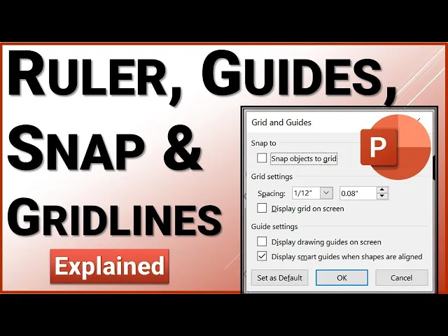
For more control, right-click on an empty area of your slide (avoiding any objects) and select Grid and Guides from the context menu. This opens the Grid and Guides dialog box, where you can tweak the settings. Start by checking the Display grid on screen option to activate the grid.
PowerPoint uses inches by default, allowing for precise adjustments. If your design requires fine detail, set the grid spacing to 0.5 inches. For simpler layouts with larger elements, 1-inch spacing works well. Many designers also prefer a 12-column grid for creating balanced, flexible layouts.
Once your gridlines are ready, the next step is to enable snap-to-grid for effortless alignment.
Using the Snap-to-Grid Feature
The snap-to-grid feature takes alignment to the next level. In the Grid and Guides dialog box, enable the Snap objects to grid option. With this setting active, objects like text boxes, images, and shapes will automatically align to the closest gridline as you move them.
One of the best parts? Snap-to-grid works even if the gridlines aren’t visible. You can hide the gridlines to keep your workspace uncluttered while still enjoying the alignment benefits. To toggle this feature, navigate to View > Guides > Snap to Grid on the ribbon.
As you move objects around, you’ll notice them "snap" into place, saving you from endless manual adjustments. Need more control? Hold the Command key (on Mac) while dragging to temporarily disable snapping, allowing for precise fine-tuning.
Snap-to-grid is especially useful when working with recurring elements like logos, footers, or headers across multiple slides. Consistently aligned elements give your presentation a polished and professional feel, making a strong impression on your audience.
Working with Drawing Guides for Advanced Layouts
Gridlines are a great starting point, but if you're aiming for precision and flexibility in your slide designs, drawing guides are the way to go. These movable guides let you position elements exactly where you want them. Unlike fixed, evenly spaced gridlines, drawing guides allow for custom layouts tailored to your needs.
Drawing guides complement your grid system by giving you finer control over how and where you place objects. They’re especially handy for aligning elements that don’t naturally fit into a standard grid or when creating unique layouts for specialized content.
Adding and Adjusting Drawing Guides
Adding drawing guides is simple and gives you instant control over your slide layout. Just right-click on an empty area of your slide, navigate to "Guides", and choose either "Add Vertical Guide" or "Add Horizontal Guide." A new guide will appear on your slide, ready for you to move it into position.
To reposition a guide, just click and drag it. As you move it, PowerPoint displays the exact distance from the slide center, measured in inches, so you can place it precisely where you need. If a guide is no longer required, just right-click on it and select "Delete." This flexibility allows you to experiment with layouts without cluttering your workspace.
For more advanced adjustments, hold down Shift while dragging to move multiple guides at once. This is particularly useful when setting up intricate grid systems or tweaking layouts that involve multiple guides.
Pairing drawing guides with PowerPoint's snap feature ensures your objects align perfectly. Even if you hide the guides during your presentation, their alignment properties remain active, keeping your design consistent and professional.
To take this precision a step further, set up your guides in the Slide Master. This ensures every slide in your presentation inherits the same alignment structure.
Setting Up Guides in the Slide Master
The Slide Master is the best place to establish drawing guides for a presentation-wide layout. By doing this, every slide based on that master template will automatically follow the same guide structure, ensuring consistency across your entire deck.
To access the Slide Master, go to the View tab and choose Slide Master. Once there, you can add guides that will appear on all slides using that template. A popular approach for business presentations is a 12-column grid system with 0.5-inch margins. This setup is incredibly versatile, allowing you to create layouts like 2-column, 3-column, or 4-column designs - or even an 8+4 column split for primary and secondary content.
When creating master guides, think about defining specific zones for different content types. For example:
Reserve the top area for titles.
Dedicate corners for logos and branding.
Use the bottom for footers, page numbers, or disclaimers.
Experts suggest aligning charts, visuals, and text to these predefined zones. This keeps your slides balanced and ensures every element integrates seamlessly, avoiding awkward gaps or inconsistent sizing.
The benefits of this approach go beyond individual slides. When every slide follows the same alignment and grid structure, your presentation feels cohesive, helping your audience focus on the message rather than being distracted by layout inconsistencies.
For example, Present Partners uses this method when designing custom grids for high-profile presentations like investor pitches or client proposals. By setting up a clear 12-column structure with zones for titles, logos, and content, they ensure every slide supports the overall story. This attention to detail can make a big difference, helping clients secure funding or win new business with polished, professional designs.
Using Smart Guides for Dynamic Alignment
Gridlines and drawing guides are great for creating consistent layouts, but Smart Guides take alignment to a whole new level. These handy tools pop up automatically as you move objects on your slide, giving you real-time visual cues to ensure everything is positioned just right.
Unlike static gridlines, Smart Guides adjust dynamically, showing when objects are centered, evenly spaced, or aligned at their edges. For example, if you're dragging a title box above a chart, Smart Guides will indicate the exact moment the title is perfectly centered over the chart. This instant feedback makes designing slides faster and eliminates the guesswork.
Enabling Smart Guides in PowerPoint
Turning on Smart Guides is quick and simple. Head over to the View tab on the ribbon and locate the Show group. Click the small arrow in the bottom-right corner of this group to open the Grid and Guides dialog box.
In the dialog box, you'll find a checkbox labeled "Display smart guides when shapes are aligned." Check this box to activate the feature. From here on, Smart Guides will appear automatically whenever you move objects, providing alignment hints as thin, colored lines. These guides are temporary - they only show up while you're dragging an object and disappear once you release the mouse button, keeping your workspace clean and distraction-free.
Need to override Smart Guides for some reason? Hold down Ctrl (on Windows) or Command (on Mac) while dragging. This disables Smart Guides temporarily, giving you complete manual control for those rare instances when precision requires a personal touch.
Tips for Combining Smart Guides with Other Tools
Smart Guides work best when paired with gridlines and drawing guides. Each tool has its role:
Gridlines provide the overall structure and spacing.
Drawing guides mark important reference points.
Smart Guides handle the fine-tuned, object-to-object alignment as you move elements around.
Here’s a quick comparison of the three:
Feature | Gridlines | Drawing Guides | Smart Guides |
|---|---|---|---|
Visibility | Always visible (if on) | Always visible (if on) | Only visible during movement |
Setup | Pre-set spacing, static | Manually placed, static | Automatic, dynamic |
Use Case | Structure, spacing | Key reference points | Real-time alignment |
Flexibility | Low | Medium | High |
This layered approach ensures precise and polished slides, even when working on collaborative projects. For team efforts, consider creating a template with predefined gridlines and drawing guides, and make sure Smart Guides are enabled for everyone. This ensures consistency across the board, reducing alignment errors when multiple contributors are involved.
Before finalizing your slides, take a moment to double-check alignment using Smart Guides. Even minor misalignments can detract from a polished, professional look - especially in presentations where every detail matters. With Smart Guides, this final quality check is quick and painless. Just nudge objects slightly and watch for those alignment cues.
Smart Guides shine when objects are close together. For distant elements or more complex layouts, you’ll want to rely on gridlines and drawing guides as backup. Together, these three tools - gridlines, drawing guides, and Smart Guides - create a robust system for ensuring your slides look clean and professional. This foundation will help you deliver presentations that stand out for their attention to detail and visual consistency.
Best Practices for Using Grids in High-Stakes Presentations
Grid systems are the backbone of polished, professional presentations. In high-stakes scenarios, where every detail can sway decisions, grids ensure your slides stay visually consistent and convey credibility. A well-structured layout not only enhances aesthetics but also signals meticulous attention to detail.
Maintaining Consistency Across Slides
Setting up a grid is just the first step - keeping it consistent across all slides is where the real challenge lies, especially when multiple contributors are involved. Start by configuring grid guidelines in the Slide Master. Go to View > Slide Master in PowerPoint, and set up gridlines and drawing guides so every new slide automatically adheres to the same layout.
For existing slides, assign a team member to audit alignment. Create a one-page reference guide with screenshots highlighting key elements like title placement, chart dimensions, and margins. Use PowerPoint's commenting feature to flag any misaligned items for quick fixes.
Using Templates with Predefined Grid Systems
Templates with built-in grids can save time and simplify the process of maintaining a cohesive design. Many effective templates use a 12-column grid, with distinct zones for titles, main content, and citations. For example, a template might allocate space for titles at the top, charts or bullet points in the center, and footnotes at the bottom. This approach ensures that similar content is consistently placed across all slides.
When designing templates, test them on various screen sizes and aspect ratios. A layout that looks great on a laptop might feel cramped or distorted on a large screen or tablet. Incorporating flexible elements - like relative positioning instead of fixed measurements - ensures your content remains balanced and readable, no matter the device.
It can also be helpful to create multiple template variations tailored to specific presentation needs. A financial report might prioritize layouts for charts and performance metrics, while a creative pitch could focus on large visuals and minimal text. For high-stakes presentations, collaborating with design experts can further refine these templates, ensuring they meet your exact requirements.
Partnering with Experts for Polished Presentations
When the stakes are high, bringing in professionals can elevate your presentation to the next level. Agencies like Present Partners, based in New York, specialize in creating high-impact presentations that secure funding, win clients, and drive decisions. They craft custom templates tailored to your needs, ensuring every slide aligns seamlessly with your goals.
Beyond aesthetics, these experts tackle technical challenges, such as ensuring compatibility across PowerPoint versions and adapting designs for different devices or environments. Their expertise allows your audience to focus on your message rather than being distracted by design inconsistencies.
Building a long-term relationship with a presentation design agency can be a game-changer. It provides ongoing access to professional insights and ensures your presentations consistently meet high standards. This partnership frees up your internal team to focus on crafting compelling content and strategy, while the experts handle the design finesse.
Conclusion: Key Takeaways for Creating Consistent Slides with Grids
Grid systems are the secret weapon for turning messy, unstructured slides into polished, professional presentations. The techniques and tools outlined in this guide offer a solid framework for crafting slides that not only look great but also deliver your message clearly and effectively.
Recap of Grid Tools and Techniques
To recap, gridlines, drawing guides, and smart guides work together to ensure your slides are aligned and visually consistent. The best results come from using all three tools in a thoughtful way. Start with gridlines to establish the basic structure, incorporate drawing guides for specific layout needs, and use smart guides to fine-tune alignment as you add content. For measurements, stick to inches to align with U.S. standards and ensure consistency across devices.
Here’s a practical example: A company that implemented a 12-column grid system cut their presentation creation time by 40% while improving clarity for executives. This highlights how a disciplined approach to grids can make a real difference, especially in high-pressure situations.
Final Thoughts on Consistency in Presentation Design
Consistency is the cornerstone of effective slide design. Uniform layouts not only make your presentation look more professional but also improve comprehension and build trust - critical factors when decisions are on the line.
To maintain this consistency, especially in collaborative projects, appoint a "grid guardian" to oversee the proper use of your grid system. Create a quick-reference guide with key alignment rules and test your grid across various screen sizes to ensure it adapts well to different devices.
As presentations are increasingly viewed on laptops, tablets, and large displays, ensuring your grid system works across multiple aspect ratios is more important than ever. Organizations are catching on to the value of responsive grid systems that maintain visual harmony no matter where they’re displayed.
When the stakes are exceptionally high, it might be worth teaming up with presentation design professionals. Agencies like Present Partners specialize in crafting presentations that make an impact. As they put it:
"We design high-stakes presentations. The ones that win funding, secure clients, and drive decisions."
These experts use advanced grid systems and custom templates to ensure every slide is visually cohesive and strategically effective. Their mastery of layout, structure, and design helps clients create presentations that truly stand out.
Grid systems are the invisible backbone of well-designed slides. By mastering these tools and maintaining consistency, you’ll elevate your presentations to a level that commands attention and drives results. Whether you’re presenting to win funding, secure a deal, or influence key decisions, a strong grid system will help you deliver with confidence and impact.
FAQs
How can I choose the right grid system to create consistent slides for my presentation?
Choosing the right grid system boils down to the type of content you’re showcasing and the design goals you have in mind. Think about the layout of your slides - are they primarily text-based, filled with visuals, or a balance of both? For slides dominated by text, a straightforward two- or three-column grid can simplify organization and improve readability. On the other hand, if your slides lean heavily on visuals, a more adaptable grid with several rows and columns might be a better fit.
Consistency is key when it comes to presentations. Once you’ve chosen a grid system, stick with it across all your slides to ensure a unified and polished appearance. If you’re feeling stuck or want professional input, you might want to reach out to a presentation design agency like Present Partners. They excel in crafting visually engaging and strategically designed slides.
What mistakes should I avoid when using grids and guides in PowerPoint?
To make sure your slides look clean and professional, steer clear of these frequent missteps when using grids and guides in PowerPoint:
Overcrowding the grid: Filling your slide with too many gridlines can create a chaotic and distracting layout. Opt for a straightforward structure that complements your content without overwhelming it.
Ignoring alignment: Misaligned text, images, or shapes can give your slides an unpolished appearance. Use grids and guides to ensure everything lines up perfectly.
Inconsistent spacing: Uneven spacing between elements disrupts the visual flow of your slides. Keep margins and spacing consistent across all slides to maintain a unified design.
Taking the time to set up grids and guides thoughtfully can transform your presentation into a polished, professional piece. If you need expert design help, a specialized agency like Present Partners can help bring your slides to the next level.
Can I use grid systems in other presentation tools besides PowerPoint?
Yes, you can absolutely use grid systems in presentation tools like Google Slides or Keynote. Although the setup process might vary a bit, the purpose stays consistent: grids ensure your slides have a clean and organized look with proper alignment and spacing.
To incorporate grids in these tools, check for features such as rulers, guides, or alignment settings. Most modern presentation software offers these options to help you design slides that feel balanced and visually appealing. If you're not sure how to get started, dive into the help section or look up tutorials specific to the tool you're using.