


Visuals for Opening and Closing Slides
Your opening and closing slides are the most critical parts of your presentation. Why? The opening slide sets the tone, grabs attention, and builds credibility in just 30 seconds, while the closing slide leaves a lasting impression and drives action. Together, they frame your message and shape how your audience remembers it.
To create effective slides:
Visual Hierarchy: Use size, placement, and whitespace to guide attention. Headlines should dominate, and key messages belong in high-visibility zones like the center or top-left.
Typography: Choose readable fonts (e.g., sans-serif like Arial) and maintain contrast. Headlines should be bold and engaging, telling a story rather than being generic.
Imagery: Use one high-quality image per slide that aligns with your message. Avoid overused stock photos and ensure visuals are clear and accessible.
Color Strategy: Stick to 2-3 complementary colors. Use contrast for readability and consider color psychology to set the right mood.
Consistency across these elements reinforces professionalism and ensures your message resonates. Thoughtful design can make or break your presentation, so focus on clarity, simplicity, and impact.
1. Visual Hierarchy
Use Size, Placement, and Whitespace to Direct Attention
Visual hierarchy shapes how your audience navigates your slide - what they notice first, second, and third. This becomes even more critical on opening and closing slides, where time is limited, and clarity is key. By arranging elements based on their importance, you can guide your viewer’s focus effectively.
Size is your strongest ally. The largest element on your slide should always be your headline or main message. For an opening slide, if you’re presenting a compelling statistic, make those numbers bold and big enough for everyone in the room to see - even from the back. On a closing slide, if you have a call-to-action, it should dominate the space. Keep secondary details, like your name, date, or logo, smaller to ensure they don’t compete with the main message.
Placement aligns with natural reading habits. People tend to scan slides starting from the top-left and center areas. Use this to your advantage. Place your most important message - whether it’s your presentation title, a thought-provoking statement, or a key takeaway - in these high-visibility zones. For closing slides, the center is the perfect spot for your call-to-action, ensuring it grabs attention right when it matters most.
Whitespace is your clarity tool. Overcrowding your slide with elements can confuse your audience. Instead, use generous whitespace to create breathing room and highlight hierarchy. Group related items together and separate different ideas with clear spacing. For example, if your closing slide lists multiple contact options, whitespace can subtly indicate which action you want your audience to prioritize.
Consistency throughout your presentation is equally important. Stick to a uniform placement for headings, subheadings, and logos. For instance, if your opening slide places the headline at the top center, keep that placement consistent across all slides. This repetition not only reinforces your design but also makes your presentation feel polished and professional.
Lastly, avoid giving all elements equal weight. Every piece on the slide should work to emphasize the primary message. Once you’ve nailed the hierarchy, you can refine other details, like typography, to further enhance the slide’s clarity and impact.
2. Typography
Choose Fonts That Command Attention While Maintaining Readability
Typography on your opening and closing slides does more than just display text - it shapes the mood and strengthens your message with visual impact. Picking the right fonts can make your slides stand out, as long as you strike a balance between making a statement and keeping things clear.
Start with fonts that are easy to read. Sans-serif fonts like Arial, Helvetica, or Calibri are great choices for on-screen presentations because they stay sharp and legible, even when projected in larger venues. For headlines, aim for a font size of at least 44 points, and keep supporting text no smaller than 18–24 points. This ensures everyone in the room can follow along. Also, think beyond basic labels when crafting your headlines - they should tell a story.
Turn your headlines into part of your narrative. Instead of generic titles like "Introduction" or "Summary", use headlines that communicate your main message. For example, swap "Q4 Strategy Overview" with something more engaging, like "Three Market Shifts Driving Our Q4 Priorities." Similarly, replace "Thank You" on your closing slide with an actionable phrase like "Let's Launch This Partnership." This approach ensures your typography adds depth to your story, even at a quick glance.
Create contrast to guide the audience's focus. Stick to two fonts - one for headlines and another for body text. This keeps your design clean and helps establish a clear hierarchy. To highlight key points, adjust font weight, size, or color instead of introducing extra typefaces. For instance, if your closing slide features a call-to-action, make it bold and use a larger font to draw attention.
Make your slides accessible and visually balanced. Use a contrast ratio of at least 4.5:1 between text and background to ensure readability for all viewers, including those with visual impairments. Don’t rely solely on color to emphasize importance; pair it with changes in size or weight. Consistent alignment - such as centering text on opening and closing slides - adds a polished, intentional feel.
Finally, tie everything together by matching the typography on your opening and closing slides. If your opening slide features a bold, 60-point navy-blue headline, use a similar style on the closing slide. This creates a unified look that reinforces your brand and leaves a lasting impression.
3. Imagery and Graphics
Select High-Impact Visuals That Communicate Without Words
Imagery plays a key role in shaping your narrative, complementing visual hierarchy and typography. Because our brains process visuals so quickly, the right image can instantly grab attention and make your message stick - especially on opening and closing slides.
Start with visuals that tell your story instantly. Opening slides are most effective when they feature a striking image that conveys your central idea. For example, an image of an iceberg can symbolize hidden potential or unseen challenges. The key is to pick images that align with your content rather than using visuals just for decoration.
Stick to one strong image per slide. The "one idea per slide" rule applies to visuals, too. Crowding a slide with multiple images can dilute their impact and confuse your audience. Instead, choose a single high-quality image with plenty of white space around it. This minimalist approach ensures your audience can absorb your message in seconds.
Create a cohesive visual narrative from start to finish. Your opening visual should spark interest and introduce your topic, while your closing visual should tie everything together and leave a lasting impression. For example, you could echo the color palette or style of your opening image in your closing slide. This consistency gives your presentation a polished, intentional feel.
Avoid overused stock photos - choose distinctive visuals. Unique and relevant images not only enhance your presentation’s look but also make your message more memorable. Explore reputable image libraries, commission custom photography, or create original graphics that reflect your brand’s identity. Always test your visuals on the equipment you’ll use to ensure they display clearly.
Use infographics and data visualizations wisely. A well-designed infographic on your opening slide can grab attention with a surprising statistic or a compelling visual. On closing slides, infographics are perfect for summarizing key takeaways. Keep them clean and focused so your audience can quickly grasp the information.
Let visuals take the lead - minimize text. Opening slides should feature a clear headline, a few bullet points at most, and minimal supporting text. The same goes for closing slides: keep text sparse so the visual element can shine and communicate your message effectively.
Think about accessibility from the beginning. Use high-contrast colors to make text easy to read, and include descriptive alt text for visuals that convey important details. Consider how your images will appear to those with visual impairments or color blindness, ensuring your presentation is accessible to everyone.
At Present Partners, we integrate these principles into every design, ensuring that each visual - whether it opens or closes your presentation - delivers your message with clarity and impact.
4. Color Strategy
Use a Limited Palette to Create Visual Impact and Brand Consistency
Stick to two or three complementary colors in your palette. Avoid cramming every brand color into your slides - too many colors can dilute your message. Instead, choose hues that align with both your brand and the presentation's theme. For example, a financial presentation might use navy blue and gold to communicate trust and success, while a creative pitch could lean into bold shades like teal and coral. This approach ties into the visual hierarchy and typography principles mentioned earlier.
Make sure your text is easy to read by ensuring strong contrast between text and background colors. High contrast improves accessibility and readability. A simple rule: dark text on a light background or light text on a dark background works best.
Consider color psychology to set the right mood. Cool colors like blue and green convey trust, stability, and professionalism. Warm tones like orange and red exude energy, passion, and urgency. Purple suggests creativity and innovation, while neutral shades like gray and white offer simplicity and sophistication. Choosing the right palette can influence how your audience feels and help reinforce your message from start to finish. Just as fonts and images shape perception, your color choices establish the emotional tone of your presentation.
Use colors strategically to create a visual hierarchy. Highlight key elements with dominant, secondary, and accent colors. For instance, a dark background on the opening slide can be paired with a bright accent color for the headline to grab attention. On closing slides, contrasts can emphasize your final takeaway.
Maintain consistency in your palette while making subtle changes to distinguish between opening and closing slides. A cohesive color scheme ensures continuity, but slight shifts in emphasis or layout can signal transitions. For example, if your opening slide uses a navy blue background with gold accents, you could reverse the colors on the closing slide - gold as the main background with navy accents. This subtle change signals the conclusion while keeping your branding intact.
Enhance legibility by overlaying photography with a semi-transparent color wash. Pulling hues from the image itself can create a harmonious, polished design.
At Present Partners, every color choice is intentional, reinforcing your message while strengthening your brand identity.
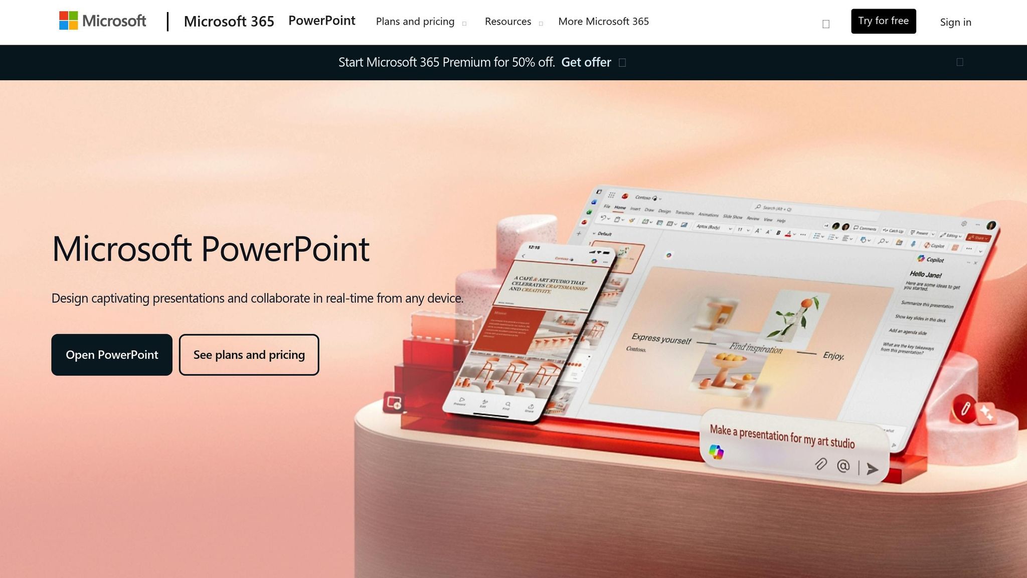
How to Make Stunning Opening Slides in PowerPoint
Conclusion
Your opening and closing slides are far more than just placeholders - they set the tone and leave the lasting impression that defines how your audience remembers your presentation. When crafted thoughtfully, these slides grab attention right from the start, emphasize your main message, and ensure your audience walks away with a clear understanding of your key points. A well-designed opening slide delivers an immediate and impactful message, establishing the context and expectations for everything that follows.
Similarly, your closing slide plays a vital role in wrapping up the narrative. It ties back to your opening, reinforcing the central takeaway and giving your presentation a sense of closure. Using consistent design elements - like matching colors, fonts, and visuals - throughout these slides signals professionalism and creates a seamless flow, making your presentation feel polished and intentional. Together, these slides act as bookends that frame your message and enhance its impact.
The strategies we've discussed earlier come together in the design of these critical slides. These aren't just aesthetic choices - they're deliberate decisions that can make or break your presentation.
For high-stakes scenarios, where every detail counts, the importance of these slides can't be overstated. A lackluster opening might lose your audience's attention, while a weak closing could leave them unclear or uninspired. On the other hand, slides that follow these principles engage your audience, reinforce your message, and inspire action.
If you're gearing up for a high-stakes presentation - whether it's pitching to investors, addressing executives, or vying for a major client - consider the value of expert design and strategic planning. At Present Partners (https://present.partners), we specialize in creating presentations that don't just look great but achieve results. Our approach combines design, templates, storytelling, and strategy to ensure your slides are not only visually compelling but also outcome-driven.
Ultimately, the difference between a forgettable presentation and one that leaves a lasting impression often comes down to how effectively you design those critical first and last moments. Approach them with intention.
FAQs
What are the best ways to create visually engaging opening and closing slides that effectively support my presentation's message?
To craft opening and closing slides that leave a lasting impression, focus on clear visuals and purposeful storytelling. Start strong with bold, eye-catching visuals on your opening slide to instantly grab attention and set the tone for your presentation. For the closing slide, aim for a concise, memorable takeaway or a clear call-to-action that reinforces your main message.
Maintain a consistent design throughout your presentation by using matching colors, fonts, and imagery. Keep text brief and ensure visuals support your story rather than distract from it. A polished opening and closing can make your presentation unforgettable and drive your message home effectively.
What are some common mistakes to avoid when designing visuals for presentation slides?
When creating visuals for presentation slides, there are a few common missteps you’ll want to steer clear of to keep your message clear and engaging:
Overcrowding slides with text or visuals: Packing too much information onto a single slide can overwhelm your audience. Focus on the essential points and use visuals to complement your message rather than complicate it.
Inconsistent design choices: Using mismatched fonts, colors, or styles can make your presentation feel disorganized or unprofessional. Stick with a unified design theme to maintain a polished look.
Ignoring readability: Tiny fonts, poor color contrast, or overly complicated graphics can make your slides difficult to follow. Prioritize clear, legible text and visuals that are easy to interpret.
By keeping your slides simple, visually cohesive, and easy to read, you’ll ensure they enhance your presentation rather than distract from it.
How do color choices and typography affect the impact of my presentation slides?
The right mix of color palette and typography can make your presentation more impactful by reinforcing your message and keeping your audience engaged. Colors aren’t just decorative - they evoke emotions and set the mood for your slides. For example, bold colors can communicate energy and urgency, while softer shades might feel more calming or professional. Typography, meanwhile, plays a key role in readability and maintaining a consistent visual style.
To leave a lasting impression, select colors that reflect your brand or message and ensure there’s enough contrast to make text easy to read. When it comes to typography, stick with clean, easy-to-read fonts and keep font sizes and styles consistent throughout your slides. These design choices work together to create a polished look that supports your story and helps your audience stay focused on what matters most.