


White Space and Visual Hierarchy in Slides
White space and visual hierarchy are two key design principles that can make or break your presentation slides. White space, often misunderstood as wasted space, ensures clarity by giving content room to breathe. Visual hierarchy organizes elements like text size, color, and spacing to guide your audience's focus. Together, they create slides that are clean, easy to follow, and impactful.
Key Takeaways:
White Space:
Macro: Separates major sections for better structure.
Micro: Improves readability between text and visuals.
Clean designs with white space improve retention by 72% (ThinkWithGoogle, 2022).
Visual Hierarchy:
Use size, contrast, and color to emphasize key points.
Group related elements for logical flow.
Typography and spacing help guide attention.
In high-stakes presentations, these principles reduce clutter and ensure your message stands out. Tools like PowerPoint’s alignment guides, grouping functions, and spacing adjustments can help you apply these techniques effectively. Whether pitching to investors or presenting to clients, clear, well-structured slides can make all the difference.
Powerpoint Tutorial: How to Use White Space in Powerpoint

Core Principles of White Space in Slide Design
White space plays a crucial role in transforming cluttered slides into polished, easy-to-follow presentations. By applying the following principles, you can create slides that not only look professional but also communicate your message more effectively.
Macro vs. Micro White Space
White space works on two levels, each with a distinct purpose. Macro white space shapes the slide's overall structure, while micro white space focuses on the finer details that improve readability.
Macro white space refers to the larger gaps, like the space between a slide's title and its main content or the buffer zones that separate topics. These spaces help your audience quickly grasp the flow of information and prevent sections from competing for attention.
Micro white space, on the other hand, deals with smaller gaps - like the spacing between lines of text, around images, or between icons and their labels. These seemingly minor spaces are essential for making your content easy to read. Without enough micro white space, even the most important points can get lost in the visual noise.
A 2022 ThinkWithGoogle study found that clean, simple designs with ample white space improved audience retention by 72% compared to cluttered slides. This highlights how both macro and micro white space work together to create presentations that are easier to absorb.
Aspect | Macro White Space | Micro White Space |
|---|---|---|
Purpose | Structures content and separates topics | Improves readability and clarifies details |
Example | Space between a slide title and its content | Space between lines of text |
Impact | Guides the overall flow of information | Prevents clutter and aids quick scanning |
Every gap - big or small - adds value, ensuring your slides are clear and effective.
White Space is Not Wasted Space
One of the biggest myths in presentation design is that white space equals wasted space. Many presenters feel the need to cram as much content as possible onto each slide, thinking it adds value. In reality, intentional white space reflects careful planning. It helps your audience focus on the key points without feeling overwhelmed.
Think of white space like the pauses in a great speech: those moments of silence emphasize the words that follow. Similarly, slides packed with too much content can blur together, making it harder for your audience to retain the information. By leaving room to breathe, you create focus and amplify the impact of your message.
The best presentations embrace this principle, recognizing that clarity always outweighs density. When every message must resonate, simplicity becomes your strongest tool.
White Space as a Tool for Readability
White space does more than make slides look clean - it directly affects how easily your audience can read and understand your content. Properly spaced slides reduce cognitive load, break information into manageable sections, and prevent the overwhelming clutter that can derail your message.
For example, increasing the space between a title and the body text not only makes the title stand out but also guides your audience's reading flow. In high-stakes presentations, where every detail matters, improved readability ensures that your key points are understood quickly and effectively.
White space also helps group related elements, creating a sense of connection without the need for additional explanations. This approach aligns with the trend toward minimalist slide design, which prioritizes clarity and professionalism. In business settings where decisions hinge on clear communication, white space has become a defining feature of impactful presentations.
Building Visual Hierarchy in Slides
Visual hierarchy turns ordinary slides into effective communication tools by organizing elements in a way that naturally guides your audience's attention. It ensures your key messages stand out.
Using Size, Contrast, and Color for Emphasis
Size is one of the simplest ways to establish hierarchy - larger elements naturally grab attention first. Your audience will instinctively focus on bigger text or graphics before smaller ones.
PowerPoint includes built-in scaling tools that make resizing elements across your slides consistent and easy. This keeps your presentation visually cohesive while emphasizing the most important information.
Contrast is another powerful tool for drawing attention. High-contrast combinations, like white text on a dark background or bold graphics on neutral slides, immediately highlight key points.
Color plays a critical role in emphasizing data and evoking emotion. Bold colors command attention, making them ideal for calls to action or highlighting important statistics. Pairing these bold colors with subtle backgrounds ensures a clean and visually pleasing layout. For instance, you can use a bright accent color to highlight critical metrics, while keeping supporting information in muted tones.
When choosing colors, accessibility is important. Ensure your slides are easy to read for viewers with color blindness by maintaining strong contrast and avoiding the sole use of color to convey meaning.
Once you've established emphasis through size, contrast, and color, the next step is to group related content for clarity.
Grouping and Proximity for Logical Flow
Elements placed close together signal a relationship, helping your audience understand connections without extra explanation. This is especially useful for simplifying complex information.
Spacing also plays a role here. Adequate space between different groups of content indicates where one idea ends and another begins, aligning the visual flow with your message's structure.
PowerPoint's grouping tools make it easy to align related elements. For example, pairing an icon with its label ensures they stay connected, even when you adjust layouts or resize content.
Consistent alignment enhances clarity and avoids visual clutter. PowerPoint’s alignment tools help you line up grouped elements neatly, creating a clean and professional appearance. When elements are predictably aligned, your audience can focus on your message without distractions.
Research from ThinkWithGoogle highlights the importance of clean design. Their study found that slides with proper grouping and plenty of white space increased audience retention by 72%. Logical grouping and spacing make it easier for viewers to follow your presentation.
Typography and Spacing as Hierarchy Tools
Typography is another essential tool for organizing content and guiding attention.
Font size, weight, and style create clear visual layers. A large, bold headline followed by a smaller subtitle naturally directs the viewer's eye. Bold fonts work well for headings, while regular fonts are better suited for supporting text.
Consistency in font usage reinforces professionalism and hierarchy. Stick to one or two font families, using variations like bold, semi-bold, and regular weights to differentiate content levels. This keeps your slides visually unified while maintaining clear distinctions.
Spacing further enhances typographic hierarchy. Adding more space between a title and its body text emphasizes the title's importance and separates content into digestible sections.
Spacing between lines, paragraphs, and sections creates a rhythm, much like paragraph breaks in written text. Consistent spacing patterns help your audience locate key information quickly, reducing mental effort and improving understanding.
A well-structured typographic hierarchy ensures that your slides are easy to scan. Headings guide the viewer to key points, while body text provides the details. This approach is particularly effective when presenting to busy professionals who need to quickly grasp the main ideas before diving deeper into specifics.
How to Apply White Space and Visual Hierarchy
Applying white space and visual hierarchy can elevate your slides into presentations that leave a lasting impression. The trick lies in approaching your slides thoughtfully, using PowerPoint's built-in tools, and selecting layouts that enhance clarity.
Planning Content for Clarity
To avoid overwhelming your audience, break up dense information into multiple slides, each focusing on a single key message. This approach not only creates more white space but also makes your content easier to digest. Generous margins around your main points further emphasize their importance.
Organize your content into a clear hierarchy: start with the primary message, follow with supporting points, and then add details. Use size, color, and positioning to make the critical information stand out, ensuring your audience knows exactly where to focus.
Spacing between elements is equally important. Adequate spacing boosts readability and prevents your slide from feeling cluttered. Always let your key message take center stage.
Once your content is planned, use PowerPoint's tools to bring your vision to life with clean, visually appealing slides.
PowerPoint Tools for White Space and Alignment
PowerPoint comes equipped with features that make creating well-spaced and aligned slides easier than you think.
Slide Master: Set default margins and spacing to ensure a consistent, professional look across all slides.
Alignment Guides and Gridlines: Found under the "View" tab, these tools help position elements precisely.
Align and Distribute Tools: Use these features to evenly space and align objects on your slide.
Group Function: Combine related items into a single group for consistent alignment and easier adjustments.
Format Background: Add intentional negative space or subtle design elements to organize content without adding clutter.
Spacing Tools in the Format Menu: Adjust distances between elements to maintain consistent micro white space throughout your presentation.
Comparing Techniques for Better Design
Different techniques can be applied based on the complexity of your content and the emphasis you want to achieve. Here's a quick comparison to guide your design choices:
Technique | Application | Outcome |
|---|---|---|
Macro white space | Between slides or sections | Separates ideas and reduces overload |
Micro white space | Within slides (between elements) | Improves readability and reduces clutter |
Large text | Headlines and key information | Draws attention to critical points |
Small text | Supporting details and captions | Adds context without overwhelming |
Grouped elements | Related concepts and data sets | Clarifies relationships and improves flow |
Scattered elements | Outliers, exceptions, or callouts | Highlights differences and adds contrast |
For example, when presenting quarterly results, you can use macro white space to separate sections for each quarter. Within each section, apply micro white space to neatly organize metrics, making the data easier to follow.
Use large text to highlight your main message, and smaller text for supporting details. This creates a natural flow that guides the audience’s attention.
Grouping related charts, statistics, or text helps establish clear connections and improves the overall flow of information. On the other hand, scattered elements are useful for emphasizing outliers or distinct points, but they should be used sparingly to avoid confusion.
A study by ThinkWithGoogle in 2022 revealed that simple, clean slide designs improve audience retention by an impressive 72% compared to cluttered slides. This highlights the importance of these design principles, especially in presentations where every detail counts.
Impact of White Space and Visual Hierarchy in High-Stakes Presentations
High-stakes presentations require more than just eye-catching visuals - they need a design approach that directs attention, enhances understanding, and prompts action. These elements play a pivotal role in how your audience absorbs and remembers your message.
Supporting Key Messages and Retention
White space isn't just empty space - it’s a powerful tool for emphasizing key points and minimizing distractions. By carefully organizing content, it helps guide your audience's focus to the most critical elements, reducing mental strain and improving retention. Pair that with a clear visual hierarchy - using size, color, and typography to establish a logical reading flow - and your main ideas naturally stand out. White space also creates breathing room around important content, making it easier for your audience to remember and act on your message. Together, these design principles ensure your presentation aligns with your communication goals.
Aligning Design with Communication Goals
The best presentations are crafted with purpose. By incorporating your brand’s colors, fonts, and spacing, you reinforce your identity while keeping the focus on your objectives. In high-stakes scenarios - whether sealing a deal or presenting to investors - every design decision should support clarity, persuasion, and impact.
Present Partners: Experts in High-Stakes Presentation Design
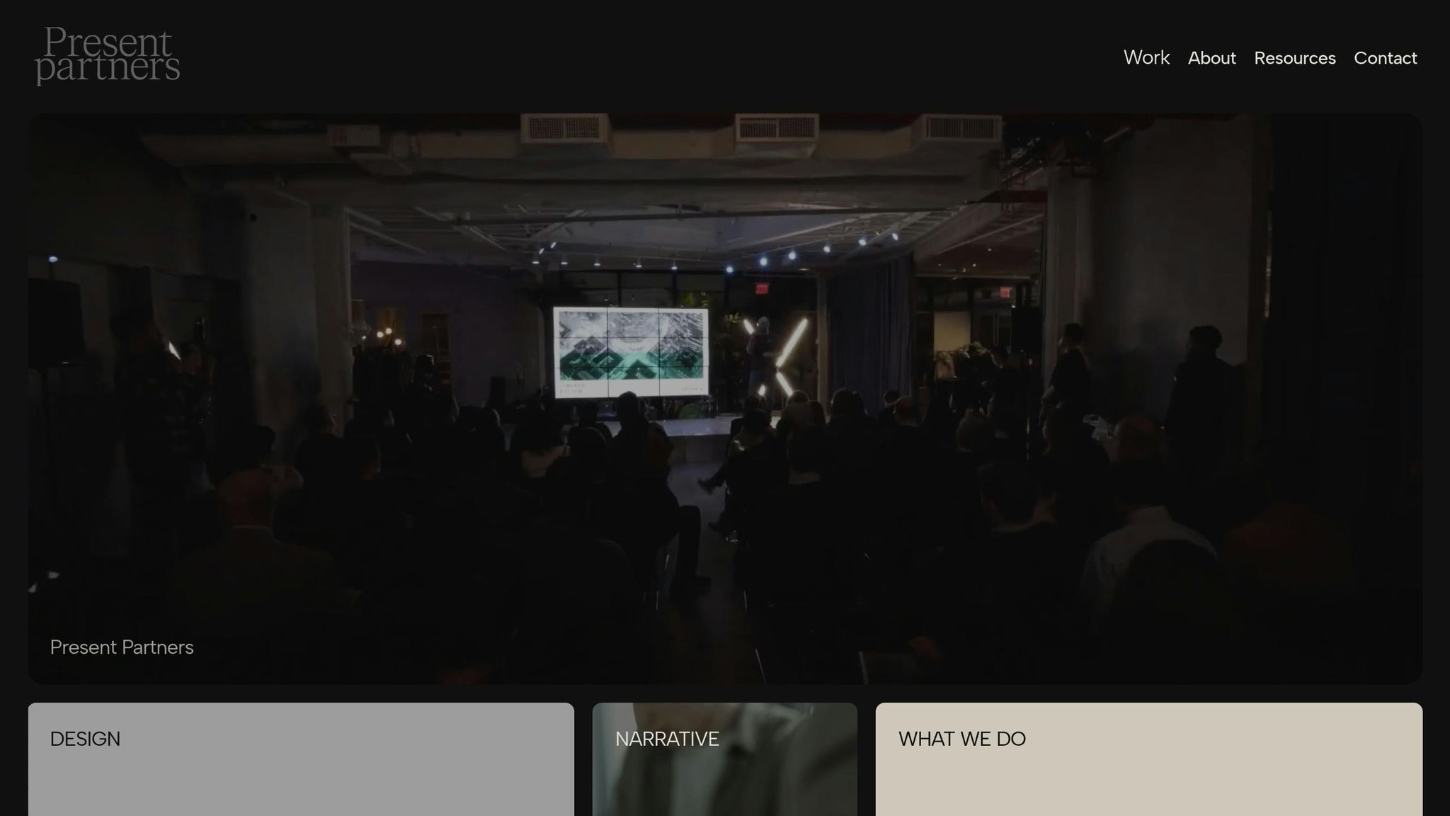
When the stakes are high, partnering with experts who understand the intricacies of white space and visual hierarchy can make all the difference. Present Partners, a New York-based agency, specializes in designing presentations that secure funding, win clients, and drive critical decisions through strategic visual storytelling and content organization.
Their approach goes beyond aesthetics. By creating custom templates and story-driven layouts, they ensure every aspect of the design enhances audience engagement and supports your goals. For example, a case study highlighted how a redesigned investor pitch deck - with more white space, grouped content, and bold headlines - led to better audience engagement and a successful funding round.
Expert designers know how to avoid common pitfalls like cluttered slides, inconsistent spacing, and unclear focal points - all of which can dilute your message. When your presentation could determine a major business outcome, leveraging white space and visual hierarchy isn’t just smart design - it’s a strategic necessity.
Conclusion: Mastering White Space and Visual Hierarchy for Impactful Slides
When done right, white space and visual hierarchy can transform your slides into powerful communication tools. White space isn’t just about empty areas - it enhances readability and guides attention. Pair that with a clear visual hierarchy, achieved through deliberate choices in size, color, contrast, and positioning, and your key messages will shine.
The benefits aren’t just aesthetic. Research shows that clean, uncluttered designs with effective white space can increase audience retention by 72%. This happens because reducing cognitive load helps clarify your message, making it easier for your audience to stay engaged.
Here’s how you can put this into practice: use macro white space to separate sections for better structure and micro white space to improve readability within each section. Establish a clear visual hierarchy by highlighting critical elements with size, bold text, contrasting colors, or logical grouping. Consistent typography and spacing also add a polished, professional feel that boosts credibility.
This approach is especially crucial for high-stakes presentations - think investor pitches, client proposals, or board meetings. In moments like these, every detail matters. Agencies like Present Partners specialize in leveraging white space and visual hierarchy to craft slides that not only look great but also help clients secure funding and make critical business decisions.
Every slide is a chance to guide your audience, reduce confusion, and amplify your message. Thoughtful use of white space and visual hierarchy ensures your presentation is as clear and impactful as possible.
FAQs
How can I use white space to make my slides more engaging without losing important content?
To make the most of white space in your slides while keeping them engaging and informative, aim for a balanced visual design. White space isn’t just blank - it’s a powerful tool that directs your audience’s attention and makes your slides more readable.
Focus on what truly matters. Highlight your key points and use white space to separate them from supporting details. Avoid cramming your slides with too much text or too many visuals. Instead, create breathing room around your content to improve clarity and help your audience stay focused without feeling overwhelmed.
Think of white space as a partner to your content. When used thoughtfully, it can enhance your presentation, making it more impactful and ensuring your message connects with your audience.
What mistakes should I avoid when creating a visual hierarchy in presentation slides?
When creating presentation slides, there are a few missteps you’ll want to steer clear of to keep your audience engaged and your message clear:
Packing slides with too much information: Overloading a slide can overwhelm your audience, making it hard for them to focus on the main points you’re trying to convey. Keep it simple and to the point.
Neglecting white space: White space isn’t just empty space - it’s a tool that helps guide your audience’s attention and gives your slides a polished, professional appearance.
Using inconsistent fonts or styles: Mixing font sizes or styles can make your slides look chaotic and distract from your message. Stick to a consistent design throughout.
Not emphasizing key points: Your most important ideas should stand out. Use size, color, or strategic placement to make sure they grab attention.
By keeping these tips in mind, you’ll create slides that are visually appealing, easy to follow, and impactful for your audience.
Why are white space and visual hierarchy important for audience engagement in high-stakes presentations?
White space and visual hierarchy are essential for creating presentations that grab attention and leave a lasting impression. White space reduces clutter, making it easier for key points to stand out, while a strong visual hierarchy guides the audience's focus to the most important information. Together, these elements create a clean, organized flow that keeps viewers engaged and reinforces the core messages.
Present Partners, a New York-based agency known for crafting high-end PowerPoint presentations, places a strong emphasis on these design principles. By combining strategic design with a focus on clarity, they create slides that not only captivate audiences but also help secure funding and drive critical decisions.