

How Alignment Guides Visual Flow in Slides
When your slides look clean and organized, it's not by accident - it's the result of proper alignment. Aligning elements like text, images, and graphics along consistent lines makes your slides easier to follow and visually appealing. Misaligned slides, on the other hand, can confuse your audience and hurt your credibility.
Key Takeaways:
Alignment creates an invisible structure that guides your audience's eyes.
Proper alignment reduces distractions and boosts clarity.
Tools like PowerPoint's alignment options, smart guides, and gridlines make it easy to achieve consistency.
Misaligned elements increase cognitive load, slow comprehension, and can damage your professional image.
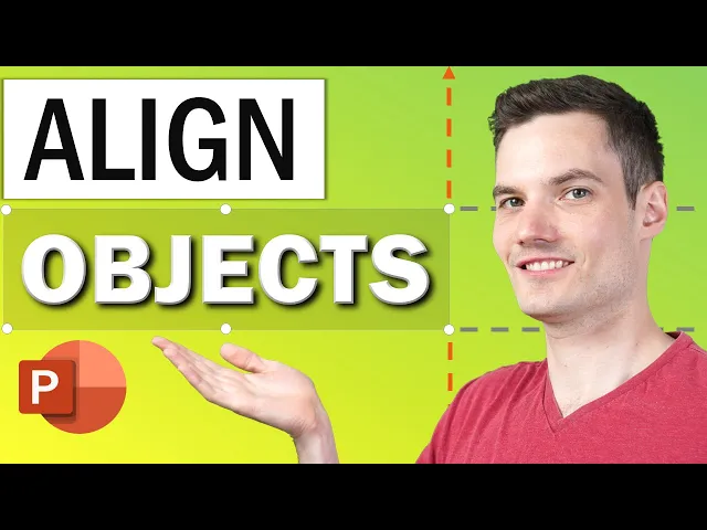
How to Align in PowerPoint

The Impact of Misalignment
Getting alignment right is crucial for guiding your audience's attention - a core principle when building a clear visual hierarchy in presentation slides. When elements aren’t aligned properly, the slide can feel chaotic and disorganized. This lack of structure distracts viewers, making it harder for them to focus on your message.
Why Visual Flow Matters
Our brains are wired to look for patterns and order. By aligning related elements along consistent vertical and horizontal lines, you create an invisible guide that directs viewers’ eyes through your content in a logical sequence.
Think about how you naturally read a newspaper or scroll through a website. Headlines, columns, and images are arranged to lead your eyes in a predictable way. Presentation slides work the same way. Proper alignment ensures your audience can quickly absorb information without unnecessary effort.
This sense of order works because alignment establishes rhythm and repetition - elements our brains instantly recognize. When related items are positioned along the same lines, they feel connected and important. Without this structure, viewers struggle to find a clear path through the slide, their eyes darting aimlessly in search of meaning.
Aligned slides also help prioritize information. Your audience will naturally process the most important elements first, then move to supporting details. When alignment is missing, everything competes for attention at once, making it hard for viewers to identify the key points.
Poor alignment doesn’t just affect flow; it can also hurt readability and even your credibility, as explained below.
Consequences of Poor Alignment
Misalignment isn’t just a visual issue - it can have real professional consequences. When slides feature inconsistent positioning, such as shifting headlines or randomly placed text blocks, it sends a message to stakeholders: a lack of attention to detail and professionalism. This perception can be especially damaging in high-pressure scenarios like client pitches, funding presentations, or critical business meetings.
The problem goes deeper than appearances. Misalignment signals a lack of precision, leaving viewers to question your overall reliability. If you can’t align elements on a slide, they may wonder whether you’re capable of handling more complex tasks. In competitive situations, this doubt could cost you opportunities.
Misalignment also creates readability challenges. For example, inconsistent left alignment forces viewers to backtrack and reread sections, slowing down comprehension. Floating images with no clear connection to the text make it harder for viewers to understand their purpose. Similarly, misaligned icons or callout boxes add unnecessary clutter rather than clarity.
These issues compound across multiple slides. Each misaligned slide forces viewers to reorient themselves, wasting mental energy on navigation instead of absorbing your message. This slows comprehension and weakens retention. Your audience ends up remembering less and feeling more fatigued.
Common alignment mistakes include mixing different alignment styles on the same slide, letting text or images touch the edges without proper margins, and failing to keep elements like logos or page numbers in consistent positions across slides.
These errors don’t just make your slides harder to read - they also undermine your professional image. When information is scattered across a slide with no clear flow, viewers can’t quickly grasp your key points. In fast-paced business settings, where time and attention are limited, this inefficiency can derail your message - not because your content lacks value, but because your presentation makes it too hard to follow.
In short, misalignment creates unnecessary obstacles between you and your audience. Instead of a smooth, intuitive experience, viewers are left navigating a disjointed layout. Every misplaced element becomes a distraction, pulling focus away from your message and weakening its impact.
Alignment Techniques for Visual Flow
PowerPoint comes equipped with tools designed to simplify alignment, ensuring your slides look polished and well-organized. These features help maintain a consistent and professional appearance throughout your presentation.
Using PowerPoint's Alignment Tools
PowerPoint's alignment tools give you precise control over how objects are positioned on your slides. You’ll find these commands under the Home tab in the Arrange group or in the Align dropdown menu under the Format tab.
The core alignment options include:
Align Left, Center, or Right for horizontal positioning
Align Top, Middle, or Bottom for vertical positioning
These commands work on selected objects, aligning them either relative to each other or to the slide itself. To use them, select the objects you want to align by clicking on the first item, then holding the Ctrl key while selecting additional items. Once selected, head to the alignment menu and choose your desired option. For example, if you have three text boxes at varying heights, selecting them all and using the Align Top option will instantly align their top edges on the same horizontal line.
When aligning objects relative to each other, they position themselves based on the outermost object in the group. Alternatively, aligning to the slide places them in relation to the slide's edges. Mixing these approaches without care can lead to visual inconsistency, so it’s important to stay mindful of the overall layout.
Alignment isn’t limited to text - it applies to images, shapes, icons, and charts as well. Consistently aligning similar elements along horizontal or vertical lines creates a rhythm that makes your slides easier to read and visually appealing.
Beyond the basic alignment tools, PowerPoint offers smart guides and gridlines to refine your layouts further.
Leveraging Smart Guides and Gridlines
Smart guides and gridlines are invaluable for maintaining alignment while designing your slides, saving you from constant manual adjustments.
Gridlines create an invisible framework on your slide, helping you position elements evenly. To enable them, go to View > Gridlines. Once activated, faint lines appear, serving as reference points. PowerPoint’s grid snap feature automatically aligns objects as you drag them close to these lines, ensuring precision without extra effort.
Smart guides function differently. They appear dynamically as you move objects, showing alignment with other elements or slide edges. To activate smart guides, go to View > Guides. As you drag an object, these temporary lines indicate when it lines up with another object’s edge or center, helping you maintain alignment effortlessly.
Using gridlines to establish a column-based layout can improve readability by organizing content into neat vertical sections rather than sprawling full-width blocks. Meanwhile, smart guides are perfect for fine-tuning the placement of individual elements within these sections.
Once everything is aligned, you can focus on achieving balanced spacing, which is where distribution tools come into play.
Distributing Elements for Balanced Spacing
Alignment tools ensure objects line up, but distribution tools take it a step further by creating even spacing between multiple items. This is key to establishing a clean and organized visual flow.
PowerPoint’s Distribute Horizontally and Distribute Vertically options are perfect for spacing objects evenly. These tools are especially helpful when working with three or more elements, such as icons or text boxes, ensuring equal gaps between them.
To use these features, select the objects you want to space evenly, then go to Format > Align and choose either Distribute Horizontally or Distribute Vertically. PowerPoint will automatically calculate and apply equal spacing.
Even spacing helps guide the viewer’s eye naturally through your content, making it easier to understand relationships between elements. Uneven gaps, on the other hand, can create visual tension and disrupt the flow of information. Balanced spacing also reinforces proximity, signaling that closely grouped items are related, while maintaining clarity and hierarchy.
For best results, align your objects along a common edge first - such as aligning all items to the top - before applying horizontal or vertical distribution. This ensures that everything stays on the same baseline while being spaced evenly. These tools eliminate the need for tedious manual adjustments, helping you achieve a polished, professional look with minimal effort.
Maintaining Alignment Across Slides
After fine-tuning individual slides, it’s crucial to ensure the entire presentation maintains a consistent look. This continuity helps guide your audience’s focus and creates a smooth viewing experience. To keep everything aligned, use tools that lock your design choices in place, so you don’t have to worry about accidental shifts. Start by grouping related elements, then take advantage of master templates for a uniform layout across all slides.
Grouping Aligned Objects
Once you’ve carefully aligned multiple elements, the last thing you want is for them to get misaligned during editing. That’s where grouping comes in handy.
By grouping aligned objects, you can lock their relative positions, making them function as a single unit. For instance, if you’ve aligned a title, subtitle, and decorative line perfectly, grouping them ensures they stay together, even as you move or resize them during editing.
Here’s how to group objects in PowerPoint:
Select all the elements you want to group by clicking the first one, then holding down Ctrl while clicking the others.
Right-click and choose “Group” from the menu, or use the shortcut Ctrl+G.
Once grouped, these elements move together as one object, preserving their alignment. If you copy the group to another slide, the alignment remains intact. Need to make changes? Simply ungroup the elements by right-clicking the group, selecting “Ungroup,” making your edits, and regrouping afterward.
Using Slide Masters for Consistency
While grouping is great for individual slides, Slide Masters offer a broader solution for maintaining alignment across your entire presentation. They’re one of the most effective tools for ensuring consistency throughout your deck.
Slide Masters are templates that automatically apply uniform layout and alignment rules to all slides using them. When you set up a master slide, elements like titles, body text, images, and logos follow the same placement guidelines across every slide. This eliminates the need for manual adjustments and keeps your presentation looking polished and professional.
To access Slide Masters in PowerPoint, navigate to View > Slide Master. Any changes you make here will update all slides tied to that master layout. For example, McKinsey consultants emphasize that headlines should always stay in the same position and font sizes should remain consistent when flipping through slides. This kind of uniformity enhances readability and builds credibility.
Slide Masters also simplify recurring elements like logos, footers, or page numbers. When these are built into the master template, they appear consistently on every slide without extra effort. For organizations that prioritize brand consistency, this is a game-changer.
To create a precise layout in your Slide Master, enable guides and gridlines to position elements accurately. Decide on key alignment details - such as whether titles should be left-aligned or centered, where body text starts, and the margins to use. Once these decisions are implemented in the master, they’ll automatically apply to every slide in your deck.
Investing time in a well-designed master template pays off quickly. Instead of spending hours tweaking alignment slide by slide, you can focus on crafting your content, knowing the visual structure is already taken care of.
Creating Visual Hierarchy Through Alignment
Once you've nailed down precise alignment to guide visual flow, the next step is establishing a visual hierarchy. This is what directs your audience's attention to the most important parts of your slide - what they see first, second, and third. By combining alignment with thoughtful decisions about size, color, and spacing, you can create a clear path for the eye to follow. The result? A presentation that's not only easier to understand but also more persuasive.
Alignment works hand-in-hand with principles like contrast, proximity, and whitespace to create a unified design system. Together, these elements can transform cluttered slides into polished, professional presentations that naturally guide your audience's focus.
Aligning Text for Readability
How you align text has a direct impact on how quickly and easily your audience can grasp your message. Left-aligned text is the go-to choice for body content because it creates a neat vertical line that helps the eye scan the text quickly and smoothly. This predictable structure makes it easier for viewers to follow along.
On the other hand, center-aligned text can slow readers down. It forces the eye to search for the start of each line, which can be frustrating when dealing with longer paragraphs. While center alignment can work for short, impactful statements or headlines, using it for larger blocks of text adds unnecessary complexity. Save it for moments when you want to emphasize symmetry or formality.
To establish a clear hierarchy, position your headline at the top-left, making it larger and left-aligned. Place body text underneath, also left-aligned, with enough whitespace to separate the sections. Supporting elements like images or icons should align with either the headline or body text to maintain a clean, cohesive look. This layered approach naturally guides viewers from the headline to the details and supporting visuals.
Whitespace is a critical tool in this process. By leaving space between aligned elements, you prevent your slides from feeling overcrowded or chaotic. For example, placing a headline at the top-left with ample whitespace below it signals its importance and separates it from the body text. In this way, even the empty space becomes part of your design language.
A common pitfall to avoid is mixing alignment styles without reason. For instance, pairing a center-aligned headline with left-aligned body text and scattering elements randomly across the slide creates a "scattershot" effect. This not only hurts readability but also undermines your presentation's professionalism. Instead, stick to consistent alignment rules - left alignment for most content is a safe and effective choice.
For wider slides, such as those in a 16:9 format, consider using a column-based layout with at least two columns. This helps break up the width of the screen and keeps text blocks manageable. Titles should be placed inside the slide with sufficient margins, creating a natural "frame" for your design and allowing elements to breathe.
Combining Alignment with Other Design Elements
Alignment becomes even more powerful when paired with contrast and proximity. Contrast helps distinguish elements by using differences in color, size, or texture. For example, aligning a bold, dark headline with lighter body text not only organizes the slide but also makes the hierarchy instantly clear - viewers know where to look first.
Proximity, on the other hand, groups related elements together. When these groups are also aligned along the same vertical or horizontal lines, they form visually connected, easy-to-understand clusters. Imagine a slide showcasing three key benefits: align each benefit's headline, supporting text, and icon vertically. Use contrasting colors to differentiate the benefits, and leave enough whitespace between each group. This approach creates a slide that's not just visually appealing but also easy to navigate.
Alignment provides the structure, while contrast and proximity highlight what’s important. Together, they ensure your audience processes information in the order you intend. Without proper alignment, even well-designed elements lose their impact because the slide feels disorganized.
Design Principle | Purpose | How It Works with Alignment |
|---|---|---|
Contrast | Highlights differences between elements | Aligned elements with contrasting colors or sizes create clear focus points |
Proximity | Groups related content together | Aligned groups form cohesive, unified clusters |
Whitespace | Reduces clutter and separates sections | Aligned elements with space guide the viewer’s eye naturally |
When designing, follow a logical process: start with layout and element importance, establish visual hierarchy, fine-tune fonts and spacing, and then add creative touches like colors and patterns. Alignment is the backbone of this process, giving your design the structure it needs to succeed.
Conclusion
Alignment is more than just a design principle - it's a powerful tool for guiding attention and improving how your message is received. When visual elements are arranged along clear vertical and horizontal lines, they create a seamless pathway for the eye, reducing mental effort and making your content easier to process.
This becomes especially critical in high-stakes presentations. Whether you're pitching for funding, trying to win over clients, or influencing key business decisions, poor alignment can unintentionally damage your credibility. Misaligned elements force your audience to work harder to understand your message, while slides with intentional alignment send a clear, professional signal that builds trust.
Thankfully, PowerPoint's built-in alignment tools make it simple to create polished, professional designs. Pairing alignment with principles like whitespace, contrast, and proximity strengthens your visual hierarchy, ensuring that every slide communicates effectively. Consistency is key: sticking to the same alignment style across your deck - such as left-aligning body text for readability and reserving center alignment for bold, impactful statements - keeps your presentation cohesive. Mixing alignment styles without a clear purpose can lead to a cluttered, unprofessional look, potentially confusing your audience.
At Present Partners, we recognize that alignment shapes how your audience experiences your presentation. By ensuring every element is thoughtfully aligned, you enhance clarity, build trust, and make your ideas more persuasive. In moments where outcomes matter most, effective alignment can mean the difference between losing attention and inspiring decisive action.
FAQs
How does misalignment in presentation slides affect audience engagement and understanding?
Misaligned elements on presentation slides can throw off the visual balance, making it difficult for your audience to stay focused on your message. This distraction can create confusion, muddle your content's clarity, and even leave an impression of unprofessionalism.
On the flip side, proper alignment ensures that the viewer's eye moves naturally across the slide, making your points easier to grasp. A well-aligned design doesn’t just look polished - it also helps your presentation feel intentional and well-thought-out, boosting your credibility as a speaker.
What are common alignment mistakes in presentation slides, and how can you fix them?
Misaligned elements on presentation slides can pull focus away from your message and make it harder for your audience to stay engaged. Common pitfalls include uneven text placement, inconsistent spacing, and visuals or bullet points that don’t line up properly. These issues can leave your slides looking cluttered and difficult to follow.
To keep things polished, take advantage of alignment tools in your presentation software - features like gridlines or snapping options can help you ensure everything is spaced evenly and aligned correctly. Stick to a uniform layout across all your slides, and take a moment to review that text, images, and other elements feel balanced. Good alignment doesn’t just make your slides look cleaner; it also helps guide the audience’s attention, making your message clearer and more effective.
How do PowerPoint's smart guides and gridlines help align elements effectively in a presentation?
PowerPoint's smart guides and gridlines make designing polished, professional slides much simpler. Smart guides pop up automatically as you move objects around, helping you align them perfectly with other elements on the slide. This saves you from the hassle of guessing or making tedious manual adjustments.
Gridlines, meanwhile, act as a visual framework, giving you a clear guide for placing elements precisely. Turning them on helps you create a clean, organized layout, making it easier to align text, images, and other objects consistently. When used together, these tools streamline the design process and enhance the visual flow of your slides, making your content easier for your audience to follow.