


Best Tools for Data Visualization in PowerPoint
When you show data in PowerPoint, using good tools can turn boring slides into ones that catch the eye. The right tools help you work fast, make fewer mistakes, and show your data in ways people can follow with ease. No matter if you need live graphs, smart charts, or neat slides, these tools help you get the job done. Here are six top tools to make your PowerPoint slides stand out:
Datawrapper Add-in: Make charts right in PowerPoint. The charts update as you change your data, so your info stays fresh. Good for teams who want sharp, quick graphs. It’s free, but full features cost about $599 or more a year.
think-cell: Makes business charts, like Gantt and waterfall, simple and fast. Works well with Excel. This saves you time. Cost is close to $300 per year for each person.
Power BI Integration: Lets you put live dashboards in PowerPoint. This is best for large groups and those who need up-to-date info all the time. Price is between $10 and $20 a month for each user.
Visme: Has lots of creative visuals and easy templates. You can save your work as PowerPoint files. This tool is great for sales folks and marketers. Starts at about $12.25 a month for each user.
RAWGraphs: A free way to make charts that stand out and fit what you want. You can save charts as SVG or PNG for easy use in PowerPoint. Best for people needing something special.
Present Partners: A service where pros help you make great-looking slides for those big, important meetings. Cost will depend on what you need.
These tools fit different jobs. Some give you quick charts, some make live dashboards, and some help you make custom visuals. Pick the one that fits your team, your needs, and your budget.
Quick Comparison
Tool | What It Does | Price | Best Use | Weak Points |
|---|---|---|---|---|
Datawrapper | Shows new info fast, lets groups work | Free/$599+ each year | News groups, quick pictures | Not much you can click or do |
think-cell | Makes work charts, links with Excel | ~ $300/each year | Work teams, office staff | Just for charts for business |
Power BI | Dashboards you can touch, live info | $10–$20/person/month | Big teams with a lot of data | Hard to learn and use |
Visme | Fun slides, many styles | $12.25–$24.75/month | People in ads or sales | Not good with lots of data |
RAWGraphs | Charts you can change a lot | Free | School, strange small jobs | Won’t link to PowerPoint itself |
Slides made just for you | Cost goes up or down | Big talks, need to impress | Not for you to make alone, a team |
What you pick rests on what you need. Do you want fresh news, new looks, or help to make things work? Try free tools first. See which tool fits how you work each day. This can help you know what will help you the most.
Data Visualization for Slide Presentations - Storytelling, Charts, Formatting
1. Datawrapper PowerPoint Add-in
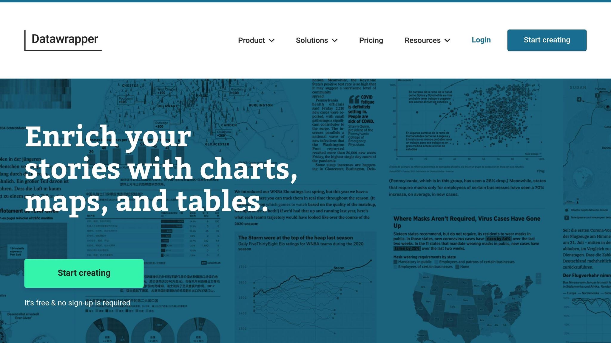
The Datawrapper Add-in lets you put great charts and graphs right inside PowerPoint. Now you can make and change your data visuals fast, all without leaving your slides. This tool helps you show numbers in a clear way, which is good for talks that need strong charts to back up your points.
PowerPoint Use and Set-Up
You can use this add-in with Office 365 on both PCs and Macs. Get it from Microsoft AppSource. People have grabbed this add-in over 100,000 times already. Once it is set up, it sits at the top of PowerPoint, so you can add or change charts in a few clicks.
One great thing about this tool is it does live updates. If you change your data in your Datawrapper page, you can press refresh in PowerPoint and your chart will show the new numbers. This helps with talks that show up-to-date info, like sales this quarter or market changes. You won’t need to update charts by hand, so you save time and don’t make mistakes.
Many Chart Styles and Visuals
Datawrapper has lots of chart types not found in PowerPoint. You can make bar graphs, line graphs, scatter charts, pie graphs, maps, heatmaps, and treemaps, each looks neat and sharp.
If you want to show data by place or show things that connect, this tool shines. For instance, if you want to show how sales change from state to state, just load your data and add a colored map to your slides. The tool puts commas in big numbers, and sets dates to month/day/year which is what most people in the USA use. This makes your slides much easier to read and understand.
Easy Data Load and Team Work
It is simple to pull your numbers into Datawrapper. Just use Excel, CSV, Google Sheets, or copy and paste right in. It also puts your data in U.S. style, so your charts are set for people in America.
The add-in lets team members work together well. Many can change the same charts at the same time, so this is good when lots of people need to help on big talks. If your team works on data, design, or wants to check for mistakes, everyone can see what’s new.
Built for Work and Big Talks
Many groups trust Datawrapper for key work where clear and correct numbers matter most. More than 30,000 companies or teams use it. Big names like The New York Times, The Washington Post, top firms, and top companies count on it.
With a great score of 4.7/5 stars, people say Datawrapper makes pro charts fast, and you don’t need to code to use it. Plus, the charts fit WCAG 2.1 rules, which means they work for people who need help to read slides.
You can try Datawrapper for free, and paid plans start at $599 a year if you need more. This way, you can use all the features before you pay.
2. think-cell
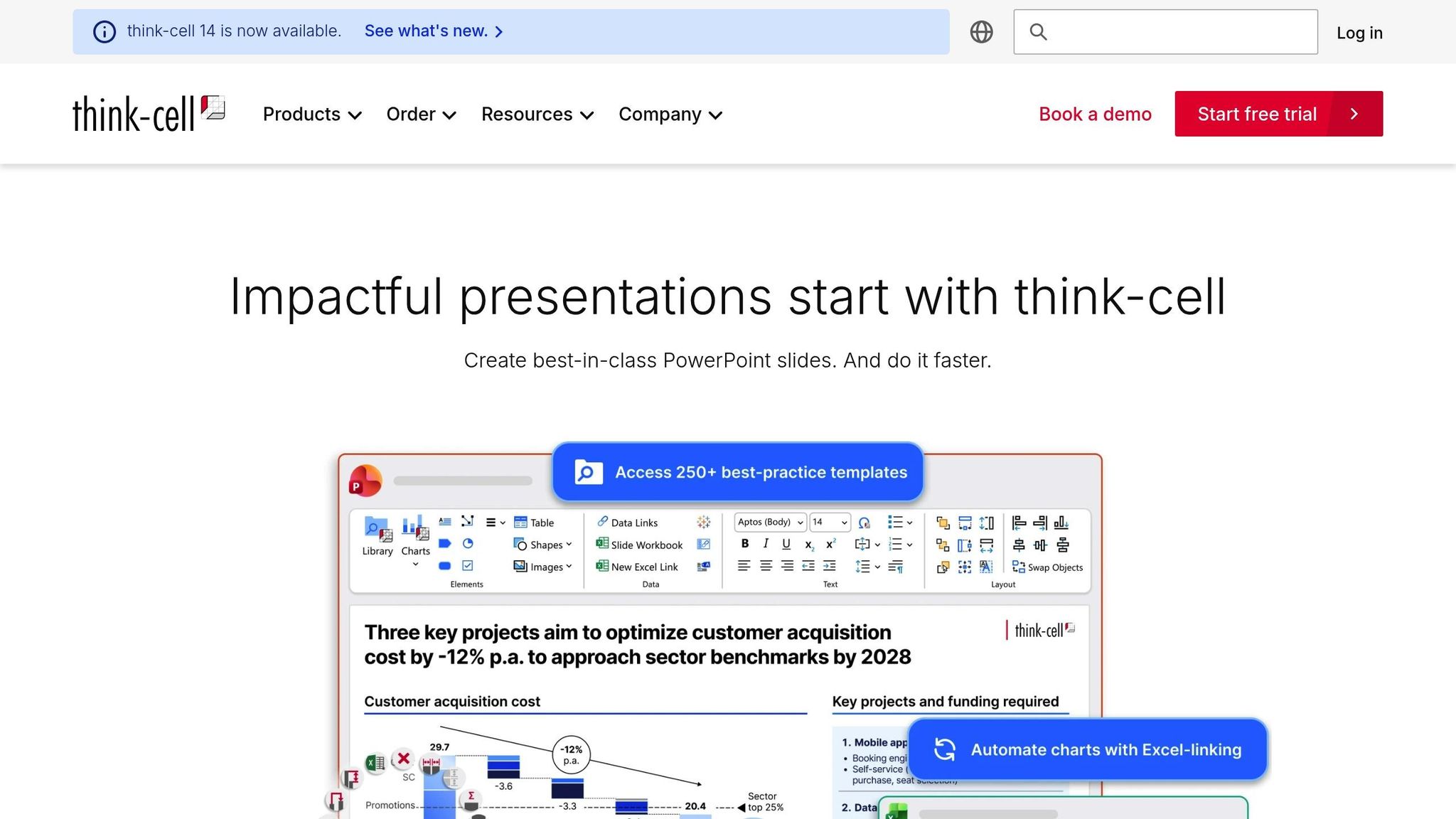
Many big firms use think-cell to make sharp charts with PowerPoint. It helps you show your data with ease and speed.
With PowerPoint, Simple and Fast
think-cell works right in PowerPoint. It fits well with Microsoft Office, both Windows and Mac, using Office 2016, 2019, and Microsoft 365. Over one million people use this tool to build and fix charts without leaving their slides. think-cell sets up your charts as you make them, so you can talk about what matters. You get many top chart styles, so your slides work for all types of business talks.
Many Chart Types and Better Images
think-cell does much more than the basic charts in PowerPoint. You can make special business charts, like Gantt charts to show work plans, waterfall charts to track money, and Mekko charts to look at the market. It even handles scatter plots, line and stacked charts, and pie charts with high detail.
For example, if you want to show profit changes in each quarter, use a waterfall chart. To show what step comes next in a job, use a Gantt chart with links and markers. These tools help your talk look smart and clear.
Easy Data Use and Team Work
A key benefit of think-cell is how it links to Excel. When you join it with Excel, new data in your sheet goes straight to your PowerPoint chart. This is great for teams who must track numbers that keep changing, like sales or budgets.
Working with your group is easy. Shared drives and cloud tools let many people work on slides at once. Since think-cell runs inside PowerPoint, it follows strong safety rules for user data. U.S. companies trust it for safe work.
Top Choice For Work and Big Talks
think-cell is strong for talks that matter. Most top firms use it with clients. Smart settings save time when making slides - a well-known consulting group found they cut down slide work time by 70% by using it.
It costs $300–$350 for each user each year. This price makes sense if your team needs to show many big charts all the time.
3. Microsoft Power BI Integration
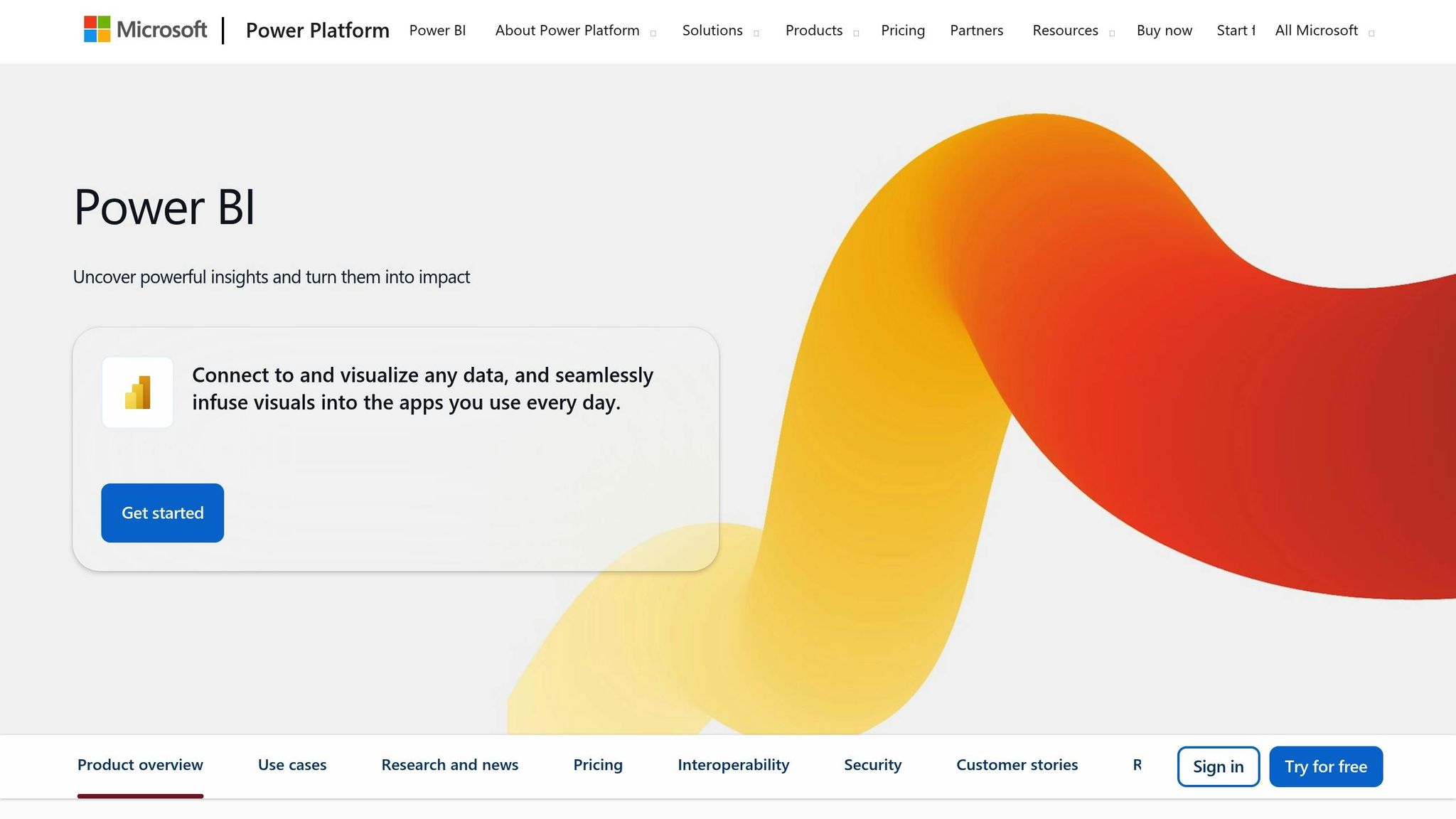
Microsoft Power BI lets you show live facts right on your PowerPoint slides. Since both Power BI and PowerPoint come from Microsoft, getting them to work together is fast and simple.
PowerPoint Integration and Compatibility
There is a special Power BI add-in made just for PowerPoint. You can add live charts with a few clicks. Pick how they look, and your viewers always see the latest numbers as they change.
Power BI also links up with other Microsoft 365 apps like Excel, Teams, and SharePoint. This helps teams that use Microsoft tools already, so there is no need to learn new tools or break how things work now. This leads to a smoother way to make slides that use up-to-date facts and charts.
Flexible Chart and Visualization Options
Power BI gives you many ways to show your numbers. You can use bar charts, lines, pies, maps, and gauges. One neat thing is you can just ask a question, like “How much did we sell last month?” and Power BI will make a chart for you right away. This makes finding and showing what you need easy and quick.
Data Import and Collaboration Features
A big plus is how Power BI can pull facts from a lot of places, like Excel, SQL, Azure, and the cloud. If things change in your source file, all the charts in PowerPoint will change too. This saves time and keeps numbers right.
Teams can work together on dashboards at once. Plus, Microsoft makes sure sharing and editing keeps your facts safe.
Ideal for Business and High-Stakes Presentations
Power BI works well for business use, like key talks. For example, a money team in the U.S. used Power BI in PowerPoint to show how they did for the quarter. Bosses could click through live numbers, try “what if” ideas, and make smart choices. This raises the bar for business slides.
Its smart charts help in executive talks and investor meetings. Instead of still charts, Power BI lets viewers see numbers from different sides, dive deeper, and filter what they see - all in one place.
For $10–$20 per person each month, Power BI is priced well for big teams. For U.S. users, numbers show up in dollars ($), dates use MM/DD/YYYY, and number forms match U.S. standards.
4. Visme
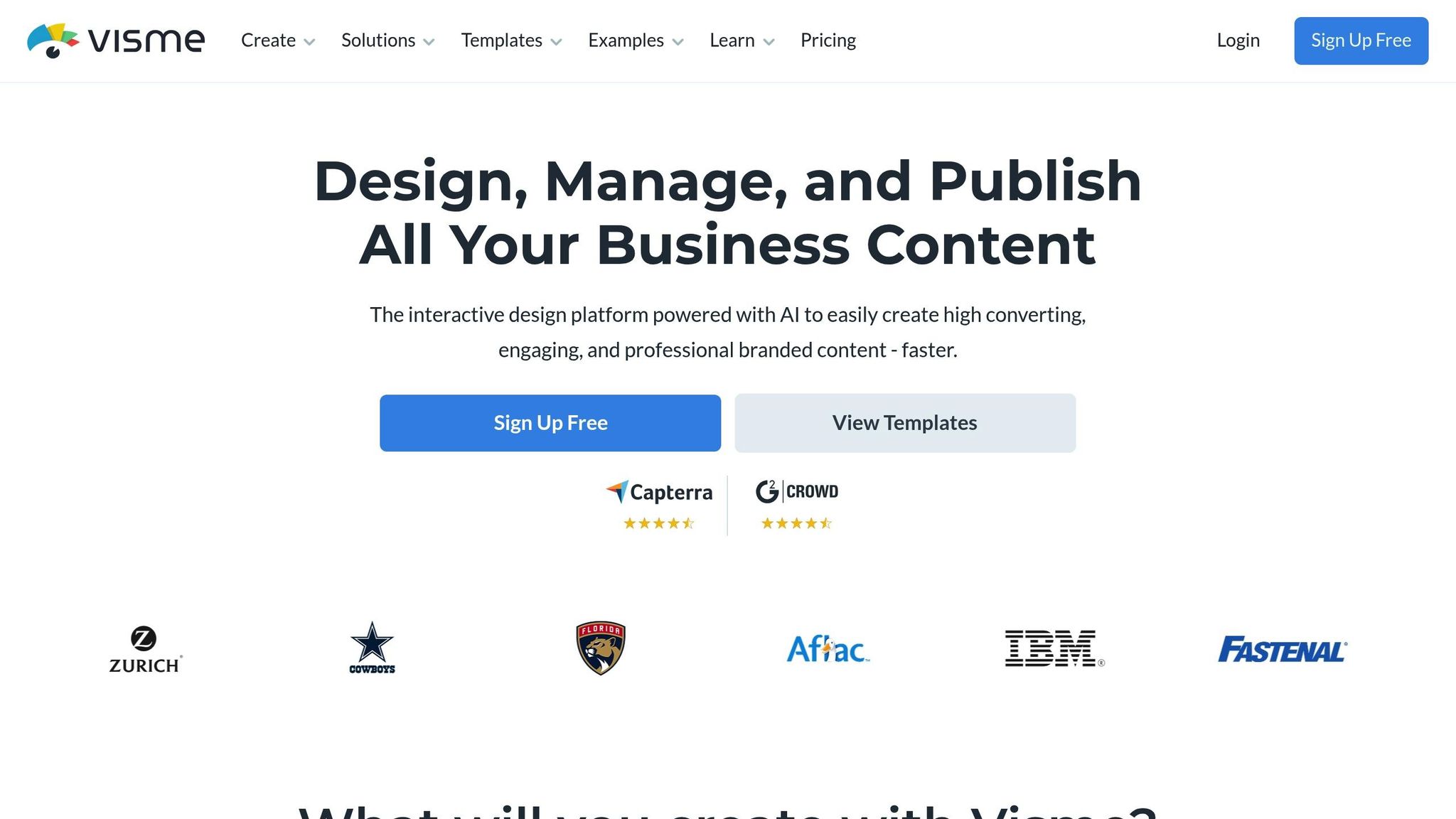
Visme is an online tool that helps you make better PowerPoint slides by letting you show data in smart ways. With more than 13 million users around the world, it helps you tell your story with strong charts and cool graphics that go far past what you get in PowerPoint. Let us look at how Visme works with PowerPoint and helps make your slides stand out.
PowerPoint Works Well With Visme
Visme lets you add great looks to your PowerPoint slides with very little work. You can make charts and graphics in Visme and then save them as PowerPoint files (.pptx). It is easy to move these files into your slides. You also get sharp images and web links that you can put right into your PowerPoint.
Just make your work in Visme, save it as a pptx, and download it. Your charts will look good and stay the same even after you move them to PowerPoint.
Many Ways to Show Your Data
Visme gives you lots of ways to show your data. You get more than the plain bar, line, and pie charts that come with PowerPoint. With Visme, you can make cool things like heat maps, flow charts, radar charts, and more, which are not in PowerPoint. You can even make your charts move or add smart data boxes to help tell your story.
You can change colors, fonts, and how things look with simple templates, so your slides fit your style and help your crowd follow your ideas.
Bringing in Data and Working in a Team
Visme makes it easy to use your own data and work with other people. You can bring in numbers from Excel, Google Sheets, or CSV files. This makes it quick and simple to keep your charts up to date as your data changes. It cuts down on mistakes and saves time.
Your team members can work together at the same time. Many people can leave notes, make changes, or check work all at once. Tools help you keep older versions safe and control who can see or change things. This is key if you need to work with people from many groups to get your presentation just right.
Best for Work and Big Moments
Visme is great for business slides, where how things look is very important. It gives you business styles and lets you set rules for your brand so every slide matches and looks sharp. This is very helpful when you need to show slides to bosses or investors.
For instance, a tech group in the U.S. used Visme to make smart sales charts for PowerPoint. This helped their buyers see the important details, and their sales grew.
The price starts at $12.25 per person per month for the small plan, or $24.75 per person per month for the pro plan (when paid by year). This makes Visme a good price for most teams who want strong, smart slides but do not want hard-to-use tools. The time you gain and the nice slides you make often are well worth the cost, most of all when you must wow people in the world of work.
5. RAWGraphs
RAWGraphs is a free tool that helps make clear and sharp pictures from your numbers and facts. It is built by smart people at a top school in Italy. You can use it to show many types of charts. It works well with PowerPoint, so your slides will look good and neat. If you want strong, smart slides, this tool does the job.
Using RAWGraphs in PowerPoint
It is easy to use RAWGraphs with PowerPoint. You make your charts on the website, then you can save them as SVG or PNG files. You can open these files in PowerPoint with no trouble. SVGs are best, as they stay sharp and clean no matter how big you make them. You just drag the chart to your slide and it fits right in. This shows how RAWGraphs makes fine, clear charts that help your talk stand out.
Many Chart Styles
RAWGraphs gives you lots of ways to show your facts. It has special charts, like ones that show how stuff moves from one group to another. You can show how things rank over time, or use maps to spot trends. There are charts for deep and tricky facts, like how people or things are mixed in groups, or where things go over time.
Bringing Data In and Sharing
Getting your facts into RAWGraphs is simple. You can use common files like CSV or Excel. Your files must look like US-style data. Once you put your facts in, RAWGraphs turns them into charts fast. You can save your chart and send it to others, making it simple to work in teams. You can use your chart in slides, or share it in other ways.
Great for Your Work and Big Talks
RAWGraphs is perfect for making charts that look sharp and show hard facts clearly. It helps in big meetings with bosses or people who want to give you money. Old chart tools don’t catch all the deep details, but RAWGraphs does. It is best for charts that do not change and where you want lots of choice in style. It shines for reports or meetings that need fine charts and design. When you need your slides to pop and look different, right for what you need, RAWGraphs is the way to go.
6. Present Partners

Present Partners makes slides that stand out and look sharp. They do not use robots or quick tools. They work with you, one to one, to make slides for your needs. This group is in New York. They help show data in PowerPoint so you can get more money for your work, win new buyers, or help make big choices.
PowerPoint Work That Fits
This team works with PowerPoint, and only PowerPoint. They use all parts of the tool to make new designs, clean charts, and cool moves on each slide. Every show will look nice, move well, and work right, even with hard and deep data. By staying in PowerPoint, they give you slides made just for you.
Many Chart and Visual Choices
You can get plain bar charts or hard ones, like waterfall charts, or slides with new and bright info pictures. Present Partners takes numbers and words and gives them shape. Their slides help you see tough facts, so now it is easy to know what matters most.
Data From File to Slide With Care
The whole team meets with each group they help. They move your data - Excel, CSV, or more - right to the slides. They keep your info safe and correct. You get to see how it looks, share what you like or not, and they fix it till it feels just right. This way, each slide is spot-on, which is key for big talks and big deals.
Good for Work, Good for Big Talks
Present Partners helps when you must be clear and sharp. Say a new group in New York worked with them to redo their pitch for folks with money to invest. The team made sure the money charts looked nice and the facts were seen quick. Their new show helped the group get $5 million. The group said their slides helped them look smart and clear, which led to their win.
"We design high-stakes presentations. The ones that win funding, secure clients, and drive decisions."
– Present Partners
Present Partners works to build strong ties that last. They make sure to know what their clients want as things change. Their team has great skill and always gives sharp work. They make talks and slides that fit the plan and look good. These are just right for big talks with money folks, leaders, and new clients.
Tool Chart
Picking the best tool for use with PowerPoint facts takes time. You need to know how each choice stacks up. Each tool gives its own set of things it can do, so some work best for some jobs. Here is a simple look at how they do in main areas:
Tool | PowerPoint Link | Type of Chart | Work Together | Cost | Who It Fits | Main Drawbacks |
|---|---|---|---|---|---|---|
Datawrapper Add-in | Easy add-in for quick use | Bar, line, pie, map charts | Share as team, export | Free / $599+ a year | News rooms, fast chart jobs | Not much to click in slides |
think-cell | Built-in add-in | Biz charts – Gantt, Mekko | Only share files | ~ $300/user/year | Money, biz groups | Only for biz charts |
Power BI Integration | Live slides | Dashboards you can click | Cloud share, real-time | $10-$20/user/month | Data teams, huge firms | Hard to learn |
Visme | Download for PowerPoint | Infographs, visuals | Work as team | Free-$25/user/month | Marketers, sales | Weak at data math |
RAWGraphs | Download as files | Custom charts – alluvial, tree | File share – free | Free | Schools, rare chart needs | No add-in for PowerPoint |
Present Partners | Design service | Custom rich visuals | Agency steps in | Varies | Key talks, money pitches | A service, not a tool |
This look at both tools shows what each can do well, and where each may not do so well. It helps you pick the one that fits what you want for your talk or show. You might want to make easy charts, or need sharp work looks for your job, or you may want to make your own style. No matter what, you can find a way to fit what you want to do and how you want it to look.
Final thoughts
The right graph tools can change plain slides into strong tools that help make good choices. When you show facts in a way that is easy to see and easy to like, people can spot what matters fast. This means you can help those who watch your slides make good choices in less time.
Groups that use tools to show facts with pictures find what they need much sooner than those who use old ways to share facts. In fact, facts say these groups are 28% more likely to see what they need when it counts.
Each tool works best for a set of needs, so check some out to see which works well for you. Try the free ones first. If you work with numbers a lot, tools like think-cell help you quickly make neat graphs. If you want your slides to always show the newest facts, Power BI does that with just one tap.
Here’s another big reason to pick tools with care: The mind takes in pictures much faster than words. Visme helps keep watchers locked in with cool, hands-on images. Also, Power BI keeps your facts fresh, so the people who need to know see the newest numbers every time - this is very important when you have big talks that matter.
When you need your slides to be just right, some groups like Present Partners can help make them better. You can use these helpers or go with simple tools yourself. What you choose can depend on what you need, how much time you have, your cost limits, and how big this talk is for your work goals.
Try things out and see what fits - many offer free trials to test before you pick. The best tool might be the thing that helps you win the next big choice at work. Go use these tools, and make your next talk the one that gets you the right answer.
FAQs
Can these tools work with data sources such as Google Sheets or SQL databases?
Some top data chart tools for PowerPoint let you link right to outside data, such as Google Sheets, SQL databases, or Excel files. This means your slides can change as soon as the numbers in the files change. It saves you time and keeps your slides up to date.
When you pick a tool, check if it works with the kind of data you use. Most tools have help guides or support teams to aid you in setting up so you can link your data with ease.