

Storytelling with Data for Decision-Makers
Decision-makers often struggle to turn raw data into actionable insights. Spreadsheets and dashboards are overflowing, but the real challenge lies in making sense of the numbers to drive decisions. This is where data storytelling becomes essential. By combining data analysis, visual design, and narrative techniques, you can transform complex datasets into clear, engaging stories that lead to better decisions.
Here’s the key takeaway: Data storytelling bridges the gap between raw numbers and impactful actions. It explains not just the "what" but also the "why" and "how" behind the data, helping stakeholders understand and act quickly.
Why It Matters:
73% of executives admit their decisions aren’t fully data-driven due to unclear insights.
Stories give context to figures, making data easier to understand and actionable.
Companies like Netflix and Google use storytelling to align data with business goals.
How It Works:
Focus on clarity: Simplify complex data to highlight key points.
Prioritize relevance: Tailor insights to what your audience cares about.
Build engagement: Use a narrative structure (beginning, middle, end) and visuals to make data memorable.
Practical Example:
Instead of merely reporting a drop in customer churn from 15% to 10%, a data story explains the reasons - like better customer support or loyalty programs - giving decision-makers the context they need to act.
The article explores the principles of effective data storytelling, the 3-act structure for crafting narratives, and techniques to create impactful presentations. By mastering this approach, you can turn data into a tool that informs, persuades, and drives results.
Data Storytelling – How to Turn Data into Decisions
Core Principles of Data Storytelling
Bridging the gap between raw data and actionable insights starts with understanding three essential principles. Effective data storytelling relies on clarity, relevance, and engagement - key elements that help turn complex datasets into meaningful insights. When these principles come together, decision-makers can quickly grasp the message and act with confidence. Let’s dive into how structuring clear insights within a compelling narrative can drive action.
Clarity: Making Complex Data Understandable
Decision-makers don’t have the luxury of wading through raw data. They need to spot trends, patterns, and anomalies quickly - without getting lost in spreadsheets or overly complicated visuals. Achieving clarity means focusing only on the data that moves the story forward, leaving out unnecessary details. In this case, less is more.
By selectively presenting data, you simplify complexity and highlight what’s truly important. For example, focused visualizations can bring attention to key metrics like churn rates, customer lifetime value, or revenue impact. Presenting this data in an easy-to-digest format not only enhances understanding but also builds confidence, enabling decision-makers to act swiftly and with certainty.
Relevance: Connecting Stories to Stakeholder Priorities
A data story that doesn’t align with its audience’s priorities risks being ignored. Stakeholders care about different things: executives may focus on revenue growth or competitive positioning, while managers might prioritize operational efficiency or customer satisfaction. To make your story resonate, identify the core problem, the audience’s concerns, and the data that provides a solution.
Take, for instance, an e-commerce team grappling with high cart abandonment rates, particularly among millennial customers. Their data revealed that a lack of trust in online transactions was driving the issue. By framing this insight around priorities like conversion rates and revenue growth, the team successfully advocated for integrating trusted payment options like PayPal and Google Pay. They also enhanced branding to emphasize security. When stakeholders see their challenges reflected in the story, the insights become more than just numbers - they become actionable intelligence.
Once you’ve established relevance, the next step is to craft a story that captures attention and drives engagement.
Engagement: Building a Narrative and Visual Appeal
Data alone rarely captivates an audience. Stories, on the other hand, tap into emotions, making information both memorable and impactful. A strong data story follows a clear narrative arc: a beginning that sets the stage, a middle that explores findings, and an end that delivers a conclusion. This structure keeps the audience engaged while emphasizing the key takeaways.
Visuals are just as important as the narrative. They help highlight risks, key insights, and guide decision-making. Whether it’s a chart, graph, or infographic, the right visual format can make all the difference.
For example, a customer support team discovered a critical churn point during initial interactions. They paired visualizations of response time delays with corresponding drops in customer satisfaction. This clear and engaging visual story led to immediate action, including investments in training and exploring AI chatbots to improve response times. By combining a strong narrative with thoughtful visuals, the team not only clarified the data but also inspired decisive action by showing what was at stake.
Building a Data Story Using the 3-Act Structure
The 3-act structure offers a clear and engaging way to transform raw data into a narrative that drives action. By organizing data into a beginning, middle, and end, this approach helps bridge the gap between complex information and actionable insights. Unlike traditional data presentations that rely heavily on charts and numbers, the 3-act structure makes data relatable and easier to understand, ensuring it resonates with decision-makers.
This framework is particularly important when you consider that 73% of executives admit their business decisions are not fully data-driven. A common reason? The inability to translate data into actionable insights. By framing data within a narrative tied to business objectives, you help decision-makers connect the dots between the numbers and the actions they need to take.
Act 1: Setting the Stage
The first act lays the groundwork by introducing the story and defining the problem or opportunity the data addresses. This is where you explain why the data matters in a business context, giving your audience the background they need to care about the insights you're about to share.
Act 1 focuses on the current state - whether it’s a challenge or an opportunity. Instead of diving straight into numbers, you answer the crucial question: “Why should this matter to decision-makers?”
For instance, when presenting quarterly financial results, don’t just report that customer churn dropped from 15% to 10%. Instead, explain how this reduction was achieved through targeted initiatives, such as improved customer support or loyalty programs. By tying the numbers to a broader narrative, you show the business impact behind the data.
The goal here is to establish the stakes. Decision-makers need to understand the problem or opportunity before they can appreciate the solution. Without this initial context, even the most compelling data risks being ignored.
Act 2: Highlighting the Conflict or Opportunity
In Act 2, you dive into the heart of the story, presenting the data to highlight challenges, trends, or opportunities. This is where you create a sense of urgency by showing the gap between the current state and the potential future state. The tension between “what is” and “what could be” is what keeps your audience engaged.
Visualizations play a key role in this act. For example, you might use charts to show drop-off points in a customer journey, pinpointing where revenue is being lost. Or, as one customer support team discovered, you could demonstrate how delays in response times lead to lower satisfaction scores and increased churn. These visuals make the connection between operational metrics and business outcomes clear.
The key is to let the data tell the story without overwhelming your audience. Focus only on the insights that move the narrative forward. Each chart or graph should answer a specific question and highlight risks or opportunities that inform your recommendations. By the end of Act 2, the audience should clearly see the problem or opportunity, setting the stage for actionable solutions in the final act.
Act 3: Delivering Recommendations
The final act is all about turning insights into action. Here, you present clear, data-backed recommendations that show how to close the gap between “what is” and “what could be.” This is where you outline specific next steps and demonstrate the potential outcomes of taking action.
An effective Act 3 doesn’t just suggest actions; it projects the results of those actions. For example, teams might recommend automating certain processes or adding trusted payment options to reduce delays and improve customer trust. These aren’t vague ideas - they’re concrete steps directly tied to the insights shared in Act 2.
Visualizations in this act should reinforce your recommendations and make the projected outcomes tangible. Whether it’s increased revenue, improved efficiency, or higher customer satisfaction, use visuals to help your audience quickly grasp the potential impact. By clearly articulating what needs to happen and what success looks like, you turn your data story into a powerful tool for driving change.
Techniques for Persuasive Data Storytelling
Turning raw numbers and charts into a compelling narrative takes more than just presenting facts. Decision-makers need stories that not only simplify complex data but also inspire confidence and drive action. The success of your presentation often hinges on how you frame insights, design visuals, and address potential concerns.
Framing Insights for Maximum Impact
The way you present your insights can determine whether decision-makers see them as actionable priorities or just another set of numbers. Framing is all about linking your data to what matters most to your audience - whether it's boosting revenue, cutting costs, improving customer satisfaction, or staying ahead of competitors. To do this effectively, you need to understand your stakeholders' goals. For instance, a CFO might focus on financial metrics like revenue growth and cost savings, while a customer experience officer may care more about retention rates and satisfaction levels. The same dataset can tell different stories depending on who you're addressing.
One powerful method is the "what is" versus "what could be" approach. This involves contrasting the current situation with potential outcomes to create a sense of urgency. For example, instead of simply stating that customer churn dropped from 15% to 10%, explain how specific actions - like enhanced customer support training or a revamped loyalty program - contributed to that improvement. By directly tying data to business priorities, your insights become not just relevant but essential. Always select data that answers your audience's key questions.
Once you've framed your insights, the next step is to use visual design to make your message even clearer.
Using Visual Design to Enhance Understanding
Visual design is more than just making your presentation look good - it’s about making complex information easy to understand. The best data visualizations are straightforward, focused, and directly aligned with the problem you're addressing. For example, if you're tackling customer churn, you might use visuals to map out the customer journey, highlighting pain points like high cart abandonment rates. Pair this with metrics such as session lengths or interaction points to guide decision-makers toward actionable solutions. Effective visuals should clearly outline risks and opportunities, making the data’s implications hard to miss.
Simplicity is key. By reducing cognitive load through well-designed infographics, charts, and graphs, you help your audience quickly grasp the story your data is telling. If this isn't your strong suit, partnering with experts like Present Partners - a New York-based agency specializing in high-end PowerPoint designs - can elevate your presentation to a level that secures buy-in, funding, or client approvals.
But even the best visuals and framing won’t matter if you don’t address potential objections.
Addressing Counterarguments and Building Trust
Once you've framed your insights and enhanced them visually, it's crucial to strengthen your case by anticipating and addressing counterarguments. Decision-makers often approach data with skepticism, so building trust requires transparency and balance. Show that you've thoroughly analyzed the situation from multiple perspectives. Highlight both the risks and rewards of your recommendations.
Including real-world examples or case studies can also bolster your credibility. For instance, if you're advocating for new payment options, acknowledge the upfront costs. Then, explain how millennial customers' distrust in existing methods is leading to cart abandonment - and how introducing trusted options like PayPal or Google Pay could reclaim lost revenue. By tying your proposal to tangible outcomes, you make your case more convincing.
It’s also important to be upfront about the limitations of your data or methodology. Acknowledging uncertainty demonstrates honesty and adds credibility to your narrative. Using a clear, three-act structure with a logical flow of information shows that your analysis is rigorous and well-thought-out. By addressing concerns head-on, you position yourself as a trusted advisor, not just someone presenting data.
When you combine strategic framing, clear visuals, and transparent communication, you turn raw data into actionable insights. This approach doesn’t just inform - it persuades, making the case for action both clear and compelling.
Applications of Data Storytelling in Business
Data storytelling isn't just a buzzword - it’s a game-changer for businesses. By linking data insights to business goals through compelling narratives, companies can revolutionize how they enhance customer experiences, develop products, and secure critical resources. Let’s dive into how this approach delivers measurable results across these areas.
Improving Customer Experience
Metrics only matter when they lead to action. Customer experience often suffers when teams fail to connect the dots between numbers and meaningful actions. That’s where data storytelling steps in, transforming raw data into insights that resonate and drive change.
Take retention rates, for example. Instead of simply noting a drop from 90% to 85%, a data story might reveal that customers without personalized onboarding are three times more likely to leave within 30 days. Suddenly, the problem is no longer abstract - it’s actionable, with clear steps to address it.
By weaving together metrics like churn rates, support tickets, satisfaction scores, and user behavior, you can create a cohesive narrative. For instance, you might illustrate how cart abandonment links to specific pain points in the checkout process and quantify the revenue impact of fixing them. This approach doesn’t just present numbers - it makes a case for action by tying data to both emotional and financial outcomes.
When customer experience data is framed as a story - with context, challenges, and solutions - it becomes a powerful tool to break down barriers and inspire meaningful change.
Driving Product Development
Product teams often face the tricky task of prioritizing features amid competing demands and limited resources. Data storytelling offers a way to cut through the noise by grounding decisions in evidence rather than opinions.
The best product stories link user behavior to business outcomes. Instead of showing a spreadsheet of feature usage stats, you might present a narrative like: “Users who engage with Feature X in their first week have a 40% higher lifetime value and 25% lower churn rates.” This shifts the conversation from raw data to strategic priorities, making the case for why certain features deserve attention.
Visualizing data is key here. Mapping user journeys alongside engagement metrics and conversion funnels helps answer not just what users are doing, but why it matters for business goals. This approach is especially effective when presenting to non-technical stakeholders who need to see the big picture rather than getting lost in analytics.
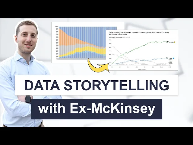
One standout example is Google, which uses data storytelling to help advertisers understand campaign performance. Through visual reports that highlight key metrics and optimization opportunities, Google enables businesses to make smarter decisions about their marketing investments.
When product teams align their data narratives with business objectives - whether it’s increasing revenue, enhancing user satisfaction, or gaining market share - they create a shared vision that resonates across departments. This alignment not only streamlines decision-making but also reinforces the role of storytelling as a critical tool for driving action.
Securing Stakeholder Buy-In
Once product priorities are clear, the next hurdle is gaining stakeholder support. High-stakes scenarios - like funding pitches, strategic planning sessions, or major project approvals - demand more than just solid data. They require a story that persuades and motivates action.
In these situations, data storytelling combines hard evidence with a compelling narrative structure. Start by defining the business challenge, back it up with data-driven insights, and finish with actionable recommendations. For example, a funding pitch might unfold like this:
Market opportunity: Our segment is growing at 35% annually, yet our market share is only 8%.
Investment needed: $2 million for product development and marketing.
Projected outcome: Capture an additional 5% market share within 18 months, generating $15 million in revenue.
This approach ties market data directly to financial goals, making the case for investment clear and persuasive.
Visuals play a crucial role in these presentations. Strategic use of color and contrast can emphasize key points, while line graphs and dashboards make data trends easy to grasp. For C-suite executives, who often need to make quick decisions, a well-structured narrative paired with clear visuals can mean the difference between action and inaction.
For high-stakes moments - whether it’s securing funding, landing a major client, or pivoting strategy - collaborating with experts like Present Partners (https://present.partners) can elevate your presentation. Their focus on strategic storytelling, visual clarity, and narrative development ensures your data doesn’t just inform - it persuades.
The most impactful presentations don’t shy away from risks. Instead, they address potential concerns upfront and demonstrate how the proposed strategy mitigates them. By combining transparency, strategic framing, and compelling visuals, you position yourself as a trusted advisor, turning data into a cornerstone for confident decision-making.
Implementing Data Storytelling in Your Organization
Turning raw data into compelling stories requires a clear, step-by-step approach. The challenge often lies in bridging the gap between understanding data storytelling as a concept and actually using it to drive meaningful decisions.
Identifying the Right Story to Tell
Start by defining the purpose of your story. What business goal are you addressing? Are you guiding a product launch, refining a brand strategy, or justifying a pricing adjustment? Instead of drowning in endless metrics, focus on framing your narrative around specific initiatives - like how a targeted campaign reduced customer churn.
This approach helps you answer not just the "what" but also the "so what" and "now what" - highlighting the implications of the data and the actions it calls for. It’s equally important to know your audience. Research from PwC reveals that 73% of executives admit their decisions aren’t fully data-driven, often because raw data lacks the context they need. Decision-makers need insights tailored to their priorities. For example, C-suite executives may prefer a high-level strategic overview, while product managers might need detailed, actionable metrics. Crafting your story to align with each stakeholder’s needs ensures clarity and alignment across your organization.
Once your narrative is clear, the next step is choosing the right tools to bring your insights to life.
Choosing the Right Tools and Visualizations
After defining your story, bring it into focus with effective visualizations. While the choice of tools matters, how you use them is even more critical. Platforms like Tableau and Power BI are often recommended by industry leaders such as McKinsey & Co. for their user-friendly dashboards. Even advanced Excel can be a powerful option when used strategically.
The key is to use visuals that make your insights immediately clear. For instance:
Line graphs work well for showing trends over time.
Bar charts are ideal for comparisons.
Pie charts can illustrate proportions but should be used sparingly.
Use color and contrast thoughtfully. Highlight significant changes - like a drop in customer churn - with bold colors, while muting less important details. For example, when a product team analyzed A/B testing data, their clear, concise visuals helped them confidently select the better-performing design.
Strong visual storytelling not only clarifies insights but also lays the groundwork for collaboration and impactful presentations.
Collaborating with Experts for High-Stakes Presentations
Once you’ve built a clear narrative and strong visuals, collaborating with experts can elevate your data storytelling to the next level - especially for high-stakes scenarios. While your internal team might handle routine presentations, critical moments like securing funding, pitching to investors, or presenting to the board require extra polish and precision.
Specialized agencies like Present Partners (https://present.partners) can help refine your story, structure your content, and ensure every element aligns with your business goals. Their experience in crafting presentations that secure funding, win clients, and drive decisions can make a significant difference.
In high-stakes situations, a well-crafted presentation doesn’t just share data - it persuades, builds trust in your recommendations, and positions you as a credible advisor. Investing in professional design and storytelling can transform your data into a powerful tool for action.
Conclusion
Data storytelling goes beyond simply presenting numbers - it's about turning complex insights into actionable steps that drive progress. By combining solid data analysis, purposeful design, and a clear narrative, you can achieve results that no spreadsheet or dashboard alone could deliver.
Organizations that excel in data storytelling recognize an important fact: it's not the data itself that drives decisions, but the story built around it. The context, the meaning, and the recommended actions are what truly inspire stakeholders to take action.
Effective data storytelling addresses the key questions decision-makers care about: "So what?" and "Now what?" It’s essential to focus on insights that tackle your most pressing business challenges. Whether you're trying to reduce customer churn, shape product development, or secure funding for a new project, your narrative should shine a light on the way forward. This kind of storytelling not only helps guide immediate decisions but also fosters a broader shift toward evidence-based thinking across your organization.
When used consistently, data storytelling can transform your workplace culture. Teams start blending data with narrative, which builds trust in their recommendations. Over time, this results in better decisions - leading to outcomes like stronger customer retention, quicker product launches, and smarter strategic planning.
As this decision-making approach becomes second nature, the quality of your data story becomes even more critical during pivotal moments. In high-stakes situations - whether pitching to investors, presenting to a board, or seeking major funding - a well-crafted data story can make the difference between success and failure. This is where strategic thinking, clear visuals, and a compelling narrative come together to create presentations that not only inform but also persuade and inspire action.
To create impactful presentations, focus on identifying your core story, choosing effective visualizations, and seeking guidance from experts like Present Partners (https://present.partners). Collaborating with professionals ensures your presentations are visually striking and strategically aligned to secure funding, win clients, and drive decisions. A clear, relevant, and engaging narrative strengthens its impact, builds stakeholder confidence, and accelerates results. A strong data story doesn’t just inform - it aligns teams, inspires action, and delivers measurable outcomes.
FAQs
How does storytelling with data help organizations make better decisions?
Storytelling with data transforms complicated information into clear, engaging narratives that drive smarter decisions. Instead of overwhelming decision-makers with raw numbers, this approach focuses on presenting insights in a way that's easy to understand and act upon.
By blending strategic thinking with impactful visuals, data storytelling brings attention to key trends, reveals opportunities, and strengthens arguments. This method ensures decisions are grounded in both logic and context, helping teams feel more confident and aligned in their choices.
What should you focus on to create a compelling data story for decision-makers?
To create a data story that truly connects with stakeholders, focus on three essential elements: clarity, relevance, and engagement. Begin by pinpointing the core message you want to communicate, ensuring it ties directly to your audience's priorities or challenges. Visual aids like charts and graphs can help break down complex data, but keep them simple - too much detail can overwhelm your audience.
Organize your story with a clear structure: start by outlining the problem, follow with the data insights, and wrap up with actionable recommendations. Keep your narrative focused and specific to your audience, highlighting how the data directly supports their decision-making process. A well-thought-out presentation can significantly enhance how your message is received.
How can using the 3-act structure improve data storytelling in business presentations?
The 3-act structure is a tried-and-true method for crafting a data-driven story that connects with decision-makers. By breaking your presentation into three parts - setup, conflict, and resolution - you can lead your audience through a narrative that highlights challenges and delivers actionable insights.
In the setup, lay the groundwork by introducing the context and key data points. This step ensures your audience understands why the topic matters. The conflict focuses on the problem or opportunity, using data to underline its significance and urgency. Finally, the resolution ties everything together by presenting insights and practical recommendations, backed by visuals and evidence, to help your audience make informed decisions. This structure not only keeps your audience engaged but also ensures your key points are communicated effectively.